Juicer Linear Modeling QC
Ittai Eres
2018-01-23
Last updated: 2020-08-05
Checks: 7 0
Knit directory: HiCiPSC/
This reproducible R Markdown analysis was created with workflowr (version 1.4.0). The Checks tab describes the reproducibility checks that were applied when the results were created. The Past versions tab lists the development history.
Great! Since the R Markdown file has been committed to the Git repository, you know the exact version of the code that produced these results.
Great job! The global environment was empty. Objects defined in the global environment can affect the analysis in your R Markdown file in unknown ways. For reproduciblity it’s best to always run the code in an empty environment.
The command set.seed(20190311) was run prior to running the code in the R Markdown file. Setting a seed ensures that any results that rely on randomness, e.g. subsampling or permutations, are reproducible.
Great job! Recording the operating system, R version, and package versions is critical for reproducibility.
Nice! There were no cached chunks for this analysis, so you can be confident that you successfully produced the results during this run.
Great job! Using relative paths to the files within your workflowr project makes it easier to run your code on other machines.
Great! You are using Git for version control. Tracking code development and connecting the code version to the results is critical for reproducibility. The version displayed above was the version of the Git repository at the time these results were generated.
Note that you need to be careful to ensure that all relevant files for the analysis have been committed to Git prior to generating the results (you can use wflow_publish or wflow_git_commit). workflowr only checks the R Markdown file, but you know if there are other scripts or data files that it depends on. Below is the status of the Git repository when the results were generated:
Ignored files:
Ignored: .DS_Store
Ignored: .Rhistory
Ignored: analysis/.DS_Store
Ignored: analysis/.Rhistory
Ignored: code/.DS_Store
Ignored: data/.DS_Store
Ignored: data/TADs/.DS_Store
Ignored: data/TADs/Human_inter_30_KR_contact_domains/.DS_Store
Ignored: data/TADs/scripts/.DS_Store
Ignored: docs/.DS_Store
Ignored: docs/figure/.DS_Store
Ignored: output/.DS_Store
Untracked files:
Untracked: Rplot.jpeg
Untracked: Rplot001.jpeg
Untracked: Rplot002.jpeg
Untracked: Rplot003.jpeg
Untracked: Rplot004.jpeg
Untracked: Rplot005.jpeg
Untracked: Rplot006.jpeg
Untracked: Rplot007.jpeg
Untracked: Rplot008.jpeg
Untracked: Rplot009.jpeg
Untracked: Rplot010.jpeg
Untracked: Rplot011.jpeg
Untracked: Rplot012.jpeg
Untracked: Rplot013.jpeg
Untracked: Rplot014.jpeg
Untracked: Rplot015.jpeg
Untracked: Rplot016.jpeg
Untracked: Rplot017.jpeg
Untracked: Rplot018.jpeg
Untracked: Rplot019.jpeg
Untracked: Rplot020.jpeg
Untracked: Rplot021.jpeg
Untracked: Rplot022.jpeg
Untracked: Rplot023.jpeg
Untracked: Rplot024.jpeg
Untracked: Rplot025.jpeg
Untracked: Rplot026.jpeg
Untracked: Rplot027.jpeg
Untracked: Rplot028.jpeg
Untracked: Rplot029.jpeg
Untracked: Rplot030.jpeg
Untracked: Rplot031.jpeg
Untracked: Rplot032.jpeg
Untracked: Rplot033.jpeg
Untracked: Rplot034.jpeg
Untracked: Rplot035.jpeg
Untracked: Rplot036.jpeg
Untracked: Rplot037.jpeg
Untracked: Rplot038.jpeg
Untracked: Rplot039.jpeg
Untracked: Rplot040.jpeg
Untracked: Rplot041.jpeg
Untracked: Rplot042.jpeg
Untracked: Rplot043.jpeg
Untracked: Rplot044.jpeg
Untracked: Rplot045.jpeg
Untracked: Rplot046.jpeg
Untracked: Rplot047.jpeg
Untracked: Rplot048.jpeg
Untracked: Rplot049.jpeg
Untracked: Rplot050.jpeg
Untracked: Rplot051.jpeg
Untracked: Rplot052.jpeg
Untracked: Rplot053.jpeg
Untracked: Rplot054.jpeg
Untracked: Rplot055.jpeg
Untracked: Rplot056.jpeg
Untracked: Rplot057.jpeg
Untracked: Rplot058.jpeg
Untracked: Rplot059.jpeg
Untracked: Rplot060.jpeg
Untracked: Rplot061.jpeg
Untracked: Rplot062.jpeg
Untracked: Rplot063.jpeg
Untracked: Rplot064.jpeg
Untracked: Rplot065.jpeg
Untracked: Rplot066.jpeg
Untracked: Rplot067.jpeg
Untracked: Rplot068.jpeg
Untracked: Rplot069.jpeg
Untracked: Rplot070.jpeg
Untracked: Rplot071.jpeg
Untracked: Rplot072.jpeg
Untracked: Rplot073.jpeg
Untracked: Rplot074.jpeg
Untracked: Rplot075.jpeg
Untracked: Rplot076.jpeg
Untracked: Rplot077.jpeg
Untracked: Rplot078.jpeg
Untracked: Rplot079.jpeg
Untracked: Rplot080.jpeg
Untracked: Rplot081.jpeg
Untracked: Rplot082.jpeg
Untracked: Rplot083.jpeg
Untracked: Rplot084.jpeg
Untracked: Rplot085.jpeg
Untracked: Rplot086.jpeg
Untracked: Rplot087.jpeg
Untracked: Rplot088.jpeg
Untracked: Rplot089.jpeg
Untracked: Rplot090.jpeg
Untracked: Rplot091.jpeg
Untracked: Rplot092.jpeg
Untracked: Rplot093.jpeg
Untracked: Rplot094.jpeg
Untracked: Rplot095.jpeg
Untracked: Rplot096.jpeg
Untracked: Rplot097.jpeg
Untracked: Rplot098.jpeg
Untracked: Rplot099.jpeg
Untracked: Rplot100.jpeg
Untracked: Rplot101.jpeg
Untracked: Rplot102.jpeg
Untracked: Rplot103.jpeg
Untracked: Rplot104.jpeg
Untracked: Rplot105.jpeg
Untracked: Rplot106.jpeg
Untracked: Rplot107.jpeg
Untracked: Rplot108.jpeg
Untracked: Rplot109.jpeg
Untracked: Rplot110.jpeg
Untracked: Rplot111.jpeg
Untracked: Rplot112.jpeg
Untracked: Rplot113.jpeg
Untracked: Rplot114.jpeg
Untracked: Rplot115.jpeg
Untracked: Rplot116.jpeg
Untracked: Rplot117.jpeg
Untracked: Rplot118.jpeg
Untracked: Rplot119.jpeg
Untracked: Rplot120.jpeg
Untracked: Rplot121.jpeg
Untracked: Rplot122.jpeg
Untracked: Rplot123.jpeg
Untracked: Rplot124.jpeg
Untracked: Rplot125.jpeg
Untracked: Rplot126.jpeg
Untracked: Rplot127.jpeg
Untracked: Rplot128.jpeg
Untracked: Rplot129.jpeg
Untracked: Rplot130.jpeg
Untracked: Rplot131.jpeg
Untracked: Rplot132.jpeg
Untracked: Rplot133.jpeg
Untracked: Rplot134.jpeg
Untracked: Rplot135.jpeg
Untracked: Rplot136.jpeg
Untracked: Rplot137.jpeg
Untracked: Rplot138.jpeg
Untracked: Rplot139.jpeg
Untracked: Rplot140.jpeg
Untracked: Rplot141.jpeg
Untracked: Rplot142.jpeg
Untracked: Rplot143.jpeg
Untracked: Rplot144.jpeg
Untracked: Rplot145.jpeg
Untracked: Rplot146.jpeg
Untracked: Rplot147.jpeg
Untracked: Rplot148.jpeg
Untracked: Rplot149.jpeg
Untracked: Rplot150.jpeg
Untracked: Rplot151.jpeg
Untracked: Rplot152.jpeg
Untracked: Rplot153.jpeg
Untracked: Rplot154.jpeg
Untracked: Rplot155.jpeg
Untracked: Rplot156.jpeg
Untracked: Rplot157.jpeg
Untracked: Rplot158.jpeg
Untracked: Rplot159.jpeg
Untracked: Rplot160.jpeg
Untracked: Rplot161.jpeg
Untracked: Rplot162.jpeg
Untracked: Rplot163.jpeg
Untracked: Rplot164.jpeg
Untracked: Rplot165.jpeg
Untracked: Rplot166.jpeg
Untracked: Rplot167.jpeg
Untracked: Rplot168.jpeg
Untracked: Rplot169.jpeg
Untracked: Rplot170.jpeg
Untracked: Rplot171.jpeg
Untracked: Rplot172.jpeg
Untracked: Rplot173.jpeg
Untracked: Rplot174.jpeg
Untracked: Rplot175.jpeg
Untracked: Rplot176.jpeg
Untracked: Rplot177.jpeg
Untracked: Rplot178.jpeg
Untracked: Rplot179.jpeg
Untracked: Rplot180.jpeg
Untracked: Rplot181.jpeg
Untracked: Rplot182.jpeg
Untracked: Rplot183.jpeg
Untracked: Rplot184.jpeg
Untracked: Rplot185.jpeg
Untracked: Rplot186.jpeg
Untracked: Rplot187.jpeg
Untracked: Rplot188.jpeg
Untracked: Rplot189.jpeg
Untracked: Rplot190.jpeg
Untracked: Rplot191.jpeg
Untracked: Rplot192.jpeg
Untracked: Rplot193.jpeg
Untracked: Rplot194.jpeg
Untracked: Rplot195.jpeg
Untracked: Rplot196.jpeg
Untracked: Rplot197.jpeg
Untracked: Rplot198.jpeg
Untracked: Rplot199.jpeg
Untracked: Rplot200.jpeg
Untracked: Rplot201.jpeg
Untracked: Rplot202.jpeg
Untracked: Rplot203.jpeg
Untracked: Rplot204.jpeg
Untracked: Rplot205.jpeg
Untracked: Rplot206.jpeg
Untracked: Rplot207.jpeg
Untracked: Rplot208.jpeg
Untracked: Rplot209.jpeg
Untracked: Rplot210.jpeg
Untracked: Rplot211.jpeg
Untracked: Rplot212.jpeg
Untracked: Rplot213.jpeg
Untracked: Rplot214.jpeg
Untracked: Rplot215.jpeg
Untracked: Rplot216.jpeg
Untracked: Rplot217.jpeg
Untracked: Rplot218.jpeg
Untracked: Rplot219.jpeg
Untracked: Rplot220.jpeg
Untracked: Rplot221.jpeg
Untracked: Rplot222.jpeg
Untracked: Rplot223.jpeg
Untracked: Rplot224.jpeg
Untracked: Rplot225.jpeg
Untracked: Rplot226.jpeg
Untracked: Rplot227.jpeg
Untracked: Rplot228.jpeg
Untracked: Rplot229.jpeg
Untracked: Rplot230.jpeg
Untracked: Rplot231.jpeg
Untracked: Rplot232.jpeg
Untracked: Rplot233.jpeg
Untracked: Rplot234.jpeg
Untracked: Rplot235.jpeg
Untracked: Rplot236.jpeg
Untracked: Rplot237.jpeg
Untracked: Rplot238.jpeg
Untracked: Rplot239.jpeg
Untracked: Rplot240.jpeg
Untracked: Rplot241.jpeg
Untracked: Rplot242.jpeg
Untracked: Rplot243.jpeg
Untracked: Rplot244.jpeg
Untracked: Rplot245.jpeg
Untracked: Rplot246.jpeg
Untracked: Rplot247.jpeg
Untracked: Rplot248.jpeg
Untracked: Rplot249.jpeg
Untracked: Rplot250.jpeg
Untracked: Rplot251.jpeg
Untracked: Rplot252.jpeg
Untracked: Rplot253.jpeg
Untracked: Rplot254.jpeg
Untracked: Rplot255.jpeg
Untracked: Rplot256.jpeg
Untracked: Rplot257.jpeg
Untracked: Rplot258.jpeg
Untracked: Rplot259.jpeg
Untracked: Rplot260.jpeg
Untracked: Rplot261.jpeg
Untracked: Rplot262.jpeg
Untracked: Rplot263.jpeg
Untracked: Rplot264.jpeg
Untracked: Rplot265.jpeg
Untracked: Rplot266.jpeg
Untracked: Rplot267.jpeg
Untracked: Rplot268.jpeg
Untracked: Rplot269.jpeg
Untracked: Rplot270.jpeg
Untracked: Rplot271.jpeg
Untracked: Rplot272.jpeg
Untracked: Rplot273.jpeg
Untracked: Rplot274.jpeg
Untracked: Rplot275.jpeg
Untracked: Rplot276.jpeg
Untracked: Rplot277.jpeg
Untracked: Rplot278.jpeg
Untracked: Rplot279.jpeg
Untracked: Rplot280.jpeg
Untracked: Rplot281.jpeg
Untracked: Rplot282.jpeg
Untracked: Rplot283.jpeg
Untracked: Rplot284.jpeg
Untracked: Rplot285.jpeg
Untracked: Rplot286.jpeg
Untracked: Rplot287.jpeg
Untracked: Rplot288.jpeg
Untracked: Rplot289.jpeg
Untracked: Rplot290.jpeg
Untracked: Rplot291.jpeg
Untracked: Rplot292.jpeg
Untracked: Rplot293.jpeg
Untracked: Rplot294.jpeg
Untracked: Rplot295.jpeg
Untracked: Rplot296.jpeg
Untracked: Rplot297.jpeg
Untracked: Rplot298.jpeg
Untracked: Rplot299.jpeg
Untracked: Rplot300.jpeg
Untracked: Rplot301.jpeg
Untracked: Rplot302.jpeg
Untracked: Rplot303.jpeg
Untracked: Rplot304.jpeg
Untracked: S2A.jpeg
Untracked: S2B.jpeg
Untracked: code/mediation_test.R
Untracked: data/Chimp_orthoexon_extended_info.txt
Untracked: data/Human_orthoexon_extended_info.txt
Untracked: data/Meta_data.txt
Untracked: data/TADs/Arrowhead_individuals/
Untracked: data/TADs/CH.10kb.closest.panTro5
Untracked: data/TADs/CTCF.overlap.computer.sh
Untracked: data/TADs/CTCF/
Untracked: data/TADs/HC.10kb.closest.hg38
Untracked: data/TADs/Human_inter_30_KR_contact_domains_PT6/
Untracked: data/TADs/Rao/
Untracked: data/TADs/TopDom/
Untracked: data/TADs/deprecated/
Untracked: data/TADs/mega.bounds.intersect.c.sh
Untracked: data/TADs/mega.bounds.intersect.merge.sh
Untracked: data/TADs/mega.bounds.rao.sh
Untracked: data/TADs/mega.domains.bedtoolsc.sh
Untracked: data/TADs/mega.domains.rao.sh
Untracked: data/TADs/overlaps/
Untracked: data/TADs/overlaps_rao_style/
Untracked: data/TADs/rao.chimp.subsample.tester.sh
Untracked: data/chimp_lengths.txt
Untracked: data/counts_iPSC.txt
Untracked: data/epigenetic_enrichments/
Untracked: data/final.10kb.homer.df
Untracked: data/final.juicer.10kb.KR
Untracked: data/final.juicer.10kb.VC
Untracked: data/hic_gene_overlap/
Untracked: data/human_lengths.txt
Untracked: data/old_mediation_permutations/
Untracked: output/DC_regions.txt
Untracked: output/IEE.RPKM.RDS
Untracked: output/IEE_voom_object.RDS
Untracked: output/data.4.filtered.lm.QC
Untracked: output/data.4.fixed.init.LM
Untracked: output/data.4.fixed.init.QC
Untracked: output/data.4.init.LM
Untracked: output/data.4.init.QC
Untracked: output/data.4.lm.QC
Untracked: output/full.data.10.init.LM
Untracked: output/full.data.10.init.QC
Untracked: output/full.data.10.lm.QC
Untracked: output/full.data.annotations.RDS
Untracked: output/gene.hic.filt.KR.RDS
Untracked: output/gene.hic.filt.RDS
Untracked: output/gene.hic.filt.VC.RDS
Untracked: output/homer_mediation.rda
Untracked: output/juicer.IEE.RPKM.RDS
Untracked: output/juicer.IEE_voom_object.RDS
Untracked: output/juicer.filt.KR
Untracked: output/juicer.filt.KR.final
Untracked: output/juicer.filt.KR.lm
Untracked: output/juicer.filt.VC
Untracked: output/juicer.filt.VC.final
Untracked: output/juicer.filt.VC.lm
Untracked: output/juicer_mediation.rda
Untracked: output/mc_de.rds
Untracked: output/mc_de_homer.rds
Untracked: output/mc_de_juicer.rds
Untracked: output/mc_node.rds
Untracked: output/mc_node_homer.rds
Untracked: output/mc_node_juicer.rds
Untracked: ~/
Unstaged changes:
Modified: analysis/TADs.Rmd
Deleted: analysis/alt_mediation.Rmd
Modified: analysis/enrichment.Rmd
Note that any generated files, e.g. HTML, png, CSS, etc., are not included in this status report because it is ok for generated content to have uncommitted changes.
These are the previous versions of the R Markdown and HTML files. If you’ve configured a remote Git repository (see ?wflow_git_remote), click on the hyperlinks in the table below to view them.
| File | Version | Author | Date | Message |
|---|---|---|---|---|
| Rmd | 37c244e | Ittai Eres | 2020-08-05 | Update formatting for headers |
| html | ff886b1 | Ittai Eres | 2019-04-30 | Build site. |
| Rmd | 311fad1 | Ittai Eres | 2019-04-30 | Update formatting of final output df for juicer VC from linear modeling QC, add in juicer enrichment file and updated upload of TAD file. |
| html | b7d82fc | Ittai Eres | 2019-04-30 | Build site. |
| Rmd | 8380e8b | Ittai Eres | 2019-04-30 | Add variety of juicer analyses into website files. |
QC on QQ Plots
Having observed inflated p-values in QQ plots from doing linear modeling, as well as a stark asymmetry in the distribution of betas for the species term in the volcano plot, here I move to examine both issues. The QQ plot issue is not truly concerning, as we were not necessarily expecting normality in this set of hits enriched for significant Hi-C contacts. It seems likely that any set of significant Hi-C hits called independently in each species will have some inflation in the significance of a species term for linearly modeling the interaction frequencies. That the QQ plot does not look like a GWAS QQ plot is not truly concerning, however, just to be sure, first I will run a series of QQ plots once again after shuffling some of the metadata labels. This simply ensures the inflation seen is not an artifact of processing. I tackle the volcano plot asymmetry after alleviating QQ plot concerns and doing some further genomic filtering explained below.
#This file will examine first the inflation of p-values from the QQ plot at the end of linear_modeling.Rmd, and then the asymmetry seen in the volcano plots from linear modeling.
#First, grab the qqplotting function I utilize from linear_modeling.Rmd:
newqqplot=function(pvals, quant, title){
len = length(pvals)
res=qqplot(-log10((1:len)/(1+len)),pvals,plot.it=F)
plot(res$x,res$y, main=title, xlab="Theoretical", ylab="Actual", col=ifelse(res$y>as.numeric(quantile(res$y, quant[1])), ifelse(res$y>as.numeric(quantile(res$y, quant[2])), "red", "blue"), "black"))
abline(0, 1)
}
#Now, as always, read in data files modified by initial_QC.Rmd and linear_modeling.Rmd
filt.KR <- fread("output/juicer.filt.KR.lm", header = TRUE, data.table=FALSE, stringsAsFactors = FALSE, showProgress = FALSE)
filt.VC <- fread("output/juicer.filt.VC.lm", header=TRUE, data.table=FALSE, stringsAsFactors=FALSE, showProgress = FALSE)
#This is the QQ plot for species from the linear model for Hi-C values from linear_modeling.Rmd. We can see a significant inflation of p-values here rising above the expected normal distribution alarmingly quickly:
newqqplot(-log10(filt.KR$sp_pval), c(0.5, 0.75), "QQ Plot, Species P-vals, KR Data")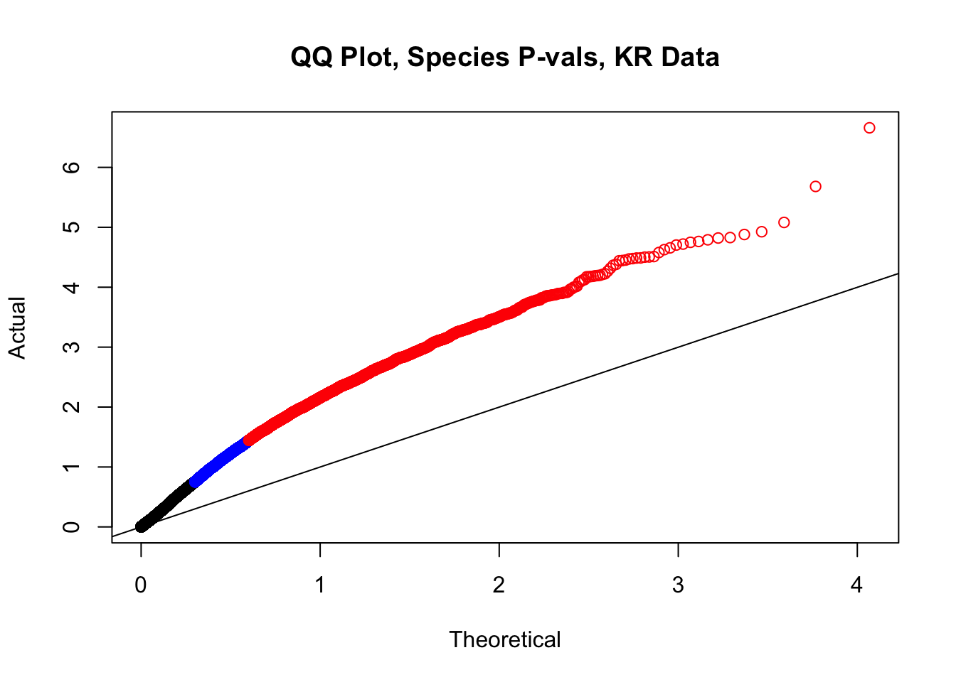
| Version | Author | Date |
|---|---|---|
| b7d82fc | Ittai Eres | 2019-04-30 |
newqqplot(-log10(filt.VC$sp_pval), c(0.5, 0.75), "QQ Plot, Species P-vals, VC Data")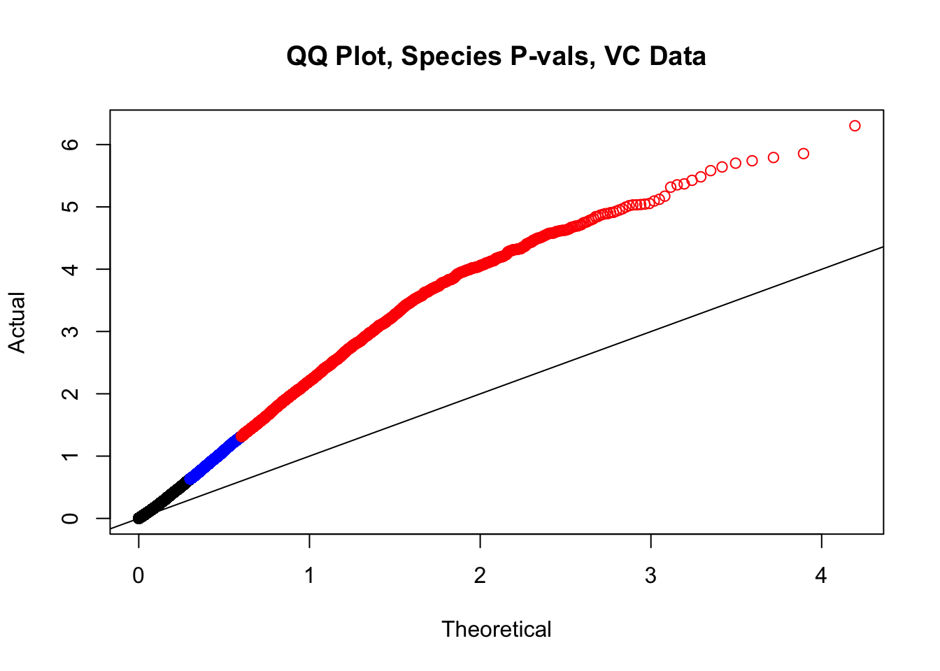
| Version | Author | Date |
|---|---|---|
| b7d82fc | Ittai Eres | 2019-04-30 |
#In order to check that this extreme inflation of p values is not merely a technical artifact, here I try shuffling the species labels and running the linear model again. I would hope to see a more normal QQplot and this would perhaps suggest this the inflation seen is due to true biological effects, rather than technical factors. The fake designs just have some species swapped; the first two fake designs are balanced across sex and batch, and the second two are balanced with respect to batch (equal numbers of humans and chimps in both), but any sex-species interaction would be confounded with batch (since all members of a species in one batch are the same sex). Note that this ultimately shouldn't matter since I'm just for checking QQ normality here, especially since I'll start with the full model but then also remove batch and sex as covariates and re-check the QQ plot, to rule out overfitting.
fake.meta1 <- data.frame("SP"=c("H", "C", "H", "C", "H", "C", "C", "H"), "SX"=c("F", "M", "M", "F", "M", "F", "M", "F"), "Batch"=c(1, 1, 1, 1, 2, 2, 2, 2))
fake.meta2 <- data.frame("SP"=c("C", "H", "C", "H", "C", "H", "H", "C"), "SX"=c("F", "M", "M", "F", "M", "F", "M", "F"), "Batch"=c(1, 1, 1, 1, 2, 2, 2, 2))
fake.meta3 <- data.frame("SP"=c("H", "C", "C", "H", "C", "H", "C", "H"), "SX"=c("F", "M", "M", "F", "M", "F", "M", "F"), "Batch"=c(1, 1, 1, 1, 2, 2, 2, 2))
fake.meta4 <- data.frame("SP"=c("C", "H", "H", "C", "C", "H", "C", "H"), "SX"=c("F", "M", "M", "F", "M", "F", "M", "F"), "Batch"=c(1, 1, 1, 1, 2, 2, 2, 2))
#First, test out the fake metadataframess utilizing the linear model with all covariates included--species, sex, and batch.
lmFit(filt.KR[,112:119], model.matrix(~1+fake.meta1$SP+fake.meta1$SX+fake.meta1$Batch)) %>% eBayes(.) %>% topTable(., coef=2, sort.by="none", number=Inf) -> fake1
lmFit(filt.KR[,112:119], model.matrix(~1+fake.meta2$SP+fake.meta2$SX+fake.meta2$Batch)) %>% eBayes(.) %>% topTable(., coef=2, sort.by="none", number=Inf) -> fake2
lmFit(filt.KR[,112:119], model.matrix(~1+fake.meta3$SP+fake.meta3$SX+fake.meta3$Batch)) %>% eBayes(.) %>% topTable(., coef=2, sort.by="none", number=Inf) -> fake3Coefficients not estimable: fake.meta3$SXM Warning: Partial NA coefficients for 11696 probe(s)Warning in .ebayes(fit = fit, proportion = proportion, stdev.coef.lim =
stdev.coef.lim, : Estimation of var.prior failed - set to default valuelmFit(filt.KR[,112:119], model.matrix(~1+fake.meta4$SP+fake.meta4$SX+fake.meta4$Batch)) %>% eBayes(.) %>% topTable(., coef=2, sort.by="none", number=Inf) -> fake4
newqqplot(-log10(fake1$P.Value), c(0.5, 0.75), "QQ Plot, Shuffled Design 1 KR")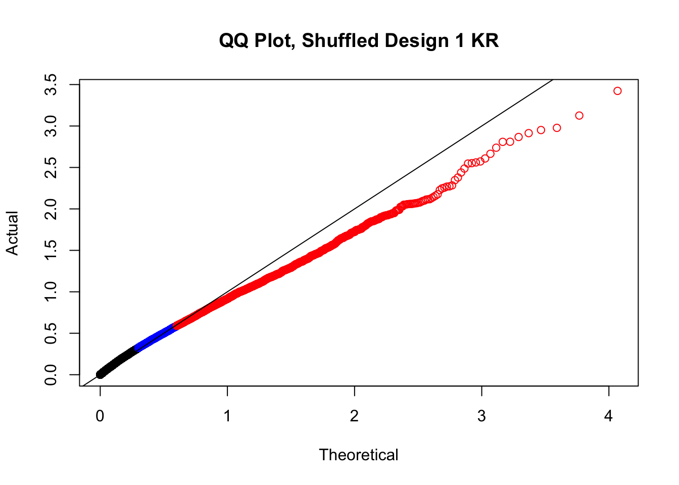
| Version | Author | Date |
|---|---|---|
| b7d82fc | Ittai Eres | 2019-04-30 |
newqqplot(-log10(fake2$P.Value), c(0.5, 0.75), "QQ Plot, Shuffled Design 2 KR")
| Version | Author | Date |
|---|---|---|
| b7d82fc | Ittai Eres | 2019-04-30 |
newqqplot(-log10(fake3$P.Value), c(0.5, 0.75), "QQ Plot, Shuffled Design 3 KR")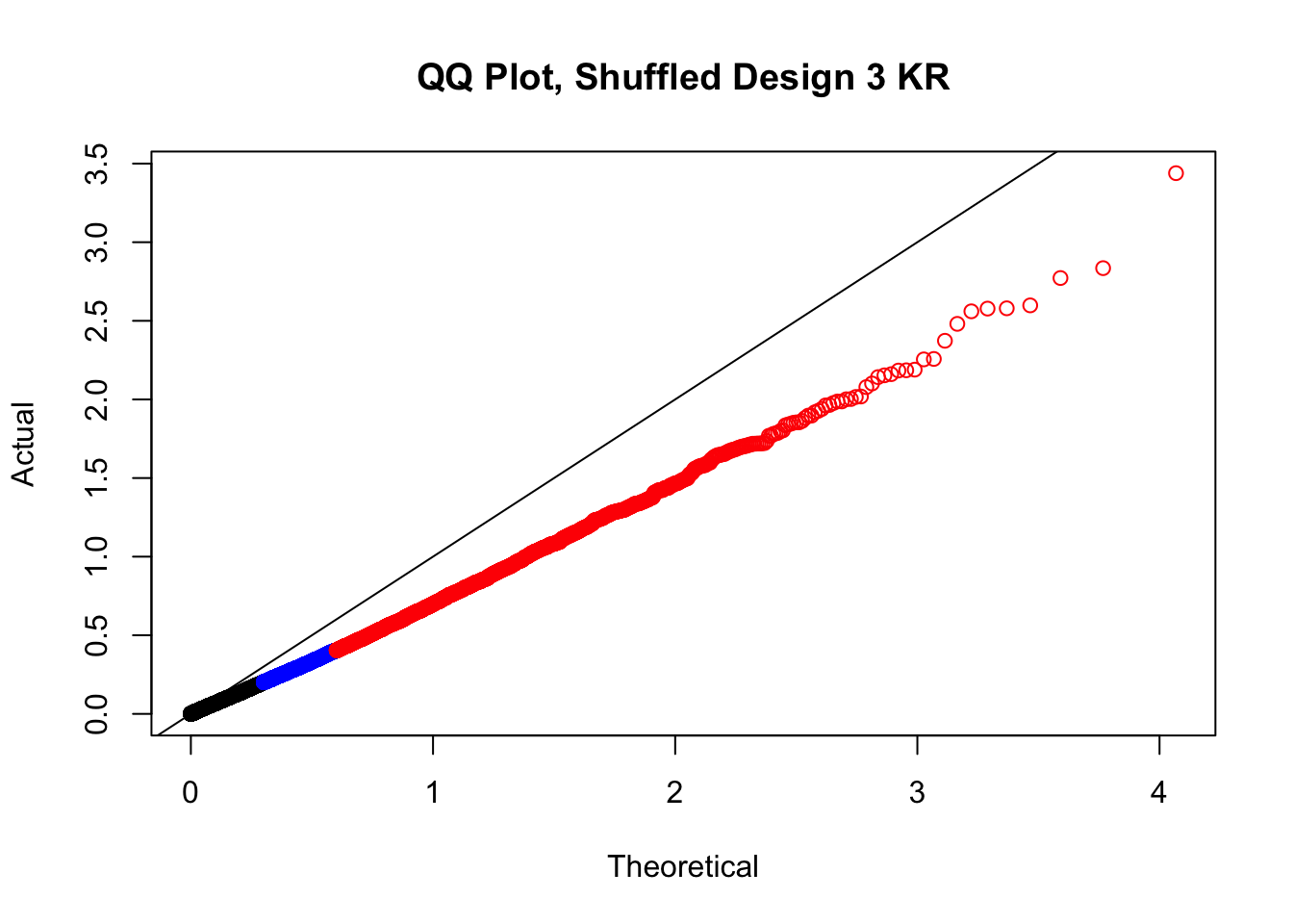
| Version | Author | Date |
|---|---|---|
| b7d82fc | Ittai Eres | 2019-04-30 |
newqqplot(-log10(fake4$P.Value), c(0.5, 0.75), "QQ Plot, Shuffled Design 4 KR")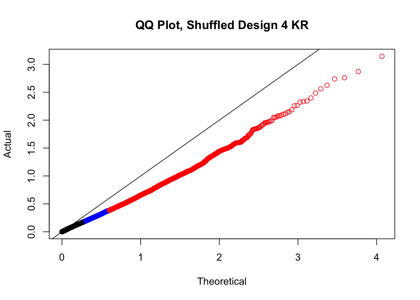
| Version | Author | Date |
|---|---|---|
| b7d82fc | Ittai Eres | 2019-04-30 |
lmFit(filt.VC[,112:119], model.matrix(~1+fake.meta1$SP+fake.meta1$SX+fake.meta1$Batch)) %>% eBayes(.) %>% topTable(., coef=2, sort.by="none", number=Inf) -> fake1
lmFit(filt.VC[,112:119], model.matrix(~1+fake.meta2$SP+fake.meta2$SX+fake.meta2$Batch)) %>% eBayes(.) %>% topTable(., coef=2, sort.by="none", number=Inf) -> fake2
lmFit(filt.VC[,112:119], model.matrix(~1+fake.meta3$SP+fake.meta3$SX+fake.meta3$Batch)) %>% eBayes(.) %>% topTable(., coef=2, sort.by="none", number=Inf) -> fake3Coefficients not estimable: fake.meta3$SXM Warning: Partial NA coefficients for 15667 probe(s)
Warning: Estimation of var.prior failed - set to default valuelmFit(filt.VC[,112:119], model.matrix(~1+fake.meta4$SP+fake.meta4$SX+fake.meta4$Batch)) %>% eBayes(.) %>% topTable(., coef=2, sort.by="none", number=Inf) -> fake4
newqqplot(-log10(fake1$P.Value), c(0.5, 0.75), "QQ Plot, Shuffled Design 1 VC")
| Version | Author | Date |
|---|---|---|
| b7d82fc | Ittai Eres | 2019-04-30 |
newqqplot(-log10(fake2$P.Value), c(0.5, 0.75), "QQ Plot, Shuffled Design 2 VC")
| Version | Author | Date |
|---|---|---|
| b7d82fc | Ittai Eres | 2019-04-30 |
newqqplot(-log10(fake3$P.Value), c(0.5, 0.75), "QQ Plot, Shuffled Design 3 VC")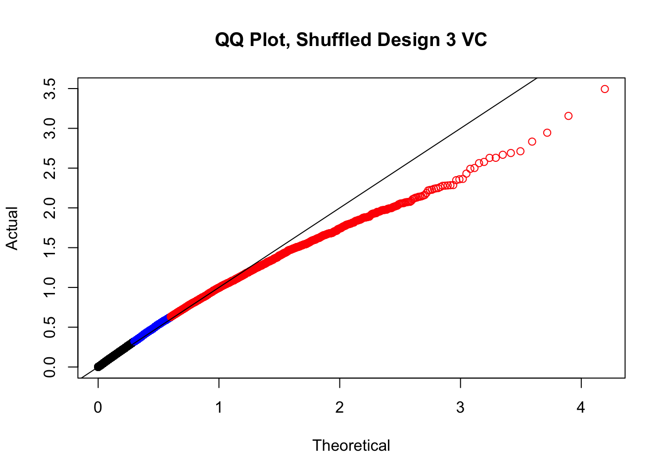
| Version | Author | Date |
|---|---|---|
| b7d82fc | Ittai Eres | 2019-04-30 |
newqqplot(-log10(fake4$P.Value), c(0.5, 0.75), "QQ Plot, Shuffled Design 4 VC")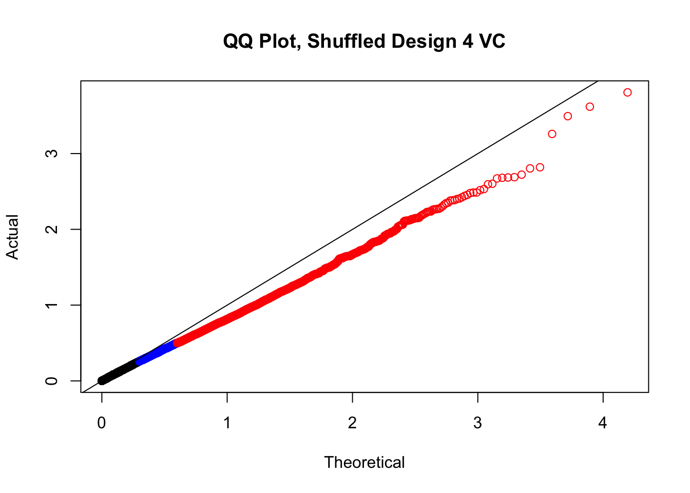
| Version | Author | Date |
|---|---|---|
| b7d82fc | Ittai Eres | 2019-04-30 |
#While these QQ plots are nice in that they no longer show inflation of p-values quickly, many of them show slight deflation. Here I try doing the same thing again but without sex and then without batch, and then without both, as covariates--to account for the possibility that inclusion of these covariates in the model is overfitting:
# lmFit(filt.KR[,112:119], model.matrix(~1+fake.meta1$SP+fake.meta1$Batch)) %>% eBayes(.) %>% topTable(., coef=2, sort.by="none", number=Inf) -> fake1
# lmFit(filt.KR[,112:119], model.matrix(~1+fake.meta2$SP+fake.meta2$Batch)) %>% eBayes(.) %>% topTable(., coef=2, sort.by="none", number=Inf) -> fake2
# lmFit(filt.KR[,112:119], model.matrix(~1+fake.meta3$SP+fake.meta3$Batch)) %>% eBayes(.) %>% topTable(., coef=2, sort.by="none", number=Inf) -> fake3
# lmFit(filt.KR[,112:119], model.matrix(~1+fake.meta4$SP+fake.meta4$Batch)) %>% eBayes(.) %>% topTable(., coef=2, sort.by="none", number=Inf) -> fake4
# newqqplot(-log10(fake1$P.Value), c(0.5, 0.75), "QQ Plot, Shuffled Design no SX, 1 | 4")
# newqqplot(-log10(fake2$P.Value), c(0.5, 0.75), "QQ Plot, Shuffled Design no SX, 2 | 4")
# newqqplot(-log10(fake3$P.Value), c(0.5, 0.75), "QQ Plot, Shuffled Design no SX, 3 | 4")
# newqqplot(-log10(fake4$P.Value), c(0.5, 0.75), "QQ Plot, Shuffled Design no SX, 4 | 4")
#
# lmFit(filt.KR[,112:119], model.matrix(~1+fake.meta1$SP+fake.meta1$SX)) %>% eBayes(.) %>% topTable(., coef=2, sort.by="none", number=Inf) -> fake1
# lmFit(filt.KR[,112:119], model.matrix(~1+fake.meta2$SP+fake.meta2$SX)) %>% eBayes(.) %>% topTable(., coef=2, sort.by="none", number=Inf) -> fake2
# lmFit(filt.KR[,112:119], model.matrix(~1+fake.meta3$SP+fake.meta3$SX)) %>% eBayes(.) %>% topTable(., coef=2, sort.by="none", number=Inf) -> fake3
# lmFit(filt.KR[,112:119], model.matrix(~1+fake.meta4$SP+fake.meta4$SX)) %>% eBayes(.) %>% topTable(., coef=2, sort.by="none", number=Inf) -> fake4
# newqqplot(-log10(fake1$P.Value), c(0.5, 0.75), "QQ Plot, Shuffled Design no BTC, 1 | 4")
# newqqplot(-log10(fake2$P.Value), c(0.5, 0.75), "QQ Plot, Shuffled Design no BTC, 2 | 4")
# newqqplot(-log10(fake3$P.Value), c(0.5, 0.75), "QQ Plot, Shuffled Design no BTC, 3 | 4")
# newqqplot(-log10(fake4$P.Value), c(0.5, 0.75), "QQ Plot, Shuffled Design no BTC, 4 | 4")
#
# lmFit(filt.KR[,112:119], model.matrix(~1+fake.meta1$SP)) %>% eBayes(.) %>% topTable(., coef=2, sort.by="none", number=Inf) -> fake1
# lmFit(filt.KR[,112:119], model.matrix(~1+fake.meta2$SP)) %>% eBayes(.) %>% topTable(., coef=2, sort.by="none", number=Inf) -> fake2
# lmFit(filt.KR[,112:119], model.matrix(~1+fake.meta3$SP)) %>% eBayes(.) %>% topTable(., coef=2, sort.by="none", number=Inf) -> fake3
# lmFit(filt.KR[,112:119], model.matrix(~1+fake.meta4$SP)) %>% eBayes(.) %>% topTable(., coef=2, sort.by="none", number=Inf) -> fake4
# newqqplot(-log10(fake1$P.Value), c(0.5, 0.75), "QQ Plot, Shuffled Design SP only, 1 | 4")
# newqqplot(-log10(fake2$P.Value), c(0.5, 0.75), "QQ Plot, Shuffled Design SP only, 2 | 4")
# newqqplot(-log10(fake3$P.Value), c(0.5, 0.75), "QQ Plot, Shuffled Design SP only, 3 | 4")
# newqqplot(-log10(fake4$P.Value), c(0.5, 0.75), "QQ Plot, Shuffled Design SP only, 4 | 4")These are slightly better, but many show some small degree of deflation. After looking at all these QQ plots concerns about p-value inflation are fairly assuaged, and it’s again worth noting that there was no real cause for concern in the first place. Once again, I pulled out significant Hi-C hits from each species, so it makes sense that this set of hits might already be enriched for strong species differences. I conclude that the signal seen in the QQ plot is not an artifact of making incorrect assumptions in linear modeling.
Genomic Differences
However, we might still be concerned that some of the observed differences are not truly driven by biology, but due to differences in genome builds or other issues induced by liftOver. I now add several other metrics measuring differences in bin sizes and pair distances between humans and chimps, to help identify differences that may be primarily driven by mapping of orthology or different genome builds rather than true biology. I will then subset the QQ plots to particular classes of these hits and see if any pattern emerges. This utilizes the normal set of p-values from the original design conditioned upon discovery in 4 individuals. I also place hits into classes based on differences in bin size or distance between pair mates, and use a 3-dimensional plot to see if any class(es) of hits show strong inflation in their species p-values from linear modeling. This represents one of the final filtering steps.
#To do this, I first have to pull out the mean start and end positions of bins for each of the species from the data:
H1startCmean <- rowMeans(filt.KR[,c('hstart1-C', 'hstart1-D', 'hstart1-G', 'hstart1-H')], na.rm=TRUE)
H1endCmean <- rowMeans(filt.KR[,c('hend1-C', 'hend1-D', 'hend1-G', 'hend1-H')], na.rm=TRUE)
H2startCmean <- rowMeans(filt.KR[,c('hstart2-C', 'hstart2-D', 'hstart2-G', 'hstart2-H')], na.rm=TRUE)
H2endCmean <- rowMeans(filt.KR[,c('hend2-C', 'hend2-D', 'hend2-G', 'hend2-H')], na.rm=TRUE)
C1startHmean <- rowMeans(filt.KR[,c('cstart1-A', 'cstart1-B', 'cstart1-E', 'cstart1-F')], na.rm=TRUE) #this is identical and easier.
C1endHmean <- rowMeans(filt.KR[,c('cend1-A', 'cend1-B', 'cend1-E', 'cend1-F')], na.rm=TRUE)
C2startHmean <- rowMeans(filt.KR[,c('cstart2-A', 'cstart2-B', 'cstart2-E', 'cstart2-F')], na.rm=TRUE)
C2endHmean <- rowMeans(filt.KR[,c('cend2-A', 'cend2-B', 'cend2-E', 'cend2-F')], na.rm=TRUE)
#Now, I use these data to add columns to the data frame for the sizes of bins and distance between bins. Note that I am only really looking at differences in the size of the "orthologous" bins called through liftover, as compared to their original size (10kb). Bin size differences in the values at the start of each individual's portion of the data frame for coordinates matching that species are merely due to size differences in reciprocal best hits liftover. The true size of bins within their own species is always 10kb. So here bin sizes being appended to the data frame are for lifted-over bins. I do the distance differences based on the HC-pair values (H1/H2 and C1/C2) that have been rounded to the nearest 10kb from the original values given by homer; since this should be balanced across species it shouldn't matter much. Worst case it would make the estimate off by 20kb, maximum.
H1sizeC <- H1endCmean-H1startCmean
H2sizeC <- H2endCmean-H2startCmean
filt.KR$H1diff <- abs(10000-H1sizeC)
filt.KR$H2diff <- abs(10000-H2sizeC)
C1sizeH <- C1endHmean-C1startHmean
C2sizeH <- C2endHmean-C2startHmean
filt.KR$C1diff <- abs(10000-C1sizeH)
filt.KR$C2diff <- abs(10000-C2sizeH)
filt.KR$Hdist <- abs(as.numeric(sub(".*-", "", filt.KR$H2))-as.numeric(sub(".*-", "", filt.KR$H1)))
filt.KR$Cdist <- abs(as.numeric(sub(".*-", "", filt.KR$C2))-as.numeric(sub(".*-", "", filt.KR$C1)))
filt.KR$dist_diff <- abs(filt.KR$Hdist-filt.KR$Cdist)
#Now I look at the distributions of some of these metrics to inform me about how best to bin the data for filtering and further QC checking.
quantile(filt.KR$H1diff, na.rm=TRUE) 0% 25% 50% 75% 100%
0.0 9.0 20.5 50.0 1097.0 quantile(filt.KR$H2diff, na.rm=TRUE) 0% 25% 50% 75% 100%
0 9 21 52 1060 quantile(filt.KR$C1diff, na.rm=TRUE) 0% 25% 50% 75% 100%
0.00 8.00 21.00 48.25 1088.00 quantile(filt.KR$C2diff, na.rm=TRUE) 0% 25% 50% 75% 100%
0 9 21 50 1063 quantile(filt.KR$dist_diff, na.rm=TRUE) 0% 25% 50% 75% 100%
0 0 0 10000 48500000 #From this I can see that the majority of bin size differences are relatively small (<25 bp), and the majority of hits do not have a difference in distance between the mates in a pair across the species (all the way up to 50th percentile the distance difference is still 0). Now I'll take a look at some QQ plots filtering along these values to get an idea of if any of these technical orthology-calling artifacts are driving the inflation we see.
newqqplot(-log10(filter(filt.KR, H1diff<21&H2diff<21&C1diff<21&C2diff<21)$sp_pval), c(0.5, 0.75), "QQ Plot, Bin Size Changes < 21 bp") #We can see that the QQplot looks a bit better if we only utilize hits where the bin size difference is less than the 50% percentile of their distribution.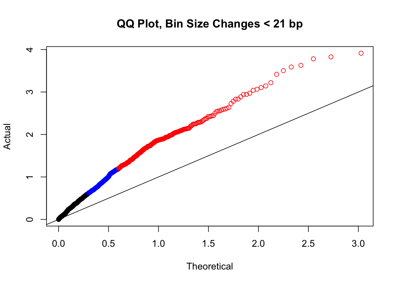
| Version | Author | Date |
|---|---|---|
| b7d82fc | Ittai Eres | 2019-04-30 |
newqqplot(-log10(filter(filt.KR, H1diff>=21&H2diff>=21&C1diff>=21&C2diff>=21)$sp_pval), c(0.5, 0.75), "QQ Plot, Bin Size Changes >= 21bp") #This doesn't look much different--what about the case where there are large differences in the size?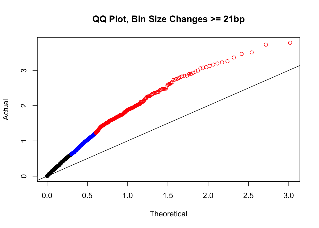
| Version | Author | Date |
|---|---|---|
| b7d82fc | Ittai Eres | 2019-04-30 |
newqqplot(-log10(filter(filt.KR, H1diff>=100|H2diff>=100|C1diff>=100|C2diff>=100)$sp_pval), c(0.5, 0.75), "QQ Plot, Bin Size Changes >= 100 bp") #It's hard to know what to make of this since here I am just allowing for any bin to have a size change greater than 100 bp. It looks fairly similar to the QQplot of the full data.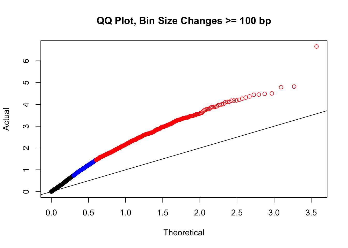
| Version | Author | Date |
|---|---|---|
| b7d82fc | Ittai Eres | 2019-04-30 |
newqqplot(-log10(filter(filt.KR, H1diff>=500|H2diff>=500|C1diff>=500|C2diff>=500)$sp_pval), c(0.5, 0.75), "QQ Plot, Bin Size Changes >= 500 bp") #It's hard to know what to make of this since here I am just allowing for any bin to have a size change greater than 500 bp.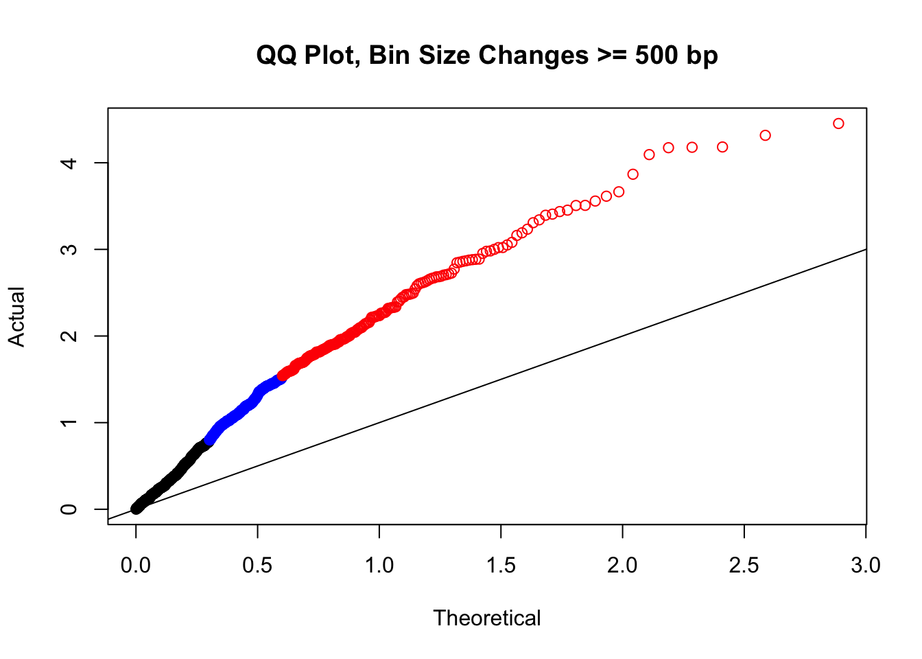
| Version | Author | Date |
|---|---|---|
| b7d82fc | Ittai Eres | 2019-04-30 |
newqqplot(-log10(filter(filt.KR, H1diff>=1000|H2diff>=1000|C1diff>=1000|C2diff>=1000)$sp_pval), c(0.5, 0.75), "QQ Plot, Bin Size Changes >= 1000 bp") #It's hard to know what to make of this since here I am just allowing for any bin to have a size change greater than 1kb.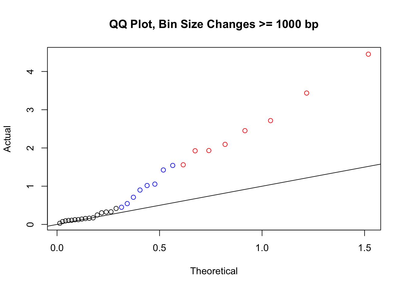
| Version | Author | Date |
|---|---|---|
| b7d82fc | Ittai Eres | 2019-04-30 |
#It may be hard to say anything super definitive about the bin size changes from these plots, but the fact that they all still show inflation, and I don't see any stark difference between bin size changes exceeding 100 bp, suggests to me that bin size is having a minimal effect here. Still, we will include it when looking at filtering criteria below for figuring out what hits might need to be removed still.
newqqplot(-log10(filter(filt.KR, dist_diff>=100000)$sp_pval), c(0.5, 0.75), "QQ Plot, Distance Diff >= 100kb") #This is good to know--see EXTREMELY strong inflation amongst this class of p-values, perhaps giving another criteria for filtering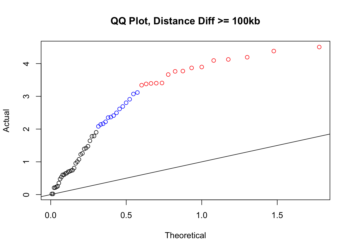
| Version | Author | Date |
|---|---|---|
| b7d82fc | Ittai Eres | 2019-04-30 |
newqqplot(-log10(filter(filt.KR, dist_diff>=50000)$sp_pval), c(0.5, 0.75), "QQ Plot, Distance Diff >= 50kb") #This is good to know--see that the inflation is a little weaker if we move towards including more pairs that have smaller distance differences between the species. What about pairs where there is no difference?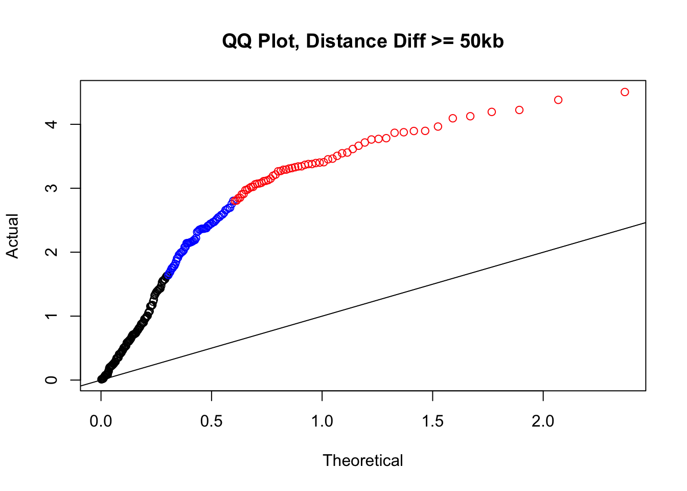
| Version | Author | Date |
|---|---|---|
| b7d82fc | Ittai Eres | 2019-04-30 |
newqqplot(-log10(filter(filt.KR, dist_diff==0)$sp_pval), c(0.5, 0.75), "QQ Plot, NO Distance Diff") #Values are still inflated, but the first solid 50% of the distribution stays along the normal line--this is great!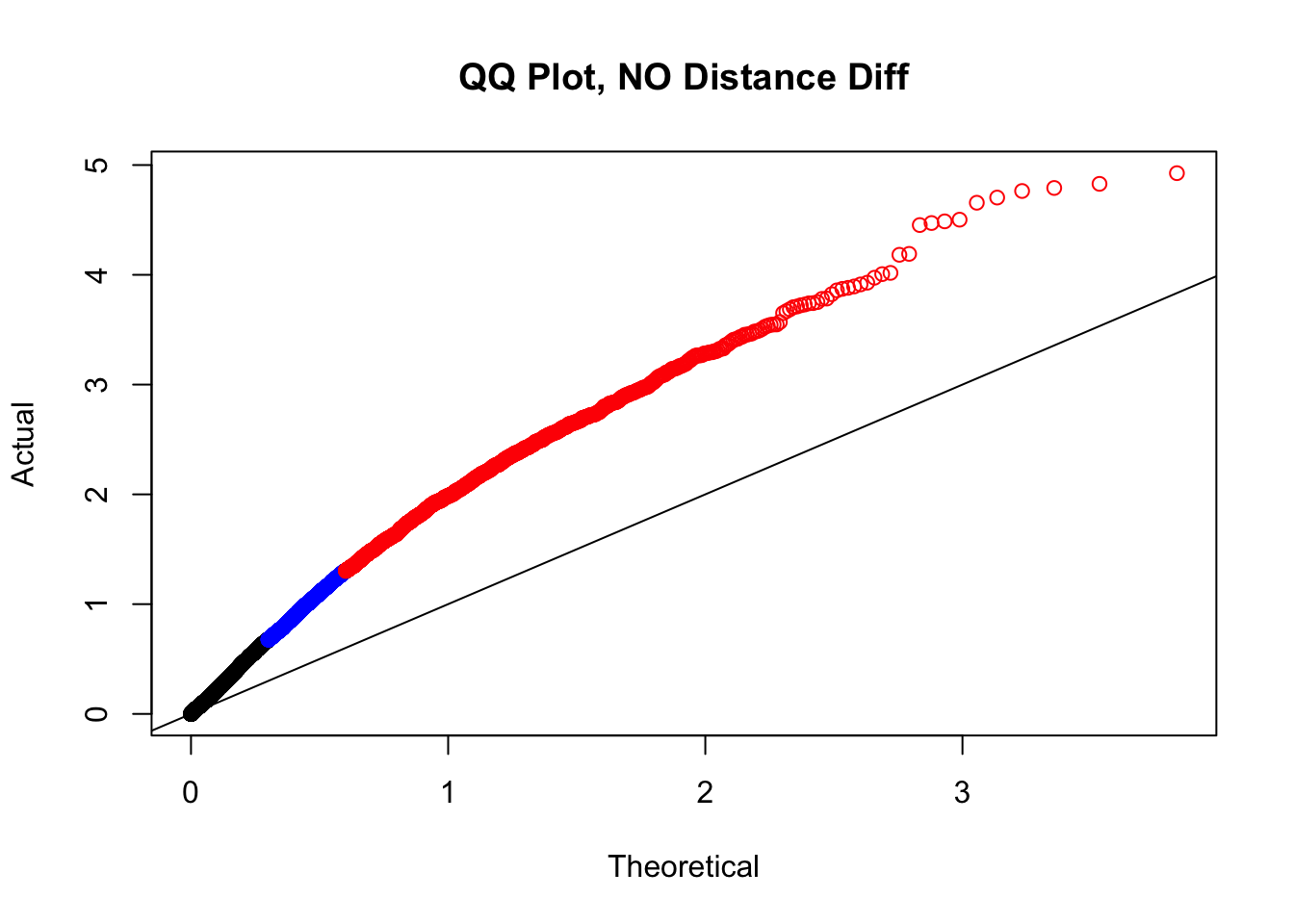
| Version | Author | Date |
|---|---|---|
| b7d82fc | Ittai Eres | 2019-04-30 |
newqqplot(-log10(filter(filt.KR, dist_diff<=20000)$sp_pval), c(0.5, 0.75), "QQ Plot, Distance Diff <=20kb") #And now we can see the trend in the opposite direction--SLIGHT inflation of the p-values when including more hits that have a larger distance difference.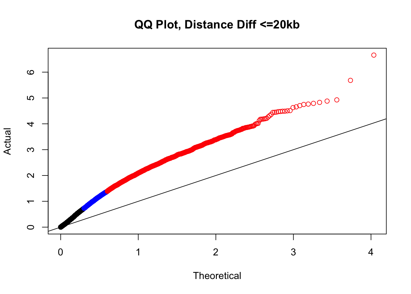
| Version | Author | Date |
|---|---|---|
| b7d82fc | Ittai Eres | 2019-04-30 |
#Based on the quantiles from before, the size differences have relatively little variation in their distribution. Hence I will take them and summarize them as a single value here:
sizediffs <- rowMeans(select(filt.KR, H1diff, H2diff, C1diff, C2diff), na.rm=TRUE)
quantile(sizediffs, probs=seq(0, 1, 0.25)) 0% 25% 50% 75% 100%
0.0000 15.4375 29.0000 81.7500 870.7500 # #Now what I would like to do is find classes of hits--combinations between size and distance differences--that comprise roughly 10% of the data, or ~30k hits here. I will look at these classes in a 3-dimensional plot that includes size and distance differences as two of the axes, and the FDR from linear modeling on the 3rd. What I am in search of are classes of hits that show inflated FDR.
plot3d <- data.frame(bin_min=pmin(filt.KR$H1diff, filt.KR$H2diff, filt.KR$C1diff, filt.KR$C2diff, na.rm=TRUE), bin_max=pmax(filt.KR$H1diff, filt.KR$H2diff, filt.KR$C1diff, filt.KR$C2diff, na.rm=TRUE), sizediffs=sizediffs, dist_diff=filt.KR$dist_diff, FDR=filt.KR$sp_BH_pval)
#
# #Of course, I already inherently know I will have a difficult time finding sets large enough with the bigger differences in distance, as only 10k or so of the hits even have a distance difference greater than 50kb. About half the hits have no distance difference, and of the remaining half, about half have size differences of 1-2 bins (10-20 kb), and half have greater size differences.
# #First, I go in search of sets that will be large enough.
#Not very large dist diff changes
nrow(filter(plot3d, sizediffs<=15.4&dist_diff<10000)) #35k, a class of minimal changes--no distance difference, and minimal size difference.[1] 1790nrow(filter(plot3d, sizediffs<=29&sizediffs>15.4&dist_diff<10000)) #35k, still minimal changes[1] 1721nrow(filter(plot3d, sizediffs<=81.8&sizediffs>29&dist_diff<10000)) #35k, minimal changes still, bin size getting up there[1] 1708nrow(filter(plot3d, sizediffs>81.8&dist_diff<10000)) #35k, minimal changes still, bin size even higher though[1] 1602#Middling dist diff changes
nrow(filter(plot3d, sizediffs<=15.4&dist_diff>=10000&dist_diff<=20000)) #35k, a class of minimal changes--no distance difference, and minimal size[1] 944nrow(filter(plot3d, sizediffs<=29&sizediffs>15.4&dist_diff>=10000&dist_diff<=20000)) #35k, still minimal changes[1] 1067nrow(filter(plot3d, sizediffs<=81.8&sizediffs>29&dist_diff>=10000&dist_diff<=20000)) #35k, minimal changes still, bin size getting up there[1] 996nrow(filter(plot3d, sizediffs>81.8&dist_diff>=10000&dist_diff<=20000)) #35k, minimal changes still, bin size even higher though[1] 1039#Large dist diff changes:
nrow(filter(plot3d, sizediffs<=15.4&dist_diff>20000)) #35k, a class of minimal changes--no distance difference, and minimal size[1] 190nrow(filter(plot3d, sizediffs<=29&sizediffs>15.4&dist_diff>20000)) #35k, still minimal changes[1] 157nrow(filter(plot3d, sizediffs<=81.8&sizediffs>29&dist_diff>20000)) #35k, minimal changes still, bin size getting up there[1] 202nrow(filter(plot3d, sizediffs>81.8&dist_diff>20000)) #35k, minimal changes still, bin size even higher though[1] 280###Now, create a data frame with these classes, their sizes, and the number of hits in each of the classes that is at FDR <= 0.05.
true3d <- data.frame(dist_class=c(rep("none", 4), rep("short", 4), rep("long", 4)), bin_quant=rep(1:4, 3), set_size=c(nrow(filter(plot3d, sizediffs<=15.4&dist_diff<10000)), nrow(filter(plot3d, sizediffs<=29&sizediffs>15.4&dist_diff<10000)), nrow(filter(plot3d, sizediffs<=81.8&sizediffs>29&dist_diff<10000)), nrow(filter(plot3d, sizediffs>81.8&dist_diff<10000)), nrow(filter(plot3d, sizediffs<=15.4&dist_diff>=10000&dist_diff<=20000)), nrow(filter(plot3d, sizediffs<=29&sizediffs>15.4&dist_diff>=10000&dist_diff<=20000)), nrow(filter(plot3d, sizediffs<=81.8&sizediffs>29&dist_diff>=10000&dist_diff<=20000)), nrow(filter(plot3d, sizediffs>81.8&dist_diff>=10000&dist_diff<=20000)), nrow(filter(plot3d, sizediffs<=15.4&dist_diff>20000)), nrow(filter(plot3d, sizediffs<=29&sizediffs>15.4&dist_diff>20000)), nrow(filter(plot3d, sizediffs<=81.8&sizediffs>29&dist_diff>20000)), nrow(filter(plot3d, sizediffs>81.8&dist_diff>20000))), num_sig=c(nrow(filter(plot3d, sizediffs<=15.4&dist_diff<10000&FDR<=0.05)), nrow(filter(plot3d, sizediffs<=29&sizediffs>15.4&dist_diff<10000&FDR<=0.05)), nrow(filter(plot3d, sizediffs<=81.8&sizediffs>29&dist_diff<10000&FDR<=0.05)), nrow(filter(plot3d, sizediffs>81.8&dist_diff<10000&FDR<=0.05)), nrow(filter(plot3d, sizediffs<=15.4&dist_diff>=10000&dist_diff<=20000&FDR<=0.05)), nrow(filter(plot3d, sizediffs<=29&sizediffs>15.4&dist_diff>=10000&dist_diff<=20000&FDR<=0.05)), nrow(filter(plot3d, sizediffs<=81.8&sizediffs>29&dist_diff>=10000&dist_diff<=20000&FDR<=0.05)), nrow(filter(plot3d, sizediffs>81.8&dist_diff>=10000&dist_diff<=20000&FDR<=0.05)), nrow(filter(plot3d, sizediffs<=15.4&dist_diff>20000&FDR<=0.05)), nrow(filter(plot3d, sizediffs<=29&sizediffs>15.4&dist_diff>20000&FDR<=0.05)), nrow(filter(plot3d, sizediffs<=81.8&sizediffs>29&dist_diff>20000&FDR<=0.05)), nrow(filter(plot3d, sizediffs>81.8&dist_diff>20000&FDR<=0.05))))
true3d$prop <- true3d$num_sig/true3d$set_size #Get the proportion of these different sets that are significant (at or below 5% FDR). Looking at these results quickly in the table indicates that we should once again filter out those hits with a big distance difference (>20kb) in between the species.
#Write out CSV of plot3d for importing into plot.ly:
write.csv(true3d, "~/Desktop/KR3d.csv")
# #I will then take this data frame and export it to plot.ly's online interface, in order to make a 3D plot that will allow me to visualize FDR significance inflation in any of these sets (and subsequently filter them out). The 3D plot looks like this:
htmltools::includeHTML("/Users/ittaieres/Hi-C/analysis/QQQCJUICERKR.html")#
# #Based on the 3D QQ quality control plot, the hit classes with larger distance-between-mates differences should be filtered out due to inflation of # hits significant @ 5% FDR. This gets rid of ~55k hits, or about a seventh of them. Essentially I am removing any hits that showed a difference in distance of greater than 20kb when lifting Over acros the species, to eliminate technical genomic differences that may drive signal in the species term:
highclass <- which(plot3d$dist_diff>20000)
filt.KR <- filt.KR[-highclass,] #Just removed high class since it has the starkest effect on proportion of hits significant @ 5% FDR
#######Repeat genomic distance and bin size differences analysis on VC data:
#To do this, I first have to pull out the mean start and end positions of bins for each of the species from the data:
H1startCmean <- rowMeans(filt.VC[,c('hstart1-C', 'hstart1-D', 'hstart1-G', 'hstart1-H')], na.rm=TRUE)
H1endCmean <- rowMeans(filt.VC[,c('hend1-C', 'hend1-D', 'hend1-G', 'hend1-H')], na.rm=TRUE)
H2startCmean <- rowMeans(filt.VC[,c('hstart2-C', 'hstart2-D', 'hstart2-G', 'hstart2-H')], na.rm=TRUE)
H2endCmean <- rowMeans(filt.VC[,c('hend2-C', 'hend2-D', 'hend2-G', 'hend2-H')], na.rm=TRUE)
C1startHmean <- rowMeans(filt.VC[,c('cstart1-A', 'cstart1-B', 'cstart1-E', 'cstart1-F')], na.rm=TRUE) #this is identical and easier.
C1endHmean <- rowMeans(filt.VC[,c('cend1-A', 'cend1-B', 'cend1-E', 'cend1-F')], na.rm=TRUE)
C2startHmean <- rowMeans(filt.VC[,c('cstart2-A', 'cstart2-B', 'cstart2-E', 'cstart2-F')], na.rm=TRUE)
C2endHmean <- rowMeans(filt.VC[,c('cend2-A', 'cend2-B', 'cend2-E', 'cend2-F')], na.rm=TRUE)
#Now, I use these data to add columns to the data frame for the sizes of bins and distance between bins. Note that I am only really looking at differences in the size of the "orthologous" bins called through liftover, as compared to their original size (10kb). Bin size differences in the values at the start of each individual's portion of the data frame for coordinates matching that species are merely due to size differences in reciprocal best hits liftover. The true size of bins within their own species is always 10kb. So here bin sizes being appended to the data frame are for lifted-over bins. I do the distance differences based on the HC-pair values (H1/H2 and C1/C2) that have been rounded to the nearest 10kb from the original values given by homer; since this should be balanced across species it shouldn't matter much. Worst case it would make the estimate off by 20kb, maximum.
H1sizeC <- H1endCmean-H1startCmean
H2sizeC <- H2endCmean-H2startCmean
filt.VC$H1diff <- abs(10000-H1sizeC)
filt.VC$H2diff <- abs(10000-H2sizeC)
C1sizeH <- C1endHmean-C1startHmean
C2sizeH <- C2endHmean-C2startHmean
filt.VC$C1diff <- abs(10000-C1sizeH)
filt.VC$C2diff <- abs(10000-C2sizeH)
filt.VC$Hdist <- abs(as.numeric(sub(".*-", "", filt.VC$H2))-as.numeric(sub(".*-", "", filt.VC$H1)))
filt.VC$Cdist <- abs(as.numeric(sub(".*-", "", filt.VC$C2))-as.numeric(sub(".*-", "", filt.VC$C1)))
filt.VC$dist_diff <- abs(filt.VC$Hdist-filt.VC$Cdist)
#Now I look at the distributions of some of these metrics to inform me about how best to bin the data for filtering and further QC checking.
quantile(filt.VC$H1diff, na.rm=TRUE) 0% 25% 50% 75% 100%
0 9 21 50 1097 quantile(filt.VC$H2diff, na.rm=TRUE) 0% 25% 50% 75% 100%
0 9 21 53 1084 quantile(filt.VC$C1diff, na.rm=TRUE) 0% 25% 50% 75% 100%
0 8 20 48 1088 quantile(filt.VC$C2diff, na.rm=TRUE) 0% 25% 50% 75% 100%
0 9 21 50 1063 quantile(filt.VC$dist_diff, na.rm=TRUE) 0% 25% 50% 75% 100%
0 0 0 10000 48500000 #From this I can see that the majority of bin size differences are relatively small (<25 bp), and the majority of hits do not have a difference in distance between the mates in a pair across the species (all the way up to 50th percentile the distance difference is still 0). Now I'll take a look at some QQ plots filtering along these values to get an idea of if any of these technical orthology-calling artifacts are driving the inflation we see.
newqqplot(-log10(filter(filt.VC, H1diff<21&H2diff<21&C1diff<21&C2diff<21)$sp_pval), c(0.5, 0.75), "QQ Plot, Bin Size Changes < 21 bp") #We can see that the QQplot looks a bit better if we only utilize hits where the bin size difference is less than the 50% percentile of their distribution.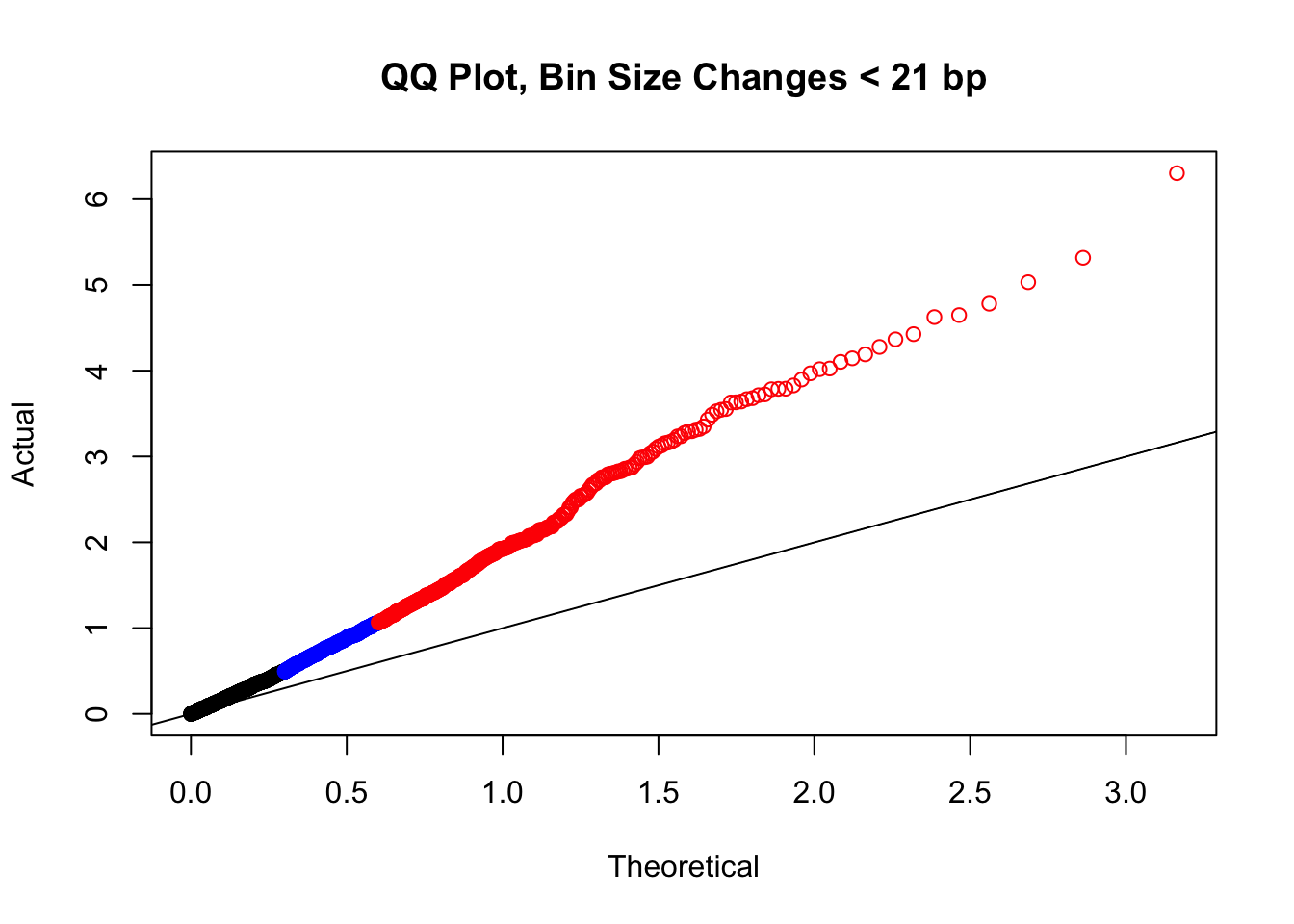
| Version | Author | Date |
|---|---|---|
| b7d82fc | Ittai Eres | 2019-04-30 |
newqqplot(-log10(filter(filt.VC, H1diff>=21&H2diff>=21&C1diff>=21&C2diff>=21)$sp_pval), c(0.5, 0.75), "QQ Plot, Bin Size Changes >= 21bp") #This doesn't look much different--what about the case where there are large differences in the size?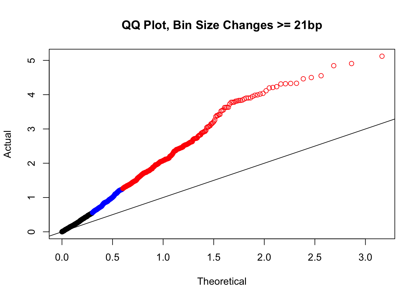
| Version | Author | Date |
|---|---|---|
| b7d82fc | Ittai Eres | 2019-04-30 |
newqqplot(-log10(filter(filt.VC, H1diff>=100|H2diff>=100|C1diff>=100|C2diff>=100)$sp_pval), c(0.5, 0.75), "QQ Plot, Bin Size Changes >= 100 bp") #It's hard to know what to make of this since here I am just allowing for any bin to have a size change greater than 100 bp. It looks fairly similar to the QQplot of the full data.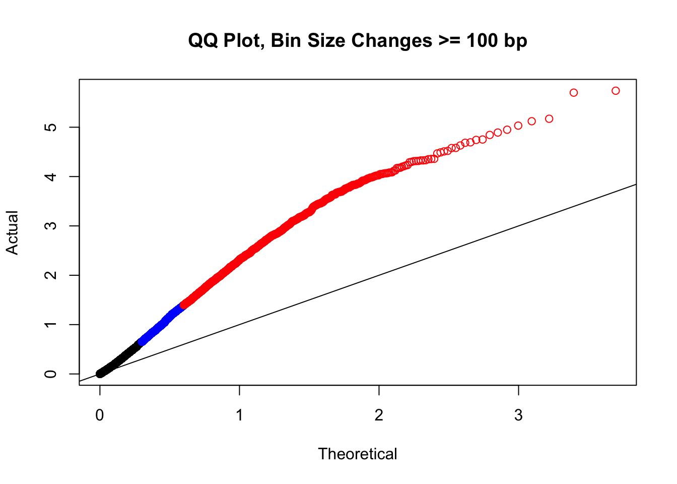
| Version | Author | Date |
|---|---|---|
| b7d82fc | Ittai Eres | 2019-04-30 |
newqqplot(-log10(filter(filt.VC, H1diff>=500|H2diff>=500|C1diff>=500|C2diff>=500)$sp_pval), c(0.5, 0.75), "QQ Plot, Bin Size Changes >= 500 bp") #It's hard to know what to make of this since here I am just allowing for any bin to have a size change greater than 500 bp.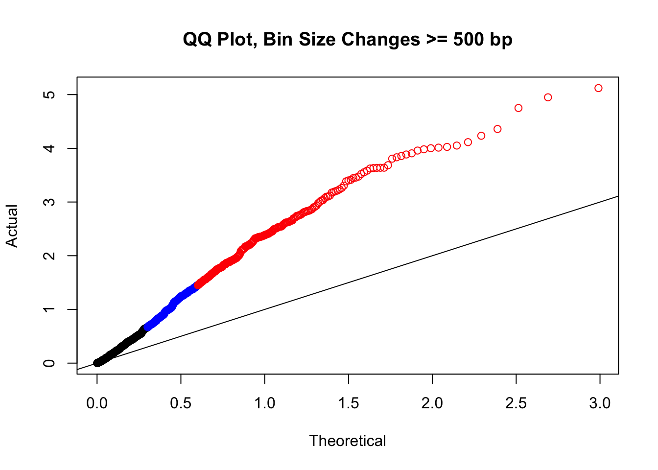
| Version | Author | Date |
|---|---|---|
| b7d82fc | Ittai Eres | 2019-04-30 |
newqqplot(-log10(filter(filt.VC, H1diff>=1000|H2diff>=1000|C1diff>=1000|C2diff>=1000)$sp_pval), c(0.5, 0.75), "QQ Plot, Bin Size Changes >= 1000 bp") #It's hard to know what to make of this since here I am just allowing for any bin to have a size change greater than 1kb.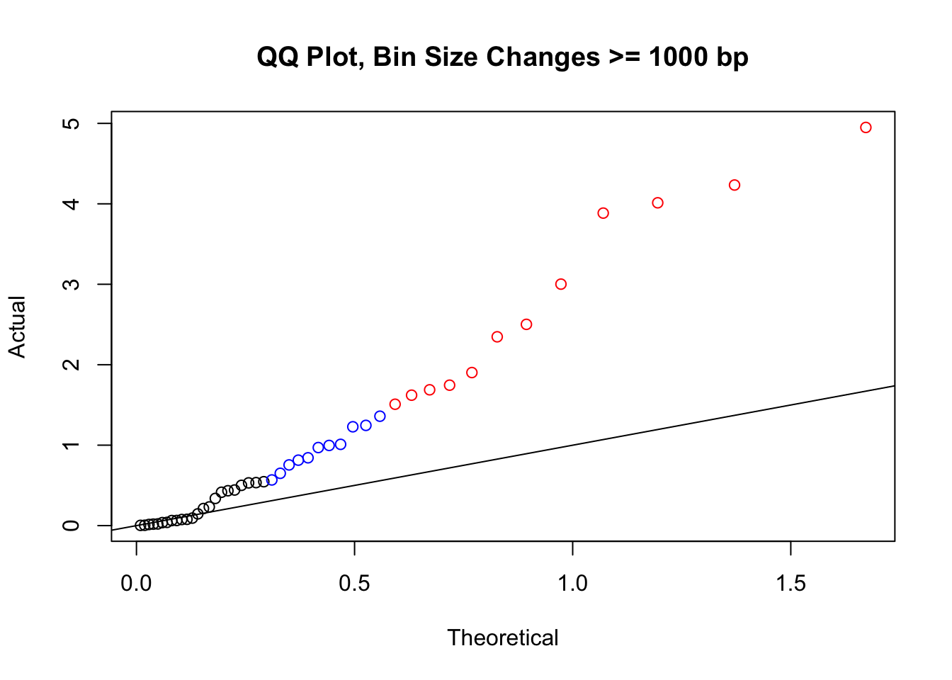
| Version | Author | Date |
|---|---|---|
| b7d82fc | Ittai Eres | 2019-04-30 |
#It may be hard to say anything super definitive about the bin size changes from these plots, but the fact that they all still show inflation, and I don't see any stark difference between bin size changes exceeding 100 bp, suggests to me that bin size is having a minimal effect here. Still, we will include it when looking at filtering criteria below for figuring out what hits might need to be removed still.
newqqplot(-log10(filter(filt.VC, dist_diff>=100000)$sp_pval), c(0.5, 0.75), "QQ Plot, Distance Diff >= 100kb") #This is good to know--see EXTREMELY strong inflation amongst this class of p-values, perhaps giving another criteria for filtering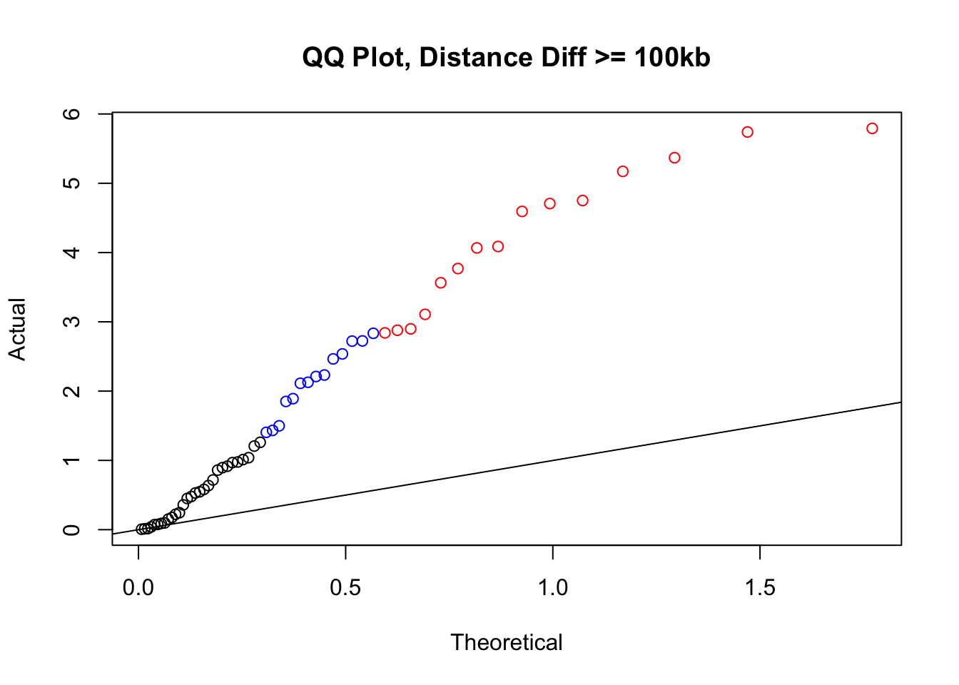
| Version | Author | Date |
|---|---|---|
| b7d82fc | Ittai Eres | 2019-04-30 |
newqqplot(-log10(filter(filt.VC, dist_diff>=50000)$sp_pval), c(0.5, 0.75), "QQ Plot, Distance Diff >= 50kb") #This is good to know--see that the inflation is a little weaker if we move towards including more pairs that have smaller distance differences between the species. What about pairs where there is no difference?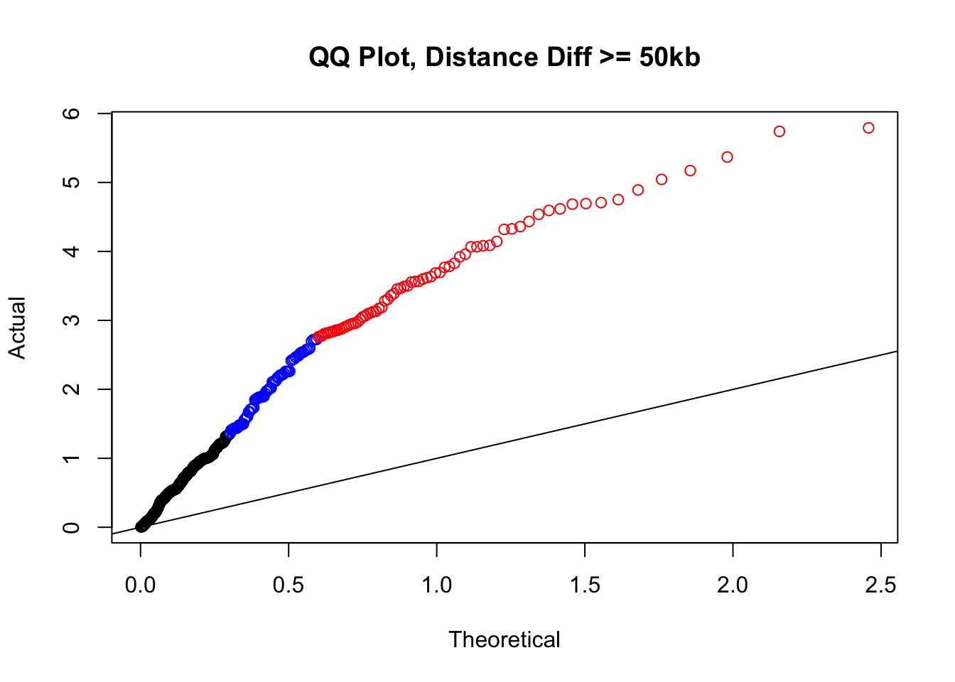
| Version | Author | Date |
|---|---|---|
| b7d82fc | Ittai Eres | 2019-04-30 |
newqqplot(-log10(filter(filt.VC, dist_diff==0)$sp_pval), c(0.5, 0.75), "QQ Plot, NO Distance Diff") #Values are still inflated, but the first solid 50% of the distribution stays along the normal line--this is great!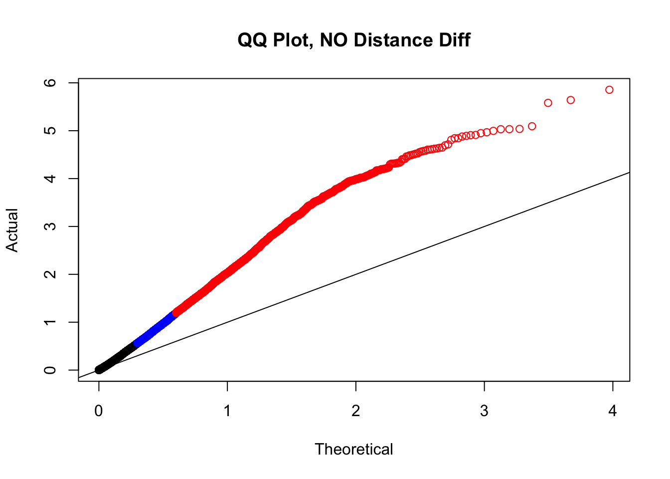
| Version | Author | Date |
|---|---|---|
| b7d82fc | Ittai Eres | 2019-04-30 |
newqqplot(-log10(filter(filt.VC, dist_diff<=20000)$sp_pval), c(0.5, 0.75), "QQ Plot, Distance Diff <=20kb") #And now we can see the trend in the opposite direction--SLIGHT inflation of the p-values when including more hits that have a larger distance difference.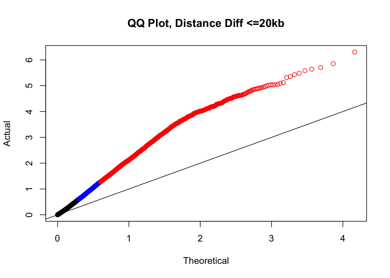
| Version | Author | Date |
|---|---|---|
| b7d82fc | Ittai Eres | 2019-04-30 |
#Based on the quantiles from before, the size differences have relatively little variation in their distribution. Hence I will take them and summarize them as a single value here:
sizediffs <- rowMeans(select(filt.VC, H1diff, H2diff, C1diff, C2diff), na.rm=TRUE)
quantile(sizediffs, probs=seq(0, 1, 0.25)) 0% 25% 50% 75% 100%
0.00 15.25 29.25 79.75 838.00 # #Now what I would like to do is find classes of hits--combinations between size and distance differences--that comprise roughly 10% of the data, or ~30k hits here. I will look at these classes in a 3-dimensional plot that includes size and distance differences as two of the axes, and the FDR from linear modeling on the 3rd. What I am in search of are classes of hits that show inflated FDR.
plot3d <- data.frame(bin_min=pmin(filt.VC$H1diff, filt.VC$H2diff, filt.VC$C1diff, filt.VC$C2diff, na.rm=TRUE), bin_max=pmax(filt.VC$H1diff, filt.VC$H2diff, filt.VC$C1diff, filt.VC$C2diff, na.rm=TRUE), sizediffs=sizediffs, dist_diff=filt.VC$dist_diff, FDR=filt.VC$sp_BH_pval)
#
# #Of course, I already inherently know I will have a difficult time finding sets large enough with the bigger differences in distance, as only 10k or so of the hits even have a distance difference greater than 50kb. About half the hits have no distance difference, and of the remaining half, about half have size differences of 1-2 bins (10-20 kb), and half have greater size differences.
# #First, I go in search of sets that will be large enough.
#Not very large dist diff changes
nrow(filter(plot3d, sizediffs<=15.25&dist_diff<10000)) #35k, a class of minimal changes--no distance difference, and minimal size difference.[1] 2394nrow(filter(plot3d, sizediffs<=29.25&sizediffs>15.25&dist_diff<10000)) #35k, still minimal changes[1] 2335nrow(filter(plot3d, sizediffs<=79.75&sizediffs>29.25&dist_diff<10000)) #35k, minimal changes still, bin size getting up there[1] 2355nrow(filter(plot3d, sizediffs>79.75&dist_diff<10000)) #35k, minimal changes still, bin size even higher though[1] 2308#Middling dist diff changes
nrow(filter(plot3d, sizediffs<=15.25&dist_diff>=10000&dist_diff<=20000)) #35k, a class of minimal changes--no distance difference, and minimal size[1] 1280nrow(filter(plot3d, sizediffs<=29.25&sizediffs>15.25&dist_diff>=10000&dist_diff<=20000)) #35k, still minimal changes[1] 1357nrow(filter(plot3d, sizediffs<=79.75&sizediffs>29.25&dist_diff>=10000&dist_diff<=20000)) #35k, minimal changes still, bin size getting up there[1] 1319nrow(filter(plot3d, sizediffs>79.75&dist_diff>=10000&dist_diff<=20000)) #35k, minimal changes still, bin size even higher though[1] 1295#Large dist diff changes:
nrow(filter(plot3d, sizediffs<=15.25&dist_diff>20000)) #35k, a class of minimal changes--no distance difference, and minimal size[1] 244nrow(filter(plot3d, sizediffs<=29.25&sizediffs>15.25&dist_diff>20000)) #35k, still minimal changes[1] 224nrow(filter(plot3d, sizediffs<=79.75&sizediffs>29.25&dist_diff>20000)) #35k, minimal changes still, bin size getting up there[1] 246nrow(filter(plot3d, sizediffs>79.75&dist_diff>20000)) #35k, minimal changes still, bin size even higher though[1] 310###Now, create a data frame with these classes, their sizes, and the number of hits in each of the classes that is at FDR <= 0.05.
true3d <- data.frame(dist_class=c(rep("none", 4), rep("short", 4), rep("long", 4)), bin_quant=rep(1:4, 3), set_size=c(nrow(filter(plot3d, sizediffs<=15.25&dist_diff<10000)), nrow(filter(plot3d, sizediffs<=29.25&sizediffs>15.25&dist_diff<10000)), nrow(filter(plot3d, sizediffs<=79.75&sizediffs>29.25&dist_diff<10000)), nrow(filter(plot3d, sizediffs>79.75&dist_diff<10000)), nrow(filter(plot3d, sizediffs<=15.25&dist_diff>=10000&dist_diff<=20000)), nrow(filter(plot3d, sizediffs<=29.25&sizediffs>15.25&dist_diff>=10000&dist_diff<=20000)), nrow(filter(plot3d, sizediffs<=79.75&sizediffs>29.25&dist_diff>=10000&dist_diff<=20000)), nrow(filter(plot3d, sizediffs>79.75&dist_diff>=10000&dist_diff<=20000)), nrow(filter(plot3d, sizediffs<=15.25&dist_diff>20000)), nrow(filter(plot3d, sizediffs<=29.25&sizediffs>15.25&dist_diff>20000)), nrow(filter(plot3d, sizediffs<=79.75&sizediffs>29.25&dist_diff>20000)), nrow(filter(plot3d, sizediffs>79.75&dist_diff>20000))), num_sig=c(nrow(filter(plot3d, sizediffs<=15.25&dist_diff<10000&FDR<=0.05)), nrow(filter(plot3d, sizediffs<=29.25&sizediffs>15.25&dist_diff<10000&FDR<=0.05)), nrow(filter(plot3d, sizediffs<=79.75&sizediffs>29.25&dist_diff<10000&FDR<=0.05)), nrow(filter(plot3d, sizediffs>79.75&dist_diff<10000&FDR<=0.05)), nrow(filter(plot3d, sizediffs<=15.25&dist_diff>=10000&dist_diff<=20000&FDR<=0.05)), nrow(filter(plot3d, sizediffs<=29.25&sizediffs>15.25&dist_diff>=10000&dist_diff<=20000&FDR<=0.05)), nrow(filter(plot3d, sizediffs<=79.75&sizediffs>29.25&dist_diff>=10000&dist_diff<=20000&FDR<=0.05)), nrow(filter(plot3d, sizediffs>79.75&dist_diff>=10000&dist_diff<=20000&FDR<=0.05)), nrow(filter(plot3d, sizediffs<=15.25&dist_diff>20000&FDR<=0.05)), nrow(filter(plot3d, sizediffs<=29.25&sizediffs>15.25&dist_diff>20000&FDR<=0.05)), nrow(filter(plot3d, sizediffs<=79.75&sizediffs>29.25&dist_diff>20000&FDR<=0.05)), nrow(filter(plot3d, sizediffs>79.75&dist_diff>20000&FDR<=0.05))))
true3d$prop <- true3d$num_sig/true3d$set_size #Get the proportion of these different sets that are significant (at or below 5% FDR). Looking at these results quickly in the table indicates that we should once again filter out those hits with a big distance difference (>20kb) in between the species.
write.csv(true3d, "~/Desktop/VC3d.csv")
# #I will then take this data frame and export it to plot.ly's online interface, in order to make a 3D plot that will allow me to visualize FDR significance inflation in any of these sets (and subsequently filter them out). The 3D plot looks like this:
htmltools::includeHTML("/Users/ittaieres/Hi-C/analysis/QQQCJUICERVC.html")#
# #Based on the 3D QQ quality control plot, the hit classes with larger distance-between-mates differences should be filtered out due to inflation of # hits significant @ 5% FDR. This gets rid of ~55k hits, or about a seventh of them. Essentially I am removing any hits that showed a difference in distance of greater than 20kb when lifting Over acros the species, to eliminate technical genomic differences that may drive signal in the species term:
highclass <- which(plot3d$dist_diff>20000)
filt.VC <- filt.VC[-highclass,] #Just removed high class since it has the starkest effect on proportion of hits significant @ 5% FDRNow I have obliterated any remaining concerns about the QQ plot inflation, and filtered out another class of Hi-C significant hits where species differences may have been driven by issues with liftOver between genomes.
Volcano Plot Asymmetry
Now, I go to the asymmetry issue seen in the volcano plot on the linear modeling outputs. I first utilize the set of data conditioned upon discovery in 4 individuals, and break this information down on a chromosome-by-chromosome basis to see if there are particular chromosomes driving the asymmetry. Upon observation of chromosome-specific effects I quantify the extent of asymmetry on individual chromosomes using a null expectation of a binomial distribution with 50/50 probability of betas being positive or negative. I then repeat these analyses and visualize them on the final set of filtered data from above.
#Here I once again show the volcano plot for 4 individuals. Observe the stark asymmetry with a pile-up of hits on the left side as compared to the right.
volcKR <- data.frame(pval=-log10(filt.KR$sp_pval), beta=filt.KR$sp_beta, species=filt.KR$disc_species, chr=filt.KR$Hchr)
ggplot(data=volcKR, aes(x=beta, y=pval)) + geom_point() + xlab("Log2 Fold Change in Contact Frequency") + ylab("-log10 BH-corrected p-values") + ggtitle("Contact Frequency Differences") + coord_cartesian(xlim=c(-6, 6))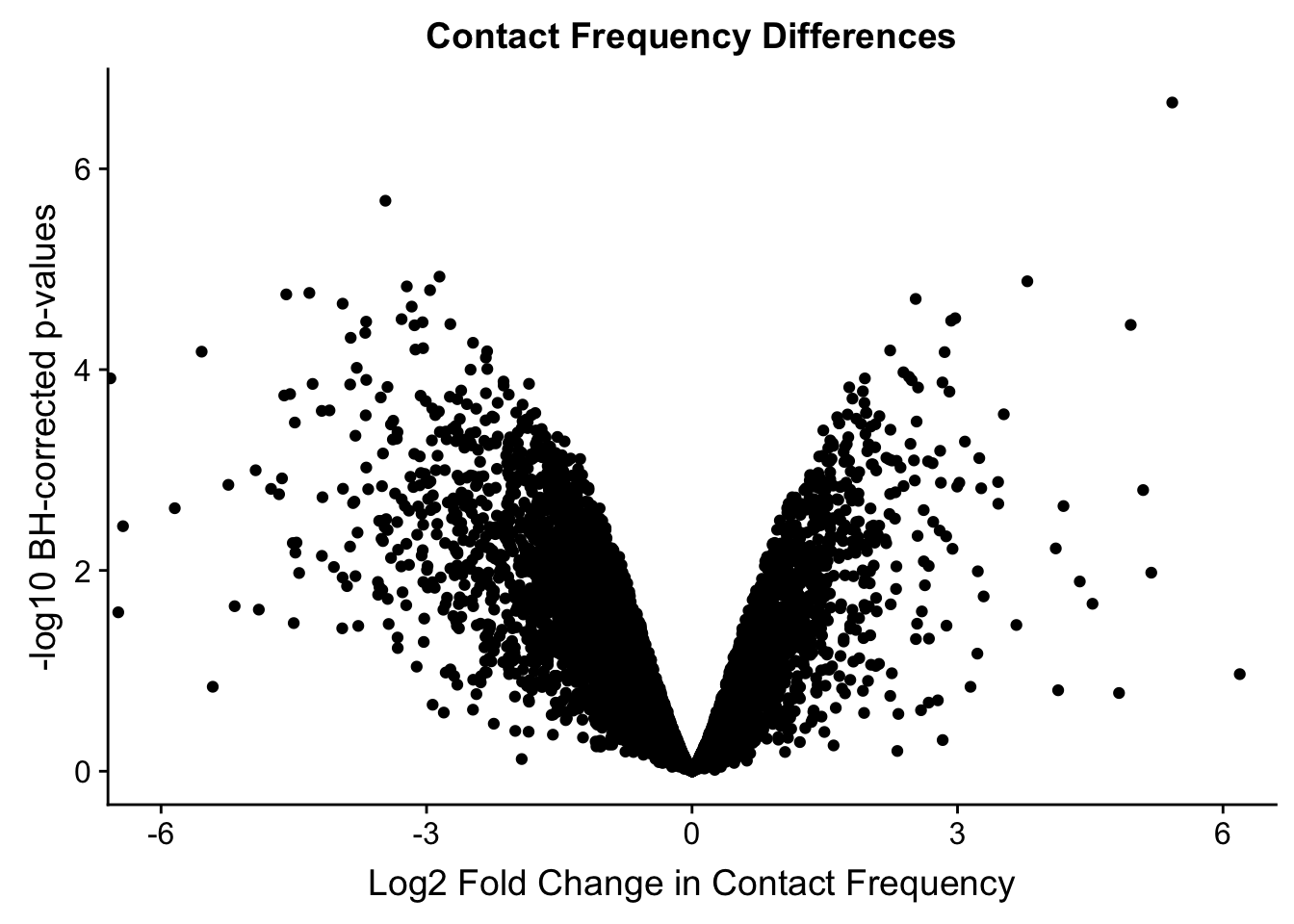
| Version | Author | Date |
|---|---|---|
| b7d82fc | Ittai Eres | 2019-04-30 |
#As expected, we see that hits which produce a strong negative beta in the linear model (suggesting a marked decrease in contact frequency in humans as compared to chimps) are primarily discovered as significant by homer in chimpanzees. The inverse also holds true for human discoveries. This is reassuring, but still, why the asymmetry? Here I break this plot down on a chromosome-by-chromosome basis to see if this is being driven by individual chromosomes ore is an overall issue with the technique or its processing:
#First rearrange chrs to make a prettier plot that has chrs sequential:
levels(volcKR$chr) [1] "chr1" "chr10" "chr11" "chr12" "chr13" "chr14" "chr15" "chr16"
[9] "chr17" "chr18" "chr19" "chr2" "chr21" "chr22" "chr3" "chr4"
[17] "chr5" "chr6" "chr8" "chr9" "chrX" volcKR$chr <- factor(volcKR$chr, levels(volcKR$chr)[c(1, 12, 15:20, 2:11, 13:14, 21)]) #Reorder factor levels!
levels(volcKR$chr) [1] "chr1" "chr2" "chr3" "chr4" "chr5" "chr6" "chr8" "chr9"
[9] "chr10" "chr11" "chr12" "chr13" "chr14" "chr15" "chr16" "chr17"
[17] "chr18" "chr19" "chr21" "chr22" "chrX" ggplot(volcKR, aes(x=beta, y=pval, color=species)) + geom_point(size=0.01) + ggtitle("Volcano Plots by Chr") + facet_wrap(~as.factor(chr), nrow=5, ncol=5) + guides(color=FALSE) + ylab("-log10 p-values") + xlab("Log2 Fold Change in Contact Frequency") + coord_cartesian(xlim=c(-6, 6))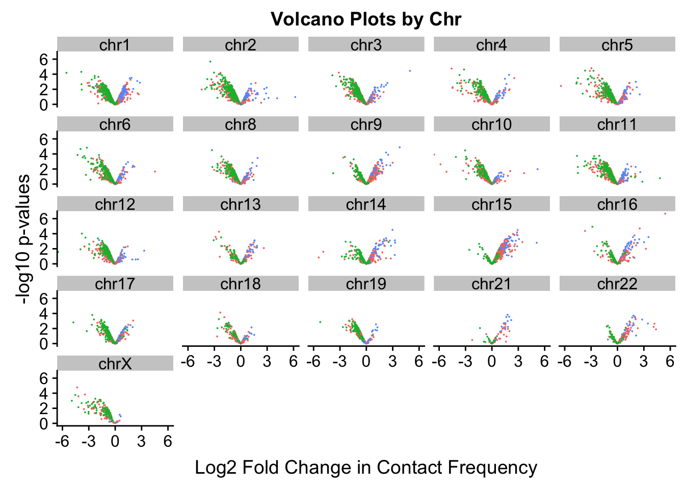
| Version | Author | Date |
|---|---|---|
| b7d82fc | Ittai Eres | 2019-04-30 |
#This is extremely interesting. It appears that the asymmetry seen is being driven primarily by only some of the chromosomes, and particularly ones where large-scale rearrangements have transpired between humans and chimps (e.g. chrs 2, 16, 17). This will warrant further investigation in another element of the analysis; for now, I am satisfied that the asymmetry is not an issue with the entire dataset but is confined to individual chromosomes.
#Now try to quantify the extent of asymmetry in the chromosomes, with a particular focus on hits that are statistically significant.
asym.stats <- data.frame(chr=unique(filt.KR$Hchr), binom.p=rep(NA, 21), prop.h=rep(NA, 21), prop.c=rep(NA, 21))
rownames(asym.stats) <- asym.stats$chr
for(chromo in unique(filt.KR$Hchr)){
mydat <- filter(filt.KR, Hchr==chromo, sp_BH_pval<=0.05) #Iterate through chromosomes
side <- ifelse(mydat$sp_beta<0, 0, 1) #Assign sides of the beta dist'n to the betas
asym.obs <- min(sum(side==1), sum(side==0)) #Find which side of the beta dist'n has less points, so I can use pbinom on default w/ lower.tail to find probability of observing a result as or MORE asymmetric than this one.
asym.stats[chromo, 2] <- pbinom(asym.obs, length(side), 0.5) #Find that probability with the assumption of 50/50 chance of landing on either side.
asym.stats[chromo, 3] <- sum(side==1)/length(side) #Find the proportion of the hits that fall on the human side of the distribution (positive, indicating increased contact frequency here in humans as compared to chimps)
asym.stats[chromo, 4] <- sum(side==0)/length(side) #Same thing as above, but for chimps this time.
}
#Now we can look at the actual results to quantify how asymmetric the significant hits are from each chromosome:
asym.stats chr binom.p prop.h prop.c
chr9 chr9 5.765915e-02 0.70000000 0.30000000
chr8 chr8 6.561279e-04 0.11111111 0.88888889
chr11 chr11 1.490116e-08 0.03225806 0.96774194
chr12 chr12 4.882812e-04 0.00000000 1.00000000
chr13 chr13 3.632813e-01 0.37500000 0.62500000
chr14 chr14 6.561279e-04 0.88888889 0.11111111
chr15 chr15 6.679102e-13 0.97826087 0.02173913
chr16 chr16 2.611949e-02 0.70370370 0.29629630
chr17 chr17 9.155273e-04 0.07142857 0.92857143
chr10 chr10 3.814697e-06 0.00000000 1.00000000
chr18 chr18 7.812500e-03 0.00000000 1.00000000
chr19 chr19 4.882812e-04 0.00000000 1.00000000
chr21 chr21 1.953125e-03 1.00000000 0.00000000
chr22 chr22 1.220703e-04 1.00000000 0.00000000
chrX chrX 4.768372e-07 0.00000000 1.00000000
chr1 chr1 3.071417e-02 0.31034483 0.68965517
chr2 chr2 7.466952e-10 0.05000000 0.95000000
chr3 chr3 2.310969e-10 0.06521739 0.93478261
chr4 chr4 9.285122e-08 0.10000000 0.90000000
chr5 chr5 6.165646e-08 0.08108108 0.91891892
chr6 chr6 2.314337e-07 0.06451613 0.93548387#Now, make volcano plots by chromosome again, this time labeling each chromosome with its binomial p-value and the percentage of significant hits showing stronger contact frequencies in each species on either side of the distribution.
ggplot(data=volcKR, aes(x=beta, y=pval, color=species)) + geom_point(size=0.001) + facet_wrap(~chr, nrow=5, ncol=5) + guides(color=FALSE) + ylab("-log10 BH-adjusted p-values") + xlab("Log2 Fold Change in Contact Frequency") + geom_text(data=asym.stats, aes(x=-4.5, y=1, label=paste(round(prop.c*100, digits=1), "%", sep=""), color=NULL), show.legend=FALSE, size=2) + geom_text(data=asym.stats, aes(x=4, y=1, label=paste(round(prop.h*100, digits=1), "%", sep=""), color=NULL), show.legend=FALSE, size=2) + geom_text(data=asym.stats, aes(x=0, y=5.75, label=signif(binom.p, digits=3), color=NULL), show.legend=FALSE, size=2) + coord_cartesian(xlim=c(-6, 6)) + ggtitle("Volcano Plots by Chr, KR Normalization")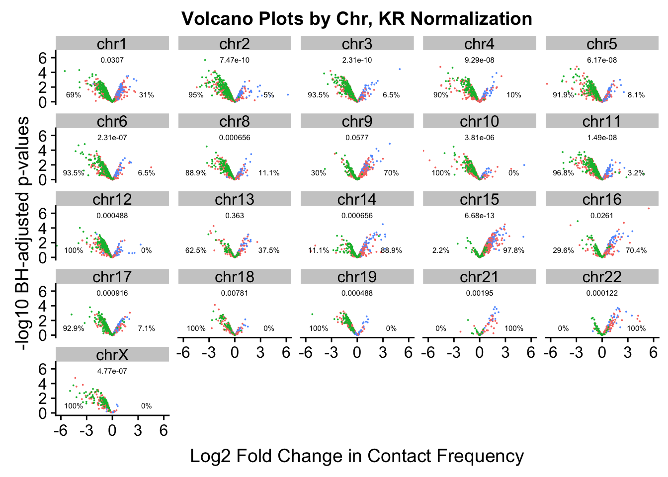
| Version | Author | Date |
|---|---|---|
| b7d82fc | Ittai Eres | 2019-04-30 |
#ggsave('~/Desktop/volcchr.jpg', device="jpeg", antialias="none") This was an earlier attempt at clearing up some image resolution blurriness with the text.
ggsave('~/Desktop/volcchrKR.jpg', device="jpeg", dpi=5000) #Works well!Saving 7 x 5 in image######Now, just repeat on VC values
volcVC <- data.frame(pval=-log10(filt.VC$sp_pval), beta=filt.VC$sp_beta, species=filt.VC$disc_species, chr=filt.VC$Hchr)
ggplot(data=volcVC, aes(x=beta, y=pval)) + geom_point() + xlab("Log2 Fold Change in Contact Frequency") + ylab("-log10 BH-corrected p-values") + ggtitle("Contact Frequency Differences") + coord_cartesian(xlim=c(-6, 6))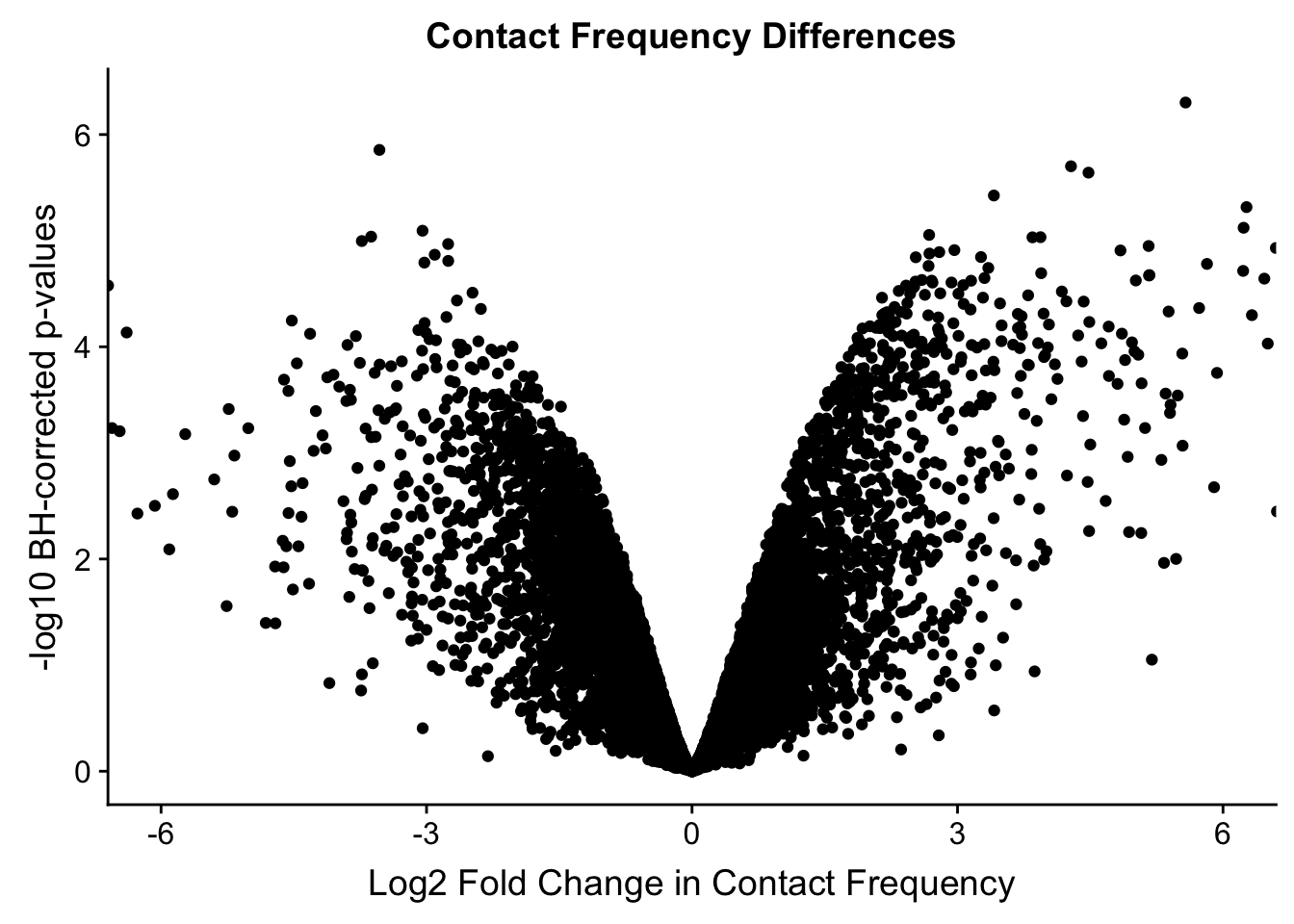
| Version | Author | Date |
|---|---|---|
| b7d82fc | Ittai Eres | 2019-04-30 |
volcVC <- data.frame(pval=-log10(filt.VC$sp_pval), beta=filt.VC$sp_beta, species=filt.VC$disc_species, chr=filt.VC$Hchr)
volcVC$specorder <- ifelse(volcVC$species=="B", 3, ifelse(volcVC$species=="C", 2, 1))
volcVC <- volcVC[order(volcVC$specorder),]
ggplot(data=volcVC, aes(x=beta, y=pval, color=species)) + geom_point(alpha=0.7) + xlab("Log2 Fold Change in Contact Frequency") + ylab("-log10 BH-corrected p-values") + ggtitle("Contact Frequency Differences") + coord_cartesian(xlim=c(-6, 6)) + scale_color_manual(name="Species", labels=c("Both", "Chimp", "Human"), values=c("#F8766D", "#00BA38", "#619CFF")) #FIG S2A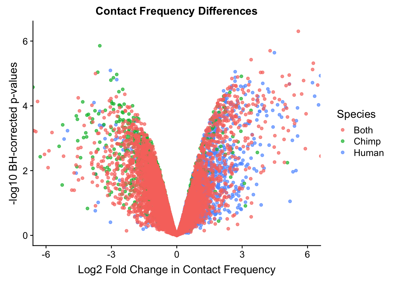
| Version | Author | Date |
|---|---|---|
| b7d82fc | Ittai Eres | 2019-04-30 |
FIGS2A <- ggplot(data=volcVC, aes(x=beta, y=pval, color=species)) + geom_point(alpha=0.7) + xlab("Log2 Fold Change in Contact Frequency") + ylab("-log10 BH-corrected p-values") + ggtitle("Contact Frequency Differences") + coord_cartesian(xlim=c(-6, 6)) + scale_color_manual(name="Species", labels=c("Both", "Chimp", "Human"), values=c("#F8766D", "#00BA38", "#619CFF")) #FIG S2A
#As expected, we see that hits which produce a strong negative beta in the linear model (suggesting a marked decrease in contact frequency in humans as compared to chimps) are primarily discovered as significant by homer in chimpanzees. The inverse also holds true for human discoveries. This is reassuring, but still, why the asymmetry? Here I break this plot down on a chromosome-by-chromosome basis to see if this is being driven by individual chromosomes ore is an overall issue with the technique or its processing:
#First rearrange chrs to make a prettier plot that has chrs sequential:
levels(volcVC$chr) [1] "chr1" "chr10" "chr11" "chr12" "chr13" "chr14" "chr15" "chr16"
[9] "chr17" "chr18" "chr19" "chr2" "chr20" "chr21" "chr22" "chr3"
[17] "chr4" "chr5" "chr6" "chr7" "chr8" "chr9" "chrX" volcVC$chr <- factor(volcVC$chr, levels(volcVC$chr)[c(1, 12, 16:22, 2:11, 13:15, 23)]) #Reorder factor levels!
levels(volcVC$chr) <- gsub("chr", "Chr. ", levels(volcVC$chr)) #Change names of factors and in actual data to make plotting easier
filt.VC$Hchr <- gsub("chr", "Chr. ", filt.VC$Hchr)
levels(volcVC$chr) [1] "Chr. 1" "Chr. 2" "Chr. 3" "Chr. 4" "Chr. 5" "Chr. 6" "Chr. 7"
[8] "Chr. 8" "Chr. 9" "Chr. 10" "Chr. 11" "Chr. 12" "Chr. 13" "Chr. 14"
[15] "Chr. 15" "Chr. 16" "Chr. 17" "Chr. 18" "Chr. 19" "Chr. 20" "Chr. 21"
[22] "Chr. 22" "Chr. X" ggplot(volcVC, aes(x=beta, y=pval, color=species)) + geom_point(size=0.01) + ggtitle("Volcano Plots by Chr") + facet_wrap(~as.factor(chr), nrow=5, ncol=5) + guides(color=FALSE) + ylab("-log10 p-values") + xlab("Log2 Fold Change in Contact Frequency") + coord_cartesian(xlim=c(-6, 6))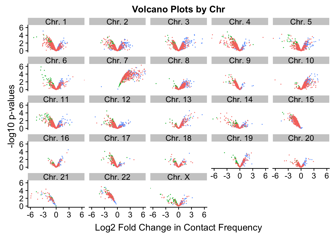
| Version | Author | Date |
|---|---|---|
| b7d82fc | Ittai Eres | 2019-04-30 |
#This is extremely interesting. It appears that the asymmetry seen is being driven primarily by only some of the chromosomes, and particularly ones where large-scale rearrangements have transpired between humans and chimps (e.g. chrs 2, 16, 17). This will warrant further investigation in another element of the analysis; for now, I am satisfied that the asymmetry is not an issue with the entire dataset but is confined to individual chromosomes.
#Now try to quantify the extent of asymmetry in the chromosomes, with a particular focus on hits that are statistically significant.
asym.stats <- data.frame(chr=unique(filt.VC$Hchr), binom.p=rep(NA, 23), prop.h=rep(NA, 23), prop.c=rep(NA, 23))
rownames(asym.stats) <- asym.stats$chr
for(chromo in unique(filt.VC$Hchr)){
mydat <- filter(filt.VC, Hchr==chromo, sp_BH_pval<=0.05) #Iterate through chromosomes
side <- ifelse(mydat$sp_beta<0, 0, 1) #Assign sides of the beta dist'n to the betas
asym.obs <- min(sum(side==1), sum(side==0)) #Find which side of the beta dist'n has less points, so I can use pbinom on default w/ lower.tail to find probability of observing a result as or MORE asymmetric than this one.
asym.stats[chromo, 2] <- pbinom(asym.obs, length(side), 0.5) #Find that probability with the assumption of 50/50 chance of landing on either side.
asym.stats[chromo, 3] <- sum(side==1)/length(side) #Find the proportion of the hits that fall on the human side of the distribution (positive, indicating increased contact frequency here in humans as compared to chimps)
asym.stats[chromo, 4] <- sum(side==0)/length(side) #Same thing as above, but for chimps this time.
}
#Now we can look at the actual results to quantify how asymmetric the significant hits are from each chromosome:
asym.stats chr binom.p prop.h prop.c
Chr. 12 Chr. 12 6.103516e-05 0.00000000 1.00000000
Chr. 9 Chr. 9 2.441406e-04 0.00000000 1.00000000
Chr. 13 Chr. 13 4.023314e-07 0.96153846 0.03846154
Chr. 14 Chr. 14 4.882812e-04 0.00000000 1.00000000
Chr. 15 Chr. 15 1.009742e-28 0.00000000 1.00000000
Chr. 16 Chr. 16 6.250000e-02 1.00000000 0.00000000
Chr. 17 Chr. 17 2.086163e-07 0.03703704 0.96296296
Chr. 18 Chr. 18 5.000000e-01 0.33333333 0.66666667
Chr. 19 Chr. 19 3.917694e-02 0.71428571 0.28571429
Chr. 20 Chr. 20 5.000000e-01 0.00000000 1.00000000
Chr. 10 Chr. 10 5.002221e-12 0.97674419 0.02325581
Chr. 21 Chr. 21 1.192093e-07 0.00000000 1.00000000
Chr. 22 Chr. 22 1.469368e-39 0.00000000 1.00000000
Chr. X Chr. X 1.718750e-01 0.30000000 0.70000000
Chr. 1 Chr. 1 1.584975e-12 0.06896552 0.93103448
Chr. 2 Chr. 2 1.859583e-03 0.21428571 0.78571429
Chr. 3 Chr. 3 5.190268e-02 0.63043478 0.36956522
Chr. 4 Chr. 4 1.459388e-12 0.05555556 0.94444444
Chr. 5 Chr. 5 3.714147e-01 0.45945946 0.54054054
Chr. 6 Chr. 6 5.387607e-02 0.32000000 0.68000000
Chr. 11 Chr. 11 5.129186e-08 0.09756098 0.90243902
Chr. 7 Chr. 7 1.210185e-122 1.00000000 0.00000000
Chr. 8 Chr. 8 5.000000e-01 0.66666667 0.33333333#Now, make volcano plots by chromosome again, this time labeling each chromosome with its binomial p-value and the percentage of significant hits showing stronger contact frequencies in each species on either side of the distribution.
options(scipen=0)
ggplot(data=volcVC, aes(x=beta, y=pval, color=species)) + geom_point(size=0.001) + facet_wrap(~chr, nrow=5, ncol=5) + guides(color=FALSE) + ylab("-log10 BH-adjusted p-values") + xlab("Log2 Fold Change in Contact Frequency") + geom_text(data=asym.stats, aes(x=-4.5, y=1, label=paste(round(prop.c*100, digits=1), "%", sep=""), color=NULL), show.legend=FALSE, size=2) + geom_text(data=asym.stats, aes(x=4, y=1, label=paste(round(prop.h*100, digits=1), "%", sep=""), color=NULL), show.legend=FALSE, size=2) + geom_text(data=asym.stats, aes(x=0, y=5.75, label=signif(binom.p, digits=3), color=NULL), show.legend=FALSE, size=2) + coord_cartesian(xlim=c(-6, 6)) + ggtitle("Volcano Plots by Chromosome, VC Normalization") + theme(strip.text=element_text(size=10, lineheight=0.5), axis.text.y=element_text(size=8), axis.text.x=element_text(size=8)) #FIGS2B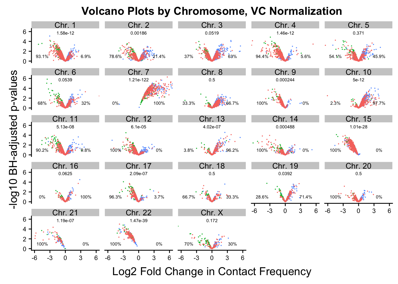
| Version | Author | Date |
|---|---|---|
| b7d82fc | Ittai Eres | 2019-04-30 |
FIGS2B <- ggplot(data=volcVC, aes(x=beta, y=pval, color=species)) + geom_point(size=0.001) + facet_wrap(~chr, nrow=5, ncol=5) + guides(color=FALSE) + ylab("-log10 BH-adjusted p-values") + xlab("Log2 Fold Change in Contact Frequency") + geom_text(data=asym.stats, aes(x=-4.5, y=1, label=paste(round(prop.c*100, digits=1), "%", sep=""), color=NULL), show.legend=FALSE, size=2) + geom_text(data=asym.stats, aes(x=4, y=1, label=paste(round(prop.h*100, digits=1), "%", sep=""), color=NULL), show.legend=FALSE, size=2) + geom_text(data=asym.stats, aes(x=0, y=5.75, label=signif(binom.p, digits=3), color=NULL), show.legend=FALSE, size=2) + coord_cartesian(xlim=c(-6, 6)) + ggtitle("Volcano Plots by Chromosome, VC Normalization") + theme(strip.text=element_text(size=10, lineheight=0.5), axis.text.y=element_text(size=8), axis.text.x=element_text(size=8)) #FIGS2B
#ggsave('~/Desktop/volcchr.jpg', device="jpeg", antialias="none") This was an earlier attempt at clearing up some image resolution blurriness with the text.
ggsave('~/Desktop/volcchrVC.jpg', device="jpeg", dpi=5000) #Works well!Saving 7 x 5 in image###FIGS2###
FIGS2 <- plot_grid(FIGS2A, FIGS2B, labels=c("A", "B"))
save_plot("~/Desktop/FIGS2.png", FIGS2, ncol=2, nrow=1, base_aspect_ratio=1.3)
######
#Write out the data with the new columns added on!
fwrite(filt.KR, "output/juicer.filt.KR.final", quote = TRUE, sep = "\t", row.names = FALSE, col.names = TRUE, na="NA", showProgress = FALSE)
#Need to switch VC human chromosome names back to normal for the rest of the downstream functions:
filt.VC$Hchr <- gsub("Chr. ", "chr", filt.VC$Hchr)
fwrite(filt.VC, "output/juicer.filt.VC.final", quote = TRUE, sep = "\t", row.names = FALSE, col.names = TRUE, na="NA", showProgress = FALSE)From this analysis we have dealt with some quality control issues, and filtered down the data to a final set of biologically significant Hi-C interaction frequencies, many of which appear species-specific. There are clearly strong differences between the species that make their 3D regulatory landscapes divergent. Now, I move to orthogonal gene expression analyses.
sessionInfo()R version 3.4.0 (2017-04-21)
Platform: x86_64-apple-darwin15.6.0 (64-bit)
Running under: macOS 10.14.6
Matrix products: default
BLAS: /Library/Frameworks/R.framework/Versions/3.4/Resources/lib/libRblas.0.dylib
LAPACK: /Library/Frameworks/R.framework/Versions/3.4/Resources/lib/libRlapack.dylib
locale:
[1] en_US.UTF-8/en_US.UTF-8/en_US.UTF-8/C/en_US.UTF-8/en_US.UTF-8
attached base packages:
[1] compiler stats graphics grDevices utils datasets methods
[8] base
other attached packages:
[1] bedr_1.0.7 forcats_0.4.0 purrr_0.3.2
[4] readr_1.3.1 tibble_2.1.3 tidyverse_1.2.1
[7] edgeR_3.20.9 RColorBrewer_1.1-2 heatmaply_0.16.0
[10] viridis_0.5.1 viridisLite_0.3.0 stringr_1.4.0
[13] gplots_3.0.1.1 Hmisc_4.2-0 Formula_1.2-3
[16] survival_2.44-1.1 lattice_0.20-38 dplyr_0.8.3
[19] plotly_4.9.0 cowplot_0.9.4 ggplot2_3.2.1
[22] reshape2_1.4.3 data.table_1.12.0 tidyr_1.0.0
[25] plyr_1.8.4 limma_3.34.9
loaded via a namespace (and not attached):
[1] colorspace_1.4-1 rprojroot_1.3-2 htmlTable_1.13.2
[4] futile.logger_1.4.3 base64enc_0.1-3 fs_1.3.1
[7] rstudioapi_0.10 lubridate_1.7.4 xml2_1.2.2
[10] codetools_0.2-16 splines_3.4.0 R.methodsS3_1.7.1
[13] knitr_1.22 zeallot_0.1.0 jsonlite_1.6
[16] workflowr_1.4.0 broom_0.5.2 cluster_2.0.7-1
[19] R.oo_1.22.0 httr_1.4.1 backports_1.1.4
[22] assertthat_0.2.1 Matrix_1.2-17 lazyeval_0.2.2
[25] cli_1.1.0 formatR_1.7 acepack_1.4.1
[28] htmltools_0.3.6 tools_3.4.0 gtable_0.3.0
[31] glue_1.3.1 Rcpp_1.0.1 cellranger_1.1.0
[34] vctrs_0.2.0 gdata_2.18.0 nlme_3.1-137
[37] iterators_1.0.12 xfun_0.5 testthat_2.2.1
[40] rvest_0.3.4 lifecycle_0.1.0 gtools_3.8.1
[43] dendextend_1.12.0 MASS_7.3-51.4 scales_1.0.0
[46] TSP_1.1-7 hms_0.5.1 parallel_3.4.0
[49] lambda.r_1.2.4 yaml_2.2.0 gridExtra_2.3
[52] rpart_4.1-15 latticeExtra_0.6-28 stringi_1.4.3
[55] gclus_1.3.2 foreach_1.4.7 checkmate_1.9.4
[58] seriation_1.2-3 caTools_1.17.1.2 rlang_0.4.0
[61] pkgconfig_2.0.3 bitops_1.0-6 evaluate_0.13
[64] labeling_0.3 htmlwidgets_1.3 tidyselect_0.2.5
[67] magrittr_1.5 R6_2.4.0 generics_0.0.2
[70] pillar_1.4.2 haven_2.1.1 whisker_0.4
[73] foreign_0.8-72 withr_2.1.2 nnet_7.3-12
[76] modelr_0.1.5 crayon_1.3.4 futile.options_1.0.1
[79] KernSmooth_2.23-15 rmarkdown_1.12 locfit_1.5-9.1
[82] grid_3.4.0 readxl_1.3.1 git2r_0.26.1
[85] digest_0.6.18 webshot_0.5.1 VennDiagram_1.6.20
[88] R.utils_2.9.0 munsell_0.5.0 registry_0.5-1