linear_modeling
Ittai Eres
2018-01-23
Last updated: 2018-09-28
Code version: e0ca9da
Linear Modeling
Having performed some basic quality control and filtering on the data, I now move to quantify how well Hi-C interaction frequency values can be predicted from species identity. To accomplish this, I utilize limma to linearly model Hi-C interaction frequencies as a function of all the metadata about each sample’s species, sex, and batch. I then add information from linear modeling to the full dataframe, including log-fold changes between species, p-values, betas, and variances. I then make a plot of the mean vs. the log-fold change as an MA plot proxy for quality control. I move on to look at distributions of all the p-values and betas for each of the terms, make some QQ plots to check for normality in the p-values for each term, and represent the log-fold change and p-values in a volcano plot of the data.
###Read in data, normalized in initial_QC document, with condition of at least 2 individuals for discovery.
filt.KR <- fread("~/Desktop/Hi-C/juicer.filt.KR", header = TRUE, data.table=FALSE, stringsAsFactors = FALSE, showProgress = FALSE)
filt.VC <- fread("~/Desktop/Hi-C/juicer.filt.VC", header=TRUE, data.table=FALSE, stringsAsFactors=FALSE, showProgress = FALSE)

###Reassign metadata here, just for quick reference.
meta.data <- data.frame("SP"=c("H", "H", "C", "C", "H", "H", "C", "C"), "SX"=c("F", "M", "M", "F", "M", "F", "M", "F"), "Batch"=c(1, 1, 1, 1, 2, 2, 2, 2))

###Now to move on to linear modeling, doing it in both the full data set and the | 4 individuals condition. I utilize limma to make this quick, parllelizable, and simple. First make the model, then do the actual fitting, and finally do multiple testing adjustment with topTable.
design <- model.matrix(~1+meta.data$SP+meta.data$SX+meta.data$Batch) #Parameterize the linear model, with an intercept, and fixed effect terms for species, sex, and library prep batch. If you prefer to think in contrasts, my contrast is humans minus chimps. I prefer to think of one species as the baseline in the linear model, and in this case that's chimps (so chimps get a 0 for species, and humans get a 1).
lmFit(filt.KR[,112:119], design) %>% eBayes(.) -> model.KR
lmFit(filt.VC[,112:119], design) %>% eBayes(.) -> model.VC
volc.KR <- topTable(model.KR, coef = 2, sort.by = "none", number = Inf)
volc.VC <- topTable(model.VC, coef=2, sort.by="none", number=Inf)

###Now append the information extracted from linear modeling (p-values and betas for species, sex, and batch) to the 2 data frames:
filt.KR$sp_beta <- volc.KR$logFC #Beta already is logFC since values are log2(obs/exp) Hi-C reads.
filt.KR$sp_pval <- volc.KR$P.Value #Unadjusted P-val
filt.KR$sp_BH_pval <- volc.KR$adj.P.Val #Benjamini-Hochberg adjusted p-values
filt.KR$avg_IF <- volc.KR$AveExpr #Average Interaction Frequency value across all individuals. Useful later for a variety of plots.
filt.KR$t_statistic <- volc.KR$t #t-statistic from limma topTable
filt.KR$B_statistic <- volc.KR$B #B-statistic (LOD) from limma topTable
filt.KR$sx_pval <- model.KR$p.value[,3]
filt.KR$btc_pval <- model.KR$p.value[,4]
filt.KR$sx_beta <- model.KR$coefficients[,3]
filt.KR$btc_beta <- model.KR$coefficients[,4]
filt.KR$SE <- sqrt(model.KR$s2.post)*model.KR$stdev.unscaled[,2]

filt.VC$sp_beta <- volc.VC$logFC #Beta already is logFC since values are log2(obs/exp) Hi-C reads.
filt.VC$sp_pval <- volc.VC$P.Value #Unadjusted P-val
filt.VC$sp_BH_pval <- volc.VC$adj.P.Val #Benjamini-Hochberg adjusted p-values
filt.VC$avg_IF <- volc.VC$AveExpr #Average Interaction Frequency value across all individuals. Useful later for a variety of plots.
filt.VC$t_statistic <- volc.VC$t #t-statistic from limma topTable
filt.VC$B_statistic <- volc.VC$B #B-statistic (LOD) from limma topTable
filt.VC$sx_pval <- model.VC$p.value[,3]
filt.VC$btc_pval <- model.VC$p.value[,4]
filt.VC$sx_beta <- model.VC$coefficients[,3]
filt.VC$btc_beta <- model.VC$coefficients[,4]
filt.VC$SE <- sqrt(model.VC$s2.post)*model.VC$stdev.unscaled[,2]

####NONE of these figures are in any supplement so WHO CURRS

###Before moving to any actual assessment of the linear modeling, do a QC check by producing MA plots for both the full set and | 2 individuals. The MA plot here is the mean of Hi-C contact frequencies (avg_IF) on the x-axis, and the logFC (species beta, in this case) on the y-axis. What we are generally looking for is a fairly uniform cloud around 0 stretching across the x-axis.
ggplot(data=filt.KR[,c('avg_IF','sp_beta')], aes(x=avg_IF, y=sp_beta)) + geom_point() + xlab("Means of Hi-C Contact Frequencies") + ylab("Species Beta (log ratio H/C)") + ggtitle("MA Plot, KR Data") + coord_cartesian(xlim=c(-5, 500), ylim=c(-50, 50))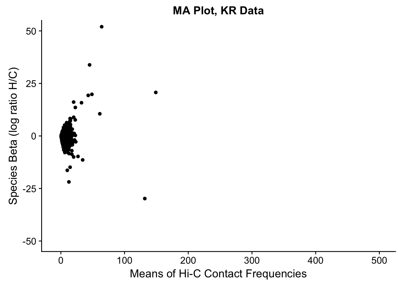
ggplot(data=filt.VC[,c('avg_IF','sp_beta')], aes(x=avg_IF, y=sp_beta)) + geom_point() + xlab("Means of Hi-C Contact Frequencies") + ylab("Species Beta (log ratio H/C)") + ggtitle("MA Plot, VC Data") + coord_cartesian(xlim=c(-5, 500), ylim=c(-50, 50))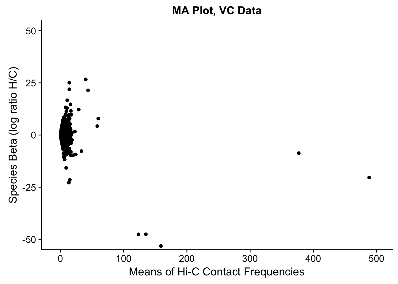
###Check some of the more basic linear modeling issues: distributions of betas, p-vals, QQplot, volcano plot, etc.
##Check p-vals and betas for all covariates in the full model, on all the data.
ggplot(data=filt.KR[,120:140], aes(x=sp_pval)) + geom_histogram(binwidth=0.01) + ggtitle("P-vals for Species, KR") + xlab("P-value") + coord_cartesian(ylim=c(0, 1000))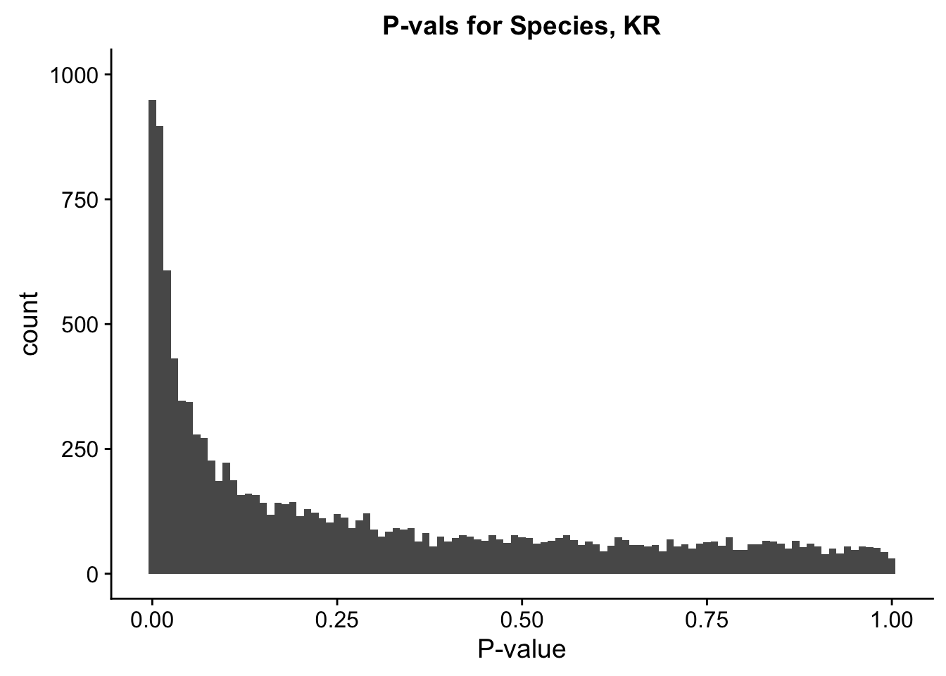
ggplot(data=filt.KR[,120:140], aes(x=sx_pval)) + geom_histogram(binwidth=0.01) + ggtitle("P-vals for Sex, KR") + xlab("P-value") + coord_cartesian(ylim=c(0, 1000))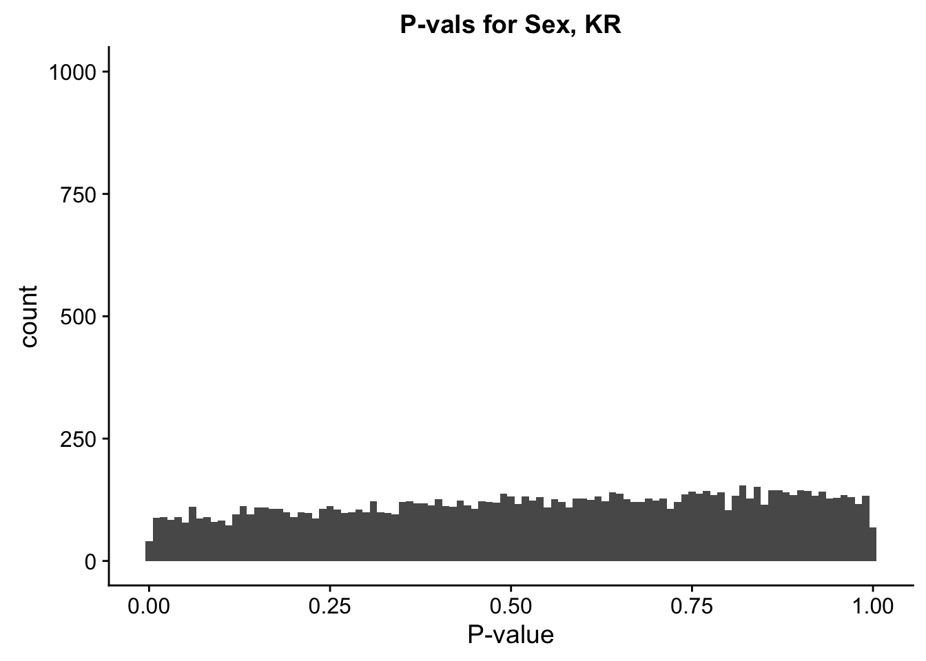
ggplot(data=filt.KR[,120:140], aes(x=btc_pval)) + geom_histogram(binwidth=0.01) + ggtitle("P-vals for Batch, KR") + xlab("P-value") + coord_cartesian(ylim=c(0, 1000))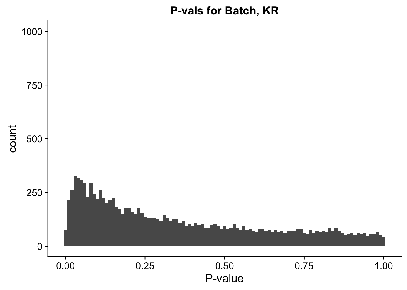
ggplot(data=filt.KR[,120:140], aes(x=sp_beta)) + geom_histogram(binwidth=0.01) + ggtitle("Betas for Species, KR") + xlab("Beta") + coord_cartesian(xlim=c(-4.5, 4.5), ylim=c(0, 200))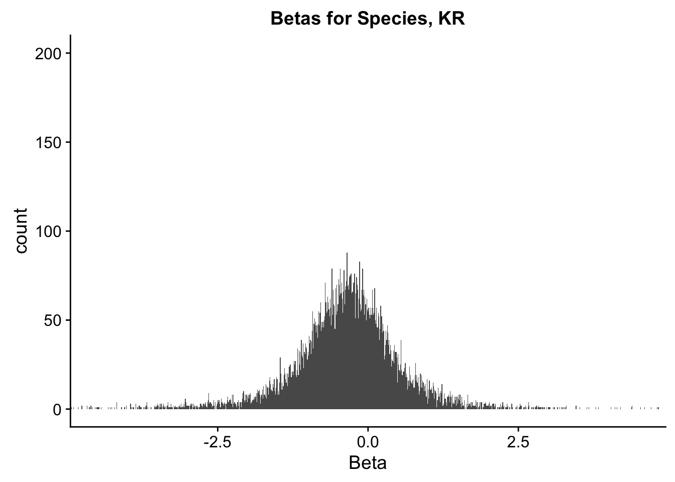
ggplot(data=filt.KR[,120:140], aes(x=sx_beta)) + geom_histogram(binwidth=0.01) + ggtitle("Betas for Sex, KR") + xlab("Beta") + coord_cartesian(xlim=c(-4.5, 4.5), ylim=c(0, 200))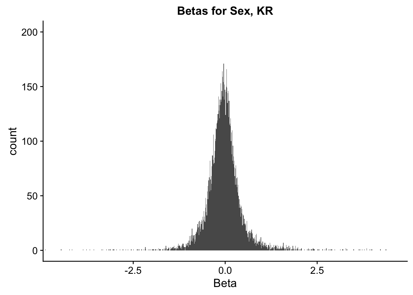
ggplot(data=filt.KR[,120:140], aes(x=btc_beta)) + geom_histogram(binwidth=0.01) + ggtitle("Betas for Batch, KR") + xlab("Beta") + coord_cartesian(xlim=c(-4.5, 4.5), ylim=c(0, 200))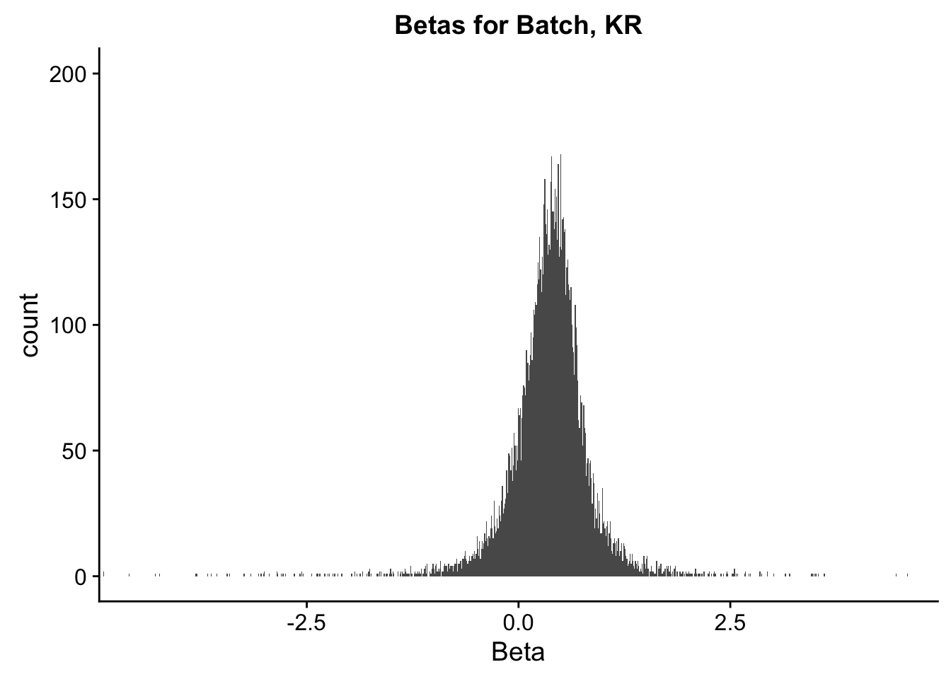
ggplot(data=filt.VC[,120:140], aes(x=sp_pval)) + geom_histogram(binwidth=0.01) + ggtitle("P-vals for Species, VC") + xlab("P-value") + coord_cartesian(ylim=c(0, 1500))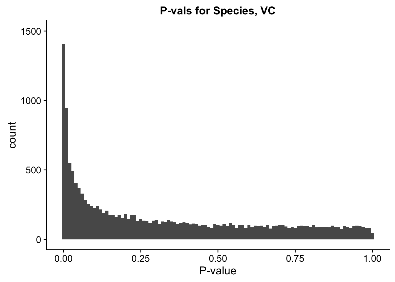
ggplot(data=filt.VC[,120:140], aes(x=sx_pval)) + geom_histogram(binwidth=0.01) + ggtitle("P-vals for Sex, VC") + xlab("P-value") + coord_cartesian(ylim=c(0, 1500))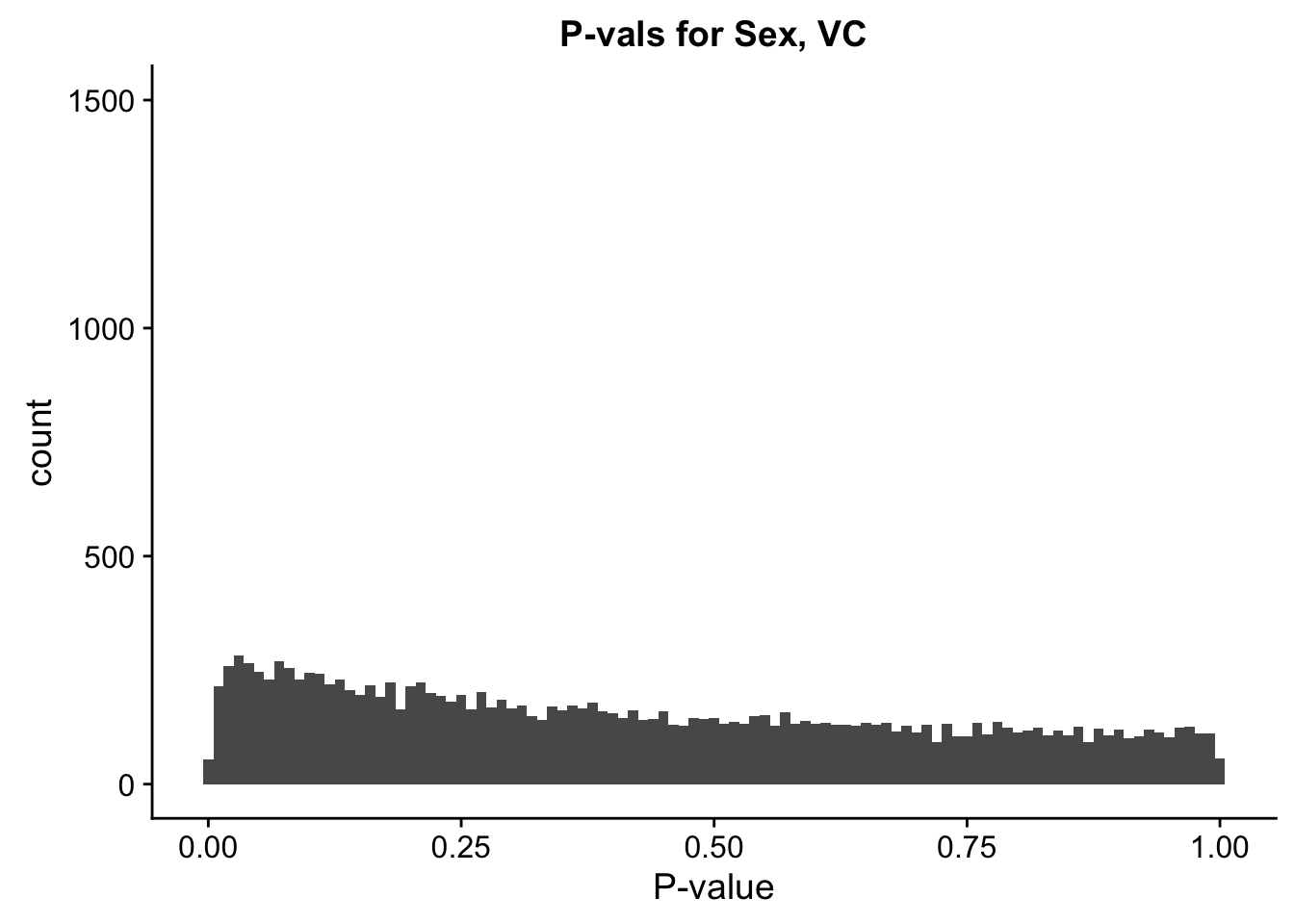
ggplot(data=filt.VC[,120:140], aes(x=btc_pval)) + geom_histogram(binwidth=0.01) + ggtitle("P-vals for Batch, VC") + xlab("P-value") + coord_cartesian(ylim=c(0, 1500))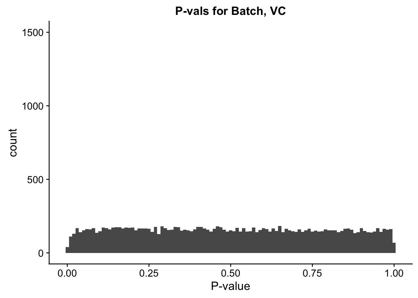
ggplot(data=filt.VC[,120:140], aes(x=sp_beta)) + geom_histogram(binwidth=0.01) + ggtitle("Betas for Species, VC") + xlab("Beta") + coord_cartesian(xlim=c(-4.5, 4.5), ylim=c(0, 210))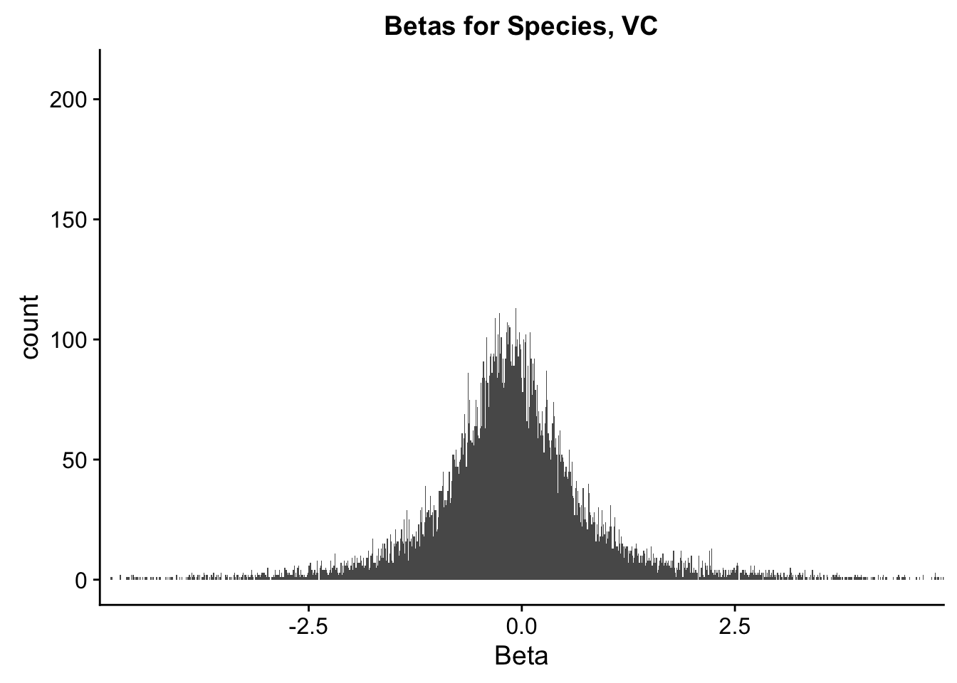
ggplot(data=filt.VC[,120:140], aes(x=sx_beta)) + geom_histogram(binwidth=0.01) + ggtitle("Betas for Sex, VC") + xlab("Beta") + coord_cartesian(xlim=c(-4.5, 4.5), ylim=c(0, 210))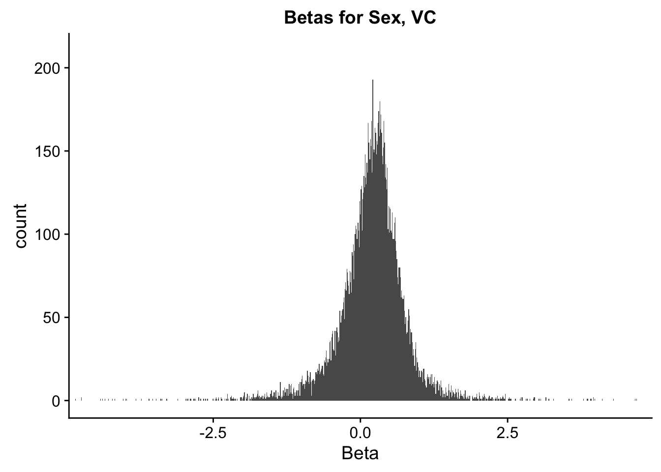
ggplot(data=filt.VC[,120:140], aes(x=btc_beta)) + geom_histogram(binwidth=0.01) + ggtitle("Betas for Batch, VC") + xlab("Beta") + coord_cartesian(xlim=c(-4.5, 4.5), ylim=c(0, 210))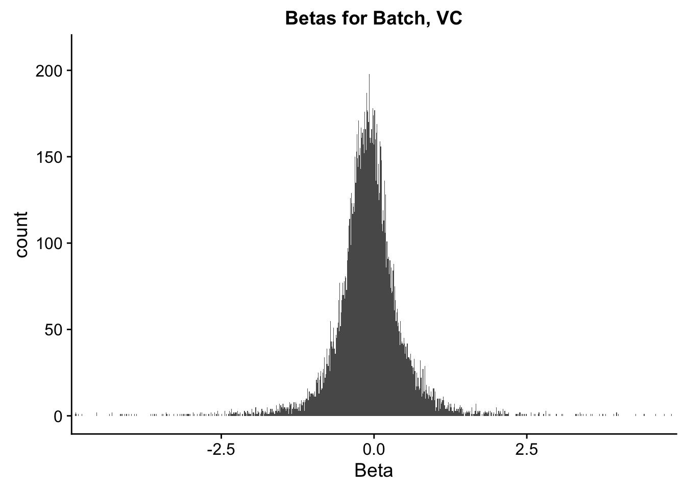
#These all look pretty good, with p-val distributions for sex and batch being fairly uniform, and betas all around being fairly normally distributed. We see distinct enrichment for significant p-values for the species term, which is what we were hoping for! Also of note is the fact that the beta distribution for species looks wider than those for batch and sex, reassuring us that species is a driving factor in differential Hi-C contacts.

###Now, to double-check on the p-values with some QQplots. First, I define a function for creating a qqplot easily and coloring elements of the distribution in order to understand where most of the density on the plot is:
newqqplot=function(pvals, quant, title){
  len = length(pvals)
  res=qqplot(-log10((1:len)/(1+len)),pvals,plot.it=F)
  plot(res$x,res$y, main=title, xlab="Theoretical", ylab="Actual", col=ifelse(res$y>as.numeric(quantile(res$y, quant[1])), ifelse(res$y>as.numeric(quantile(res$y, quant[2])), "red", "blue"), "black"))
  abline(0, 1)
}

##Start QQplotting some of these actual values.
newqqplot(-log10(filt.KR$sp_pval), c(0.5, 0.75), "QQ Plot, Species P-vals, KR Data")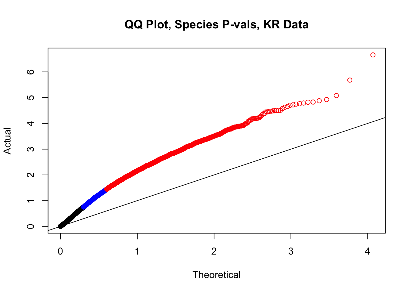
newqqplot(-log10(filt.KR$sx_pval), c(0.5, 0.75), "QQ Plot, Sex P-vals, KR Data")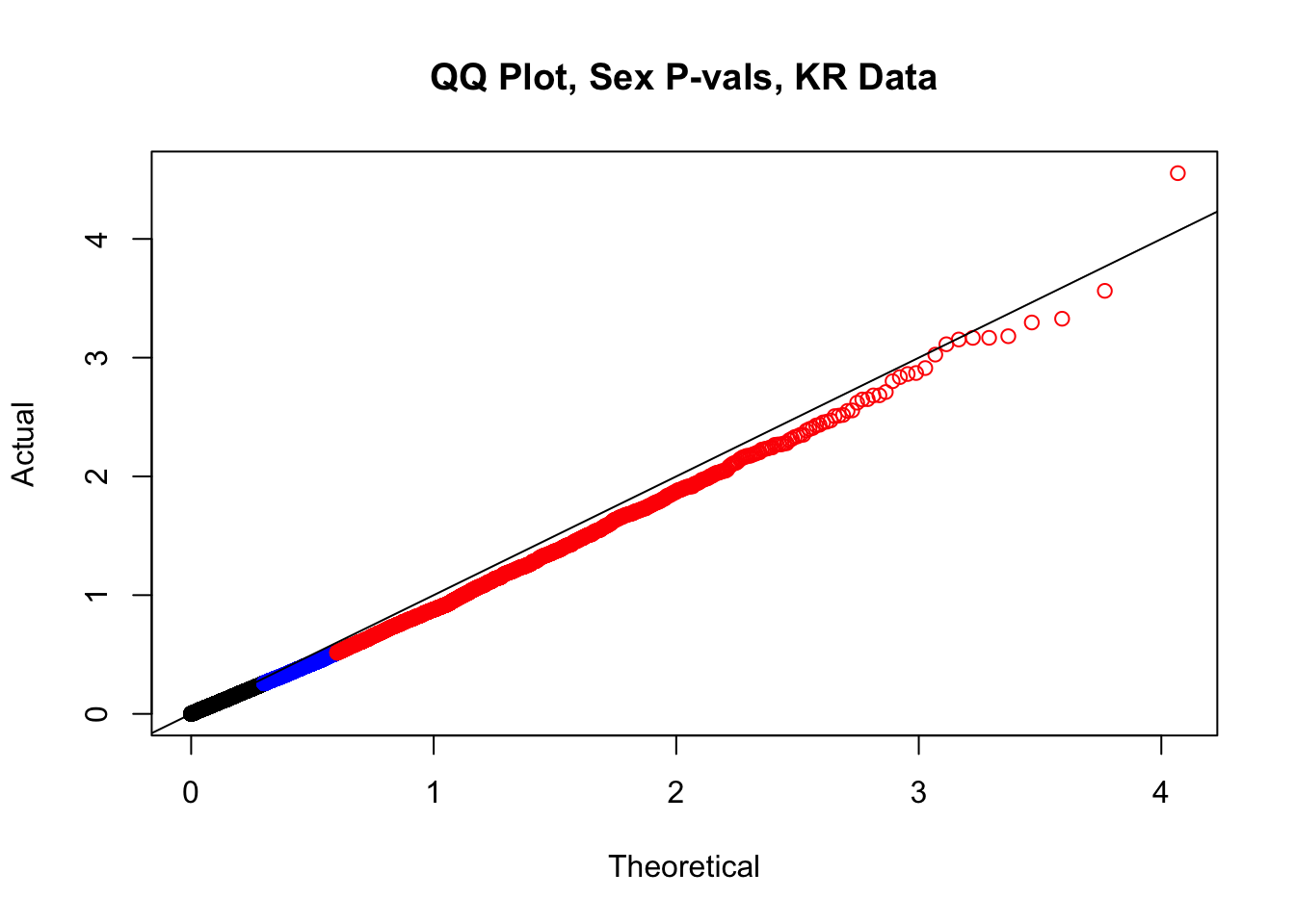
newqqplot(-log10(filt.KR$btc_pval), c(0.5, 0.75), "QQ Plot, Batch P-vals, KR Data")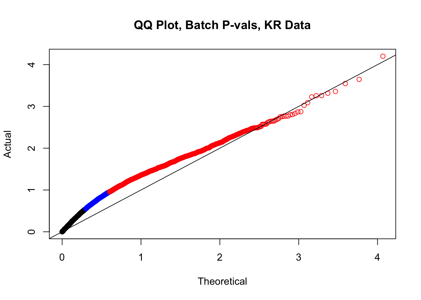
newqqplot(-log10(filt.VC$sp_pval), c(0.5, 0.75), "QQ Plot, Species P-vals, VC Data")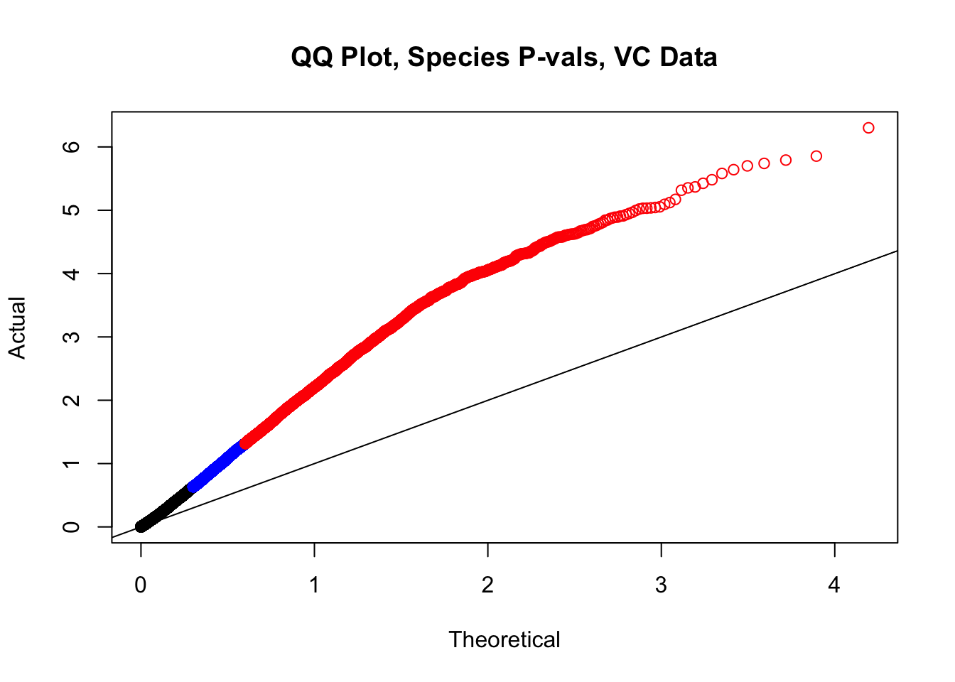
newqqplot(-log10(filt.VC$sx_pval), c(0.5, 0.75), "QQ Plot, Sex P-vals, VC Data")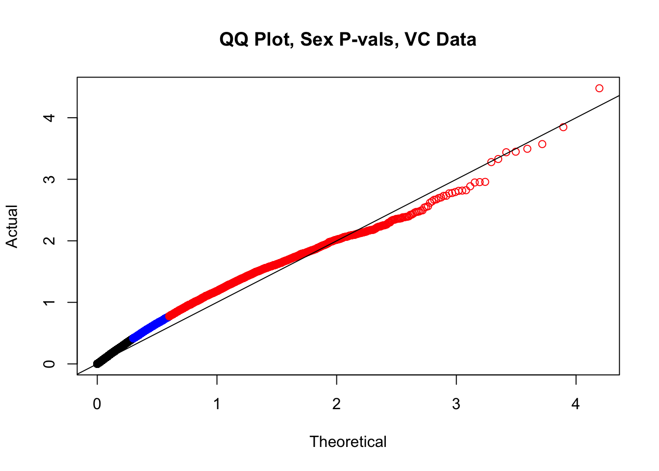
newqqplot(-log10(filt.VC$btc_pval), c(0.5, 0.75), "QQ Plot, Batch P-vals, VC Data")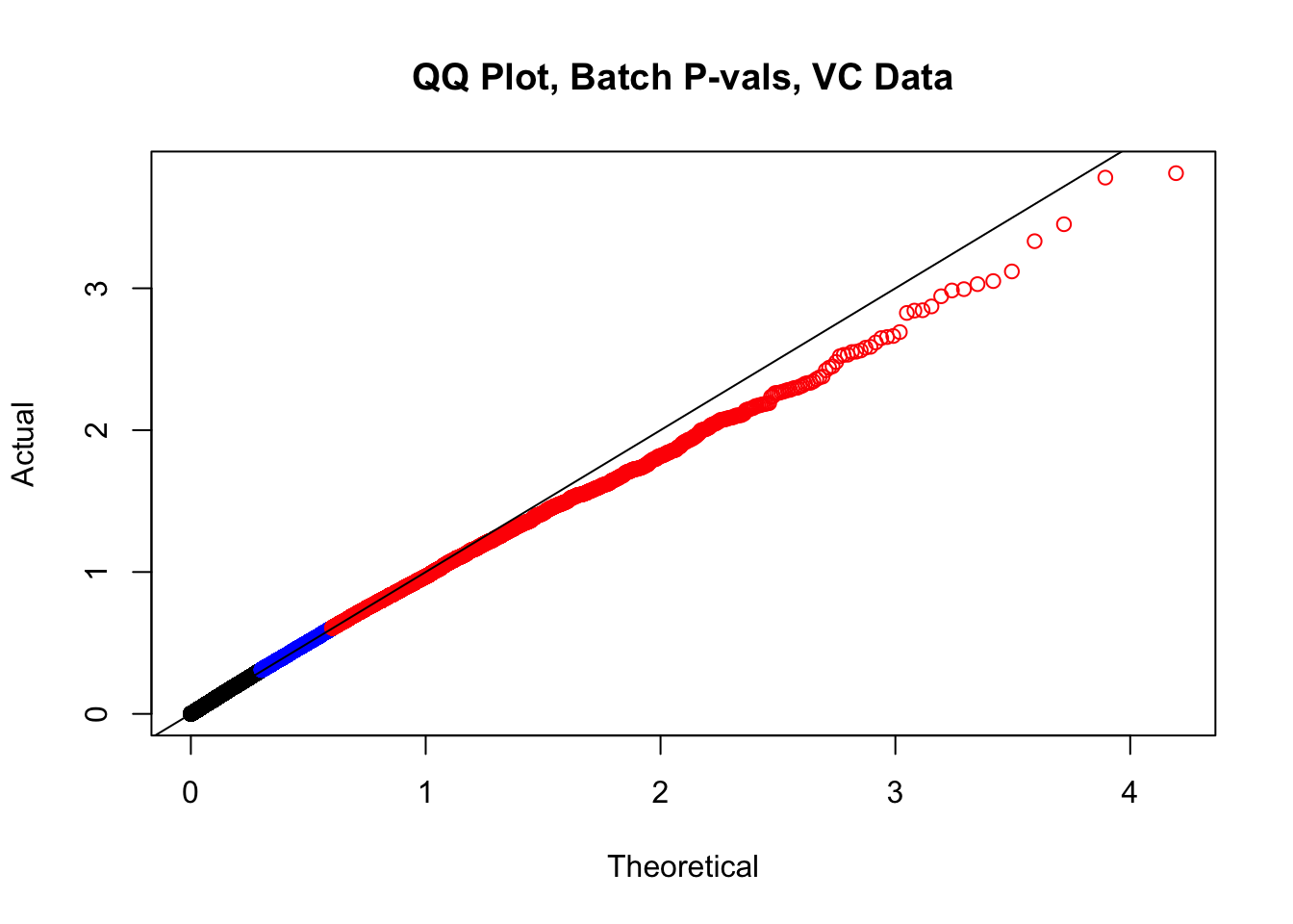
###MAIN PAPER FIG 2
#Volcano plots of the data colored by species of discovery:
volcplot.KR <- data.frame(pval=-log10(filt.KR$sp_pval), beta=filt.KR$sp_beta, species=filt.KR$disc_species)
ggplot(data=volcplot.KR, aes(x=beta, y=pval, color=species)) + geom_point() + xlab("Log2 Fold Change in KR Contact Frequency") + ylab("P-values") + ggtitle("KR Contact Frequency Differences Colored by Species of Discovery") + coord_cartesian(xlim=c(-6, 6))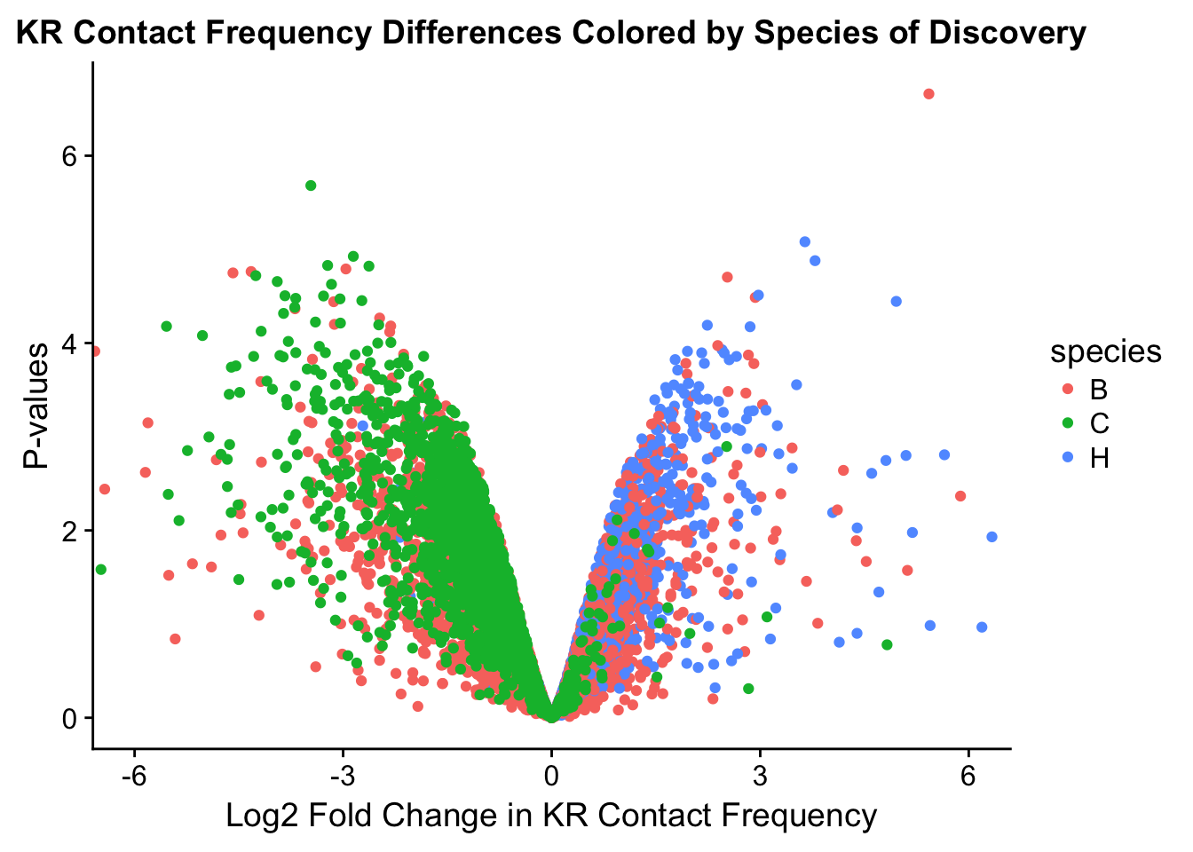
#ggplot(data=volcplot.KR, aes(x=beta, y=pval)) + geom_point() + xlab("Log2 Fold Change in Contact Frequency") + ylab("-log10 BH-corrected p-values") + ggtitle("Contact Frequency Differences, KR") + coord_cartesian(xlim=c(-6, 6))

volcplot.VC <- data.frame(pval=-log10(filt.VC$sp_pval), beta=filt.VC$sp_beta, species=filt.VC$disc_species)
ggplot(data=volcplot.VC, aes(x=beta, y=pval, color=species)) + geom_point() + xlab("Log2 Fold Change in VC Contact Frequency") + ylab("P-values") + ggtitle("VC Contact Frequency Differences Colored by Species of Discovery") + coord_cartesian(xlim=c(-6, 6))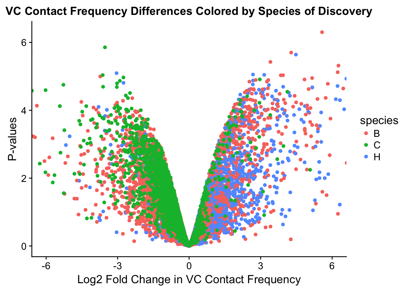
#ggplot(data=volcplot.VC, aes(x=beta, y=pval)) + geom_point() + xlab("Log2 Fold Change in Contact Frequency") + ylab("-log10 BH-corrected p-values") + ggtitle("Contact Frequency Differences, VC") + coord_cartesian(xlim=c(-6, 6))

#Write out the data with the new columns added on!
fwrite(filt.KR, "~/Desktop/Hi-C/juicer.filt.KR.lm", quote = TRUE, sep = "\t", row.names = FALSE, col.names = TRUE, na="NA", showProgress = FALSE)
fwrite(filt.VC, "~/Desktop/Hi-C/juicer.filt.VC.lm", quote=TRUE, sep="\t", row.names=FALSE, col.names=TRUE, na="NA", showProgress=FALSE)
From this analysis two concerns emerge for further exploration: the QQ plots for the species p-values seem inflated, and the volcano plot seems highly asymmetrical. I’ll examine this further in the next analysis on linear modeling QC.
sessionInfo()R version 3.4.0 (2017-04-21)
Platform: x86_64-apple-darwin15.6.0 (64-bit)
Running under: OS X El Capitan 10.11.6
Matrix products: default
BLAS: /Library/Frameworks/R.framework/Versions/3.4/Resources/lib/libRblas.0.dylib
LAPACK: /Library/Frameworks/R.framework/Versions/3.4/Resources/lib/libRlapack.dylib
locale:
[1] en_US.UTF-8/en_US.UTF-8/en_US.UTF-8/C/en_US.UTF-8/en_US.UTF-8
attached base packages:
[1] compiler stats graphics grDevices utils datasets methods
[8] base
other attached packages:
[1] bedr_1.0.4 forcats_0.3.0 purrr_0.2.4
[4] readr_1.1.1 tibble_1.4.2 tidyverse_1.2.1
[7] edgeR_3.20.9 RColorBrewer_1.1-2 heatmaply_0.14.1
[10] viridis_0.5.0 viridisLite_0.3.0 stringr_1.3.0
[13] gplots_3.0.1 Hmisc_4.1-1 Formula_1.2-2
[16] survival_2.41-3 lattice_0.20-35 dplyr_0.7.4
[19] plotly_4.7.1 cowplot_0.9.3 ggplot2_2.2.1
[22] reshape2_1.4.3 data.table_1.10.4-3 tidyr_0.8.0
[25] plyr_1.8.4 limma_3.34.9
loaded via a namespace (and not attached):
[1] colorspace_1.3-2 class_7.3-14 modeltools_0.2-21
[4] mclust_5.4 rprojroot_1.3-2 htmlTable_1.11.2
[7] futile.logger_1.4.3 base64enc_0.1-3 rstudioapi_0.7
[10] flexmix_2.3-14 mvtnorm_1.0-7 lubridate_1.7.3
[13] xml2_1.2.0 R.methodsS3_1.7.1 codetools_0.2-15
[16] splines_3.4.0 mnormt_1.5-5 robustbase_0.92-8
[19] knitr_1.20 jsonlite_1.5 broom_0.4.3
[22] cluster_2.0.6 kernlab_0.9-25 R.oo_1.21.0
[25] httr_1.3.1 backports_1.1.2 assertthat_0.2.0
[28] Matrix_1.2-12 lazyeval_0.2.1 cli_1.0.0
[31] acepack_1.4.1 htmltools_0.3.6 tools_3.4.0
[34] bindrcpp_0.2 gtable_0.2.0 glue_1.2.0
[37] Rcpp_0.12.16 cellranger_1.1.0 trimcluster_0.1-2
[40] gdata_2.18.0 nlme_3.1-131.1 iterators_1.0.9
[43] fpc_2.1-11 psych_1.7.8 testthat_2.0.0
[46] rvest_0.3.2 gtools_3.5.0 dendextend_1.7.0
[49] DEoptimR_1.0-8 MASS_7.3-49 scales_0.5.0
[52] TSP_1.1-5 hms_0.4.2 parallel_3.4.0
[55] lambda.r_1.2 yaml_2.1.18 gridExtra_2.3
[58] rpart_4.1-13 latticeExtra_0.6-28 stringi_1.1.7
[61] gclus_1.3.1 foreach_1.4.4 checkmate_1.8.5
[64] seriation_1.2-3 caTools_1.17.1 rlang_0.2.0
[67] pkgconfig_2.0.1 prabclus_2.2-6 bitops_1.0-6
[70] evaluate_0.10.1 bindr_0.1.1 labeling_0.3
[73] htmlwidgets_1.0 magrittr_1.5 R6_2.2.2
[76] pillar_1.2.1 haven_1.1.1 whisker_0.3-2
[79] foreign_0.8-69 nnet_7.3-12 modelr_0.1.1
[82] crayon_1.3.4 futile.options_1.0.0 KernSmooth_2.23-15
[85] rmarkdown_1.9 locfit_1.5-9.1 grid_3.4.0
[88] readxl_1.0.0 git2r_0.21.0 digest_0.6.15
[91] diptest_0.75-7 webshot_0.5.0 VennDiagram_1.6.19
[94] R.utils_2.6.0 stats4_3.4.0 munsell_0.4.3
[97] registry_0.5 This R Markdown site was created with workflowr