Hi-C Data Normalization and Initial Quality Control, Juicer
Ittai Eres
2018-01-23
Last updated: 2018-09-28
Code version: e0ca9da
Initial Data read-in and quality control
First, I read in the data and normalize it with cyclic pairwise loess normalization. Then I look at histograms of the distributions of the contact frequencies on an individual-by-individual basis, to see if they are comparable. I also look at a plot of the mean vs. the variance as an additional quality control metric; this is typically done on RNA-seq count data. In that case, it’s done to check if the normalized data are distributed in a particular fashion (e.g. a poisson model would have a linear mean-variance relationship). In the limma/voom pipeline, count data are log-cpm transformed and a loess trend line of variance vs. mean is then fit to create weights for individual genes to be fed into linear modeling with limma. Since this is not a QC metric typically used for Hi-C data, the only thing I hope to see is no particularly strong relationship between variance and mean.
###Read in VC and KR normalized data, normalize each with cyclic loess (pairwise), clean it from any rows that have missing values.
full.KR <- fread("~/Desktop/Hi-C/final.juicer.10kb.KR", header=TRUE, stringsAsFactors = FALSE, data.table=FALSE, showProgress = FALSE) #Start w/ roughly 31.5k hits here
full.VC <- fread("~/Desktop/Hi-C/final.juicer.10kb.VC", header=TRUE, stringsAsFactors = FALSE, data.table = FALSE, showProgress = FALSE) #~84k hits...

#Note that many more hits show up as significant under the VC normalization paradigm than do under KR balancing. This is especially bad for A-21792 for some reason.

#Subsetting down to only complete cases (I.E. none of the individuals have NA values goes to ~28k and ~77k hits for KR and VC, respectively. Reductions of both ~10%.)
full.KR <- full.KR[complete.cases(full.KR[,112:119]),]
full.VC <- full.VC[complete.cases(full.VC[,112:119]),]

#Visualize both.
boxplot(full.KR[,112:119], ylim=c(0, 30), horizontal = TRUE, main="KR Distributions")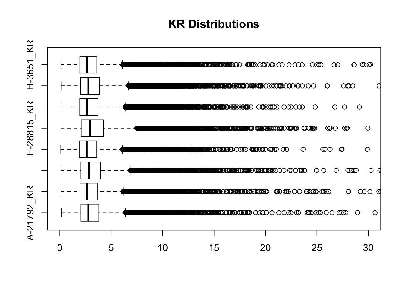
boxplot(full.VC[,112:119], ylim=c(0, 30), horizontal=TRUE, main="VC Distributions")
KR.contacts <- full.KR[,112:119]
VC.contacts <- full.VC[,112:119]

###Pearson is a product moment correlation, meaning it evaluates the relationship b/t two continuous variables. Spearman is a rank-order correlation, is mainly evaluating monotonic rlationship b/t two continuous/ordinal variables (variables change together, but not necessarily at a constant rate). It's based on ranked values for each variable, rather than the raw data itself, and is thus not quite as precise IMO. Hence here I optimize my normalization schemes WRT seeing proper clustering in a Pearson correlation heatmap. OR I do it WRT a Spearman heatmap b/c Pearson is more quantitative and thus harder to fine-tune, and keeps messing up here--can't find a single normalization scheme that gives good clustering that isn't super dirty on Pearson.
###For now, just use Spearman correlations
full.contacts.VC <- as.data.frame(normalizeCyclicLoess(VC.contacts, span=0.28, iterations=3, method="pairs"))#Pearson clusters properly, but correlation values are not very pretty for separation. Same situation in Spearman but slightly less ugly. #6 iterations of 0.1 aren't bad, and can also get beautiful results with method="fast" instead of pairs (but this takes loess to the average of all the data so that's why, maybe not as valid). 0.21 and 0.28 spans also worth checking? They produce nice looking boxplots but not great looking heatmaps in either case...

#VC Correlations
corheat <- cor(full.contacts.VC, use="complete.obs", method="pearson")
corheats <- cor(full.contacts.VC, use="complete.obs", method="spearman")
colnames(corheat) <- c("A_HF", "B_HM", "C_CM", "D_CF", "E_HM", "F_HF", "G_CM", "H_CF")
rownames(corheat) <- colnames(corheat)
colnames(corheats) <- colnames(corheat)
rownames(corheats) <- colnames(corheat)

#VC Clustering
heatmaply(corheat, main="Pairwise Pearson Correlation @ 10kb", k_row=2, k_col=2, symm=TRUE, margins=c(50, 50, 30, 30)) #Clusters well, but not super distinct.
We recommend that you use the dev version of ggplot2 with `ggplotly()`
Install it with: `devtools::install_github('hadley/ggplot2')`
We recommend that you use the dev version of ggplot2 with `ggplotly()`
Install it with: `devtools::install_github('hadley/ggplot2')`
We recommend that you use the dev version of ggplot2 with `ggplotly()`
Install it with: `devtools::install_github('hadley/ggplot2')`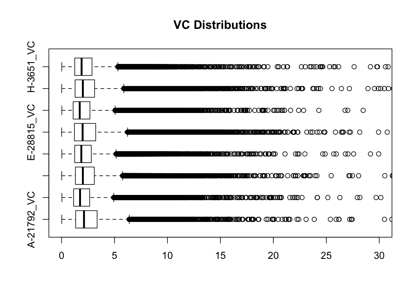
heatmaply(corheats, main="Pairwise Spearman Correlation @ 10kb", k_row=2, k_col=2, symm=TRUE, margins=c(50, 50, 30, 30)) #Same as above.We recommend that you use the dev version of ggplot2 with `ggplotly()`
Install it with: `devtools::install_github('hadley/ggplot2')`
We recommend that you use the dev version of ggplot2 with `ggplotly()`
Install it with: `devtools::install_github('hadley/ggplot2')`
We recommend that you use the dev version of ggplot2 with `ggplotly()`
Install it with: `devtools::install_github('hadley/ggplot2')`#Can't manage to find a cyclic loess normalization here that makes samples cluster properly for both types of correlations...can get samples clustering in appropriate places but not get the dendrogram to look how I expect--just use same settings as above, in interest of consistency.
full.contacts.KR <- as.data.frame(normalizeCyclicLoess(KR.contacts, span=0.36, iterations=3, method="pairs")) #Method="fast" doesn't give us the same awesomeness here, but that's not too surprising considering different normalization schemes. .26 and .32 may also be worth checking here.
#KR Correlations
corheat <- cor(full.contacts.KR, use="complete.obs", method="pearson") #Corheat for the full data set, and heatmap. Pearson clusters poorly.
corheats <- cor(full.contacts.KR, use="complete.obs", method="spearman")
colnames(corheat) <- c("A_HF", "B_HM", "C_CM", "D_CF", "E_HM", "F_HF", "G_CM", "H_CF")
rownames(corheat) <- colnames(corheat)
colnames(corheats) <- colnames(corheat)
rownames(corheats) <- colnames(corheat)
#KR Clustering
heatmaply(corheat, main="Pairwise Pearson Correlation @ 10kb", k_row=2, k_col=2, symm=TRUE, margins=c(50, 50, 30, 30)) #Clusters poorly, but at least species groups are maintained!We recommend that you use the dev version of ggplot2 with `ggplotly()`
Install it with: `devtools::install_github('hadley/ggplot2')`
We recommend that you use the dev version of ggplot2 with `ggplotly()`
Install it with: `devtools::install_github('hadley/ggplot2')`
We recommend that you use the dev version of ggplot2 with `ggplotly()`
Install it with: `devtools::install_github('hadley/ggplot2')`heatmaply(corheats, main="Pairwise Spearman Correlation @ 10kb", k_row=2, k_col=2, symm=TRUE, margins=c(50, 50, 30, 30)) #Clusters excellently!We recommend that you use the dev version of ggplot2 with `ggplotly()`
Install it with: `devtools::install_github('hadley/ggplot2')`
We recommend that you use the dev version of ggplot2 with `ggplotly()`
Install it with: `devtools::install_github('hadley/ggplot2')`
We recommend that you use the dev version of ggplot2 with `ggplotly()`
Install it with: `devtools::install_github('hadley/ggplot2')`#FINALLY have something that works for both, and boxplots look good. One last check on them before moving to hists of dist'ns:
boxplot(full.contacts.KR, ylim=c(0, 30), horizontal = TRUE, main="KR Distributions, Normalized")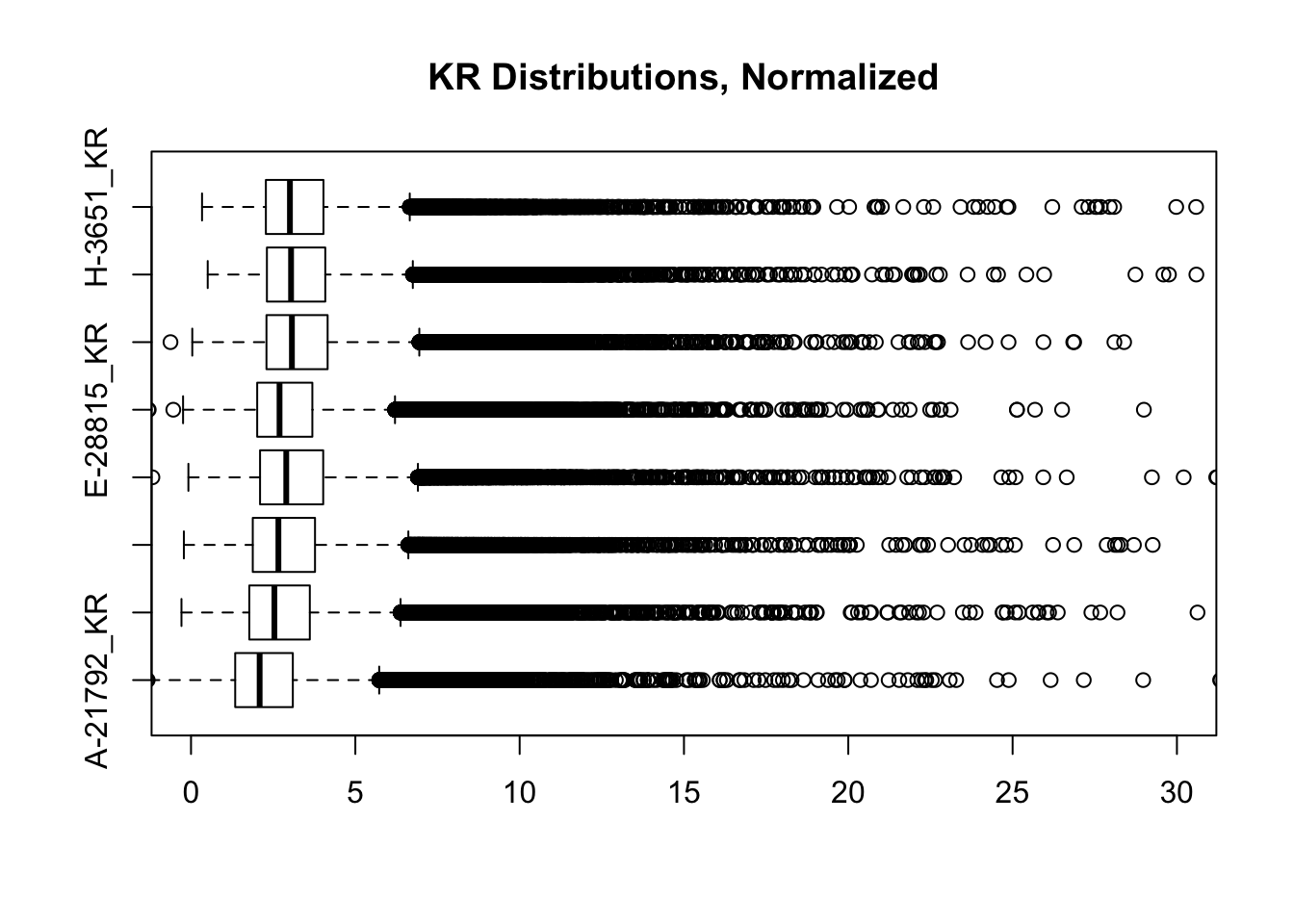
boxplot(full.contacts.VC, ylim=c(0, 30), horizontal=TRUE, main="VC Distributions, Normalized")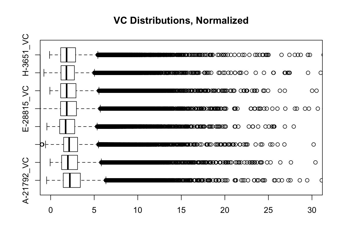
###First, a quick look at histograms of the distributions of the significant Hi-C hits from homer, in both humans and chimps. Create the melted dfs for each first otherwise it takes an absurd amount of time/memory:
VC.humans <- melt(full.contacts.VC[,c(1:2, 5:6)])
No id variables; using all as measure variablesVC.chimps <- melt(full.contacts.VC[,c(3:4, 7:8)])No id variables; using all as measure variablesKR.humans <- melt(full.contacts.KR[,c(1:2, 5:6)])No id variables; using all as measure variablesKR.chimps <- melt(full.contacts.KR[,c(3:4, 7:8)])No id variables; using all as measure variables#VC-normalized distributions:
ggplot(data=VC.humans, aes(x=value)) + geom_histogram(binwidth=0.1, aes(group=variable)) + facet_wrap(~as.factor(variable)) + ggtitle("Distributions of Normalized Juicer Hi-C Contacts, Humans") + xlab("Juicer VC-Normalized Interaction Frequency") + coord_cartesian(xlim=c(-1, 12), ylim=c(0, 3500)) #Human dist'ns
ggplot(data=VC.chimps, aes(x=value)) + geom_histogram(binwidth=0.1, aes(group=variable)) + facet_wrap(~as.factor(variable)) + ggtitle("Distributions of Normalized Juicer Hi-C Contacts, Chimps") + xlab("Juicer VC-Normalized Interaction Frequency") + coord_cartesian(xlim=c(-1, 12), ylim=c(0, 3500)) #Chimp Dist'ns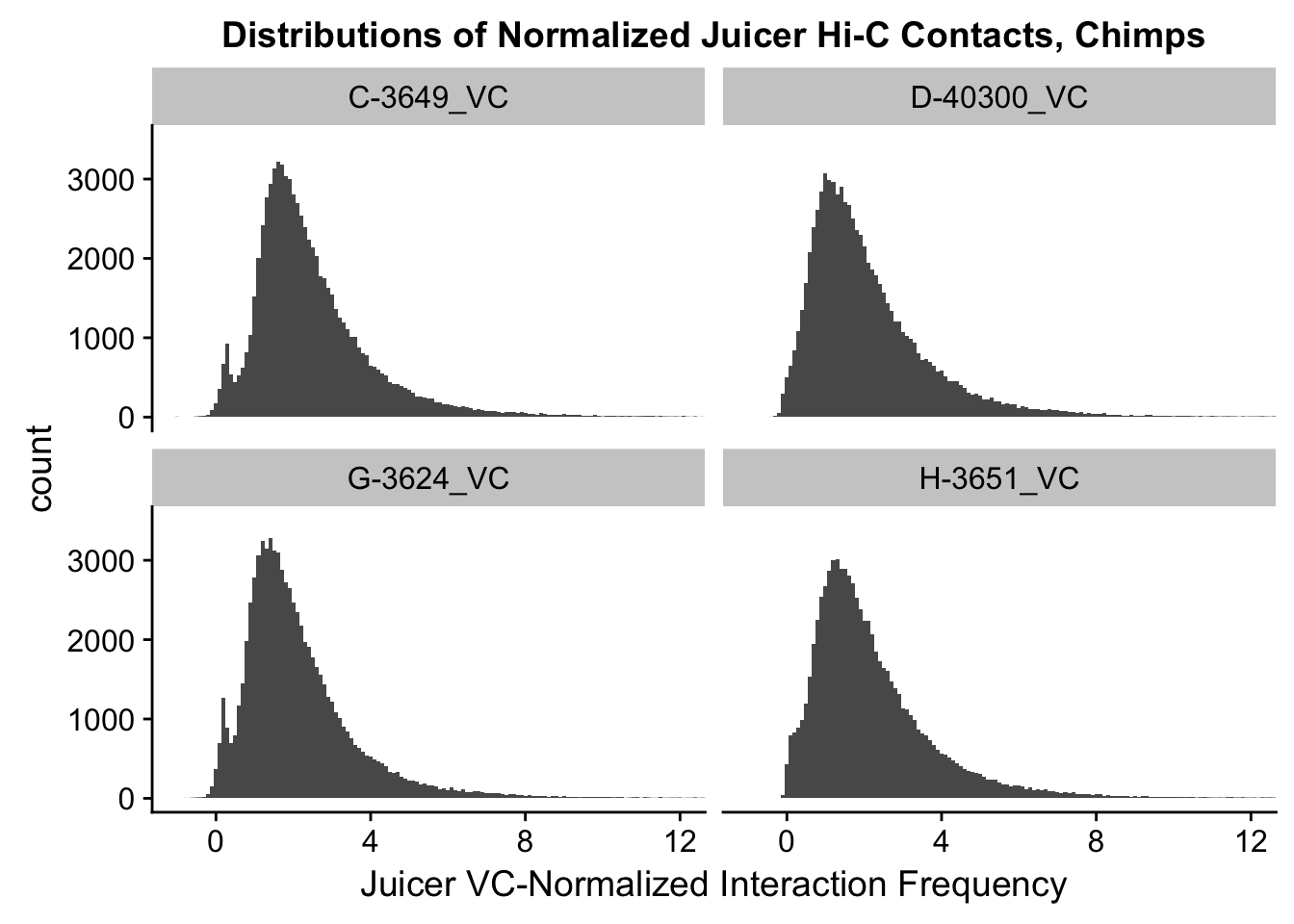
#Both sets of distributions look fairly bimodal, with chimps in particular showing a peak around 0.

###Now, the same thing for the KR-normalized interaction frequencies:
ggplot(data=KR.humans, aes(x=value)) + geom_histogram(binwidth=0.1, aes(group=variable)) + facet_wrap(~as.factor(variable)) + ggtitle("Distributions of Normalized Juicer Hi-C Contacts, Humans") + xlab("Juicer KR-Normalized Interaction Frequency") + coord_cartesian(xlim=c(-1, 12), ylim=c(0, 1500)) #Human dist'ns
ggplot(data=KR.chimps, aes(x=value)) + geom_histogram(binwidth=0.1, aes(group=variable)) + facet_wrap(~as.factor(variable)) + ggtitle("Distributions of Normalized Juicer Hi-C Contacts, Chimps") + xlab("Juicer KR-Normalized Interaction Frequency") + coord_cartesian(xlim=c(-1, 12), ylim=c(0, 1500)) #Chimp Dist'ns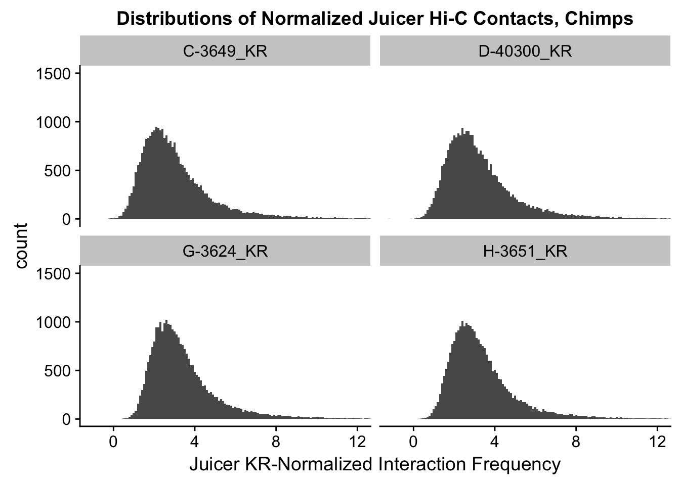
###########Take a look at these again, but on the raw data before normalization between samples:
VC.humans <- melt(VC.contacts[,c(1:2, 5:6)])
No id variables; using all as measure variablesVC.chimps <- melt(VC.contacts[,c(3:4, 7:8)])No id variables; using all as measure variablesKR.humans <- melt(KR.contacts[,c(1:2, 5:6)])No id variables; using all as measure variablesKR.chimps <- melt(KR.contacts[,c(3:4, 7:8)])No id variables; using all as measure variables#VC-normalized distributions:
ggplot(data=VC.humans, aes(x=value)) + geom_histogram(binwidth=0.1, aes(group=variable)) + facet_wrap(~as.factor(variable)) + ggtitle("Distributions of Juicer-Significant Hi-C Contacts, Humans") + xlab("Juicer VC-Normalized Interaction Frequency") + coord_cartesian(xlim=c(-1, 12), ylim=c(0, 3500)) #Human dist'ns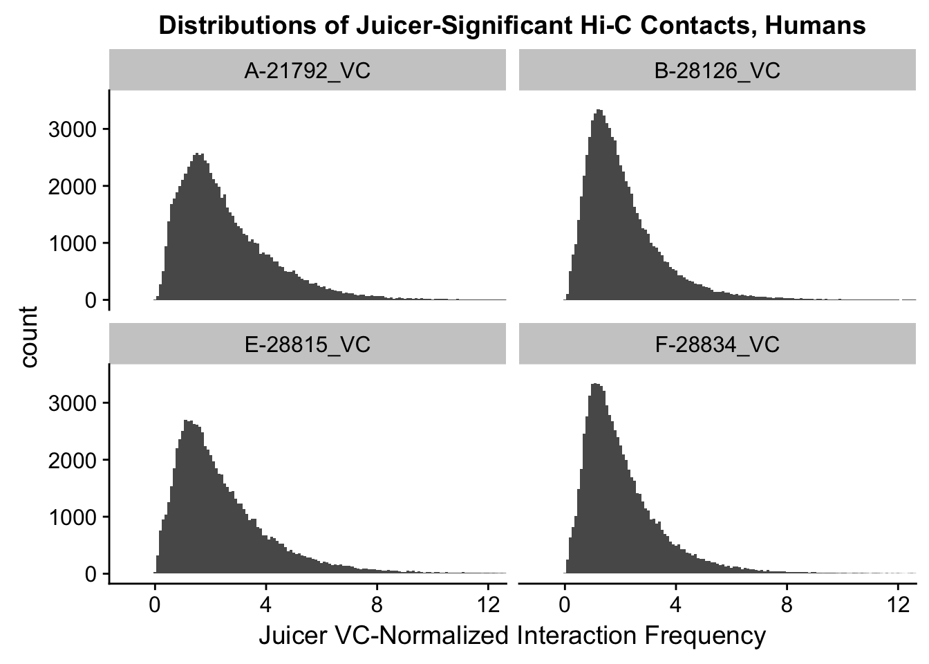
ggplot(data=VC.chimps, aes(x=value)) + geom_histogram(binwidth=0.1, aes(group=variable)) + facet_wrap(~as.factor(variable)) + ggtitle("Distributions of Juicer-Significant Hi-C Contacts, Chimps") + xlab("Juicer VC-Normalized Interaction Frequency") + coord_cartesian(xlim=c(-1, 12), ylim=c(0, 3500)) #Chimp Dist'ns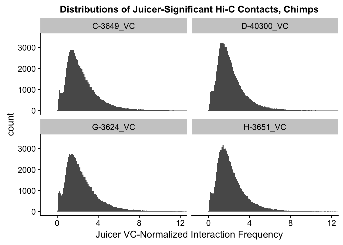
#Both sets of distributions look fairly bimodal, with chimps in particular showing a peak around 0.

###Now, the same thing for the KR-normalized interaction frequencies:
ggplot(data=KR.humans, aes(x=value)) + geom_histogram(binwidth=0.1, aes(group=variable)) + facet_wrap(~as.factor(variable)) + ggtitle("Distributions of Juicer-Significant Hi-C Contacts, Humans") + xlab("Juicer KR-Normalized Interaction Frequency") + coord_cartesian(xlim=c(-1, 12), ylim=c(0, 1500)) #Human dist'ns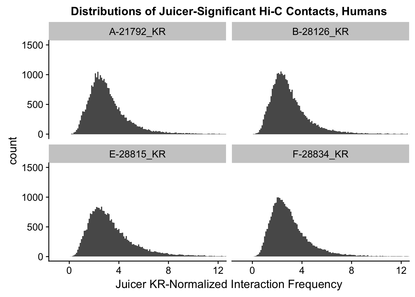
ggplot(data=KR.chimps, aes(x=value)) + geom_histogram(binwidth=0.1, aes(group=variable)) + facet_wrap(~as.factor(variable)) + ggtitle("Distributions of Juicer-Significant Hi-C Contacts, Chimps") + xlab("Juicer KR-Normalized Interaction Frequency") + coord_cartesian(xlim=c(-1, 12), ylim=c(0, 1500)) #Chimp Dist'ns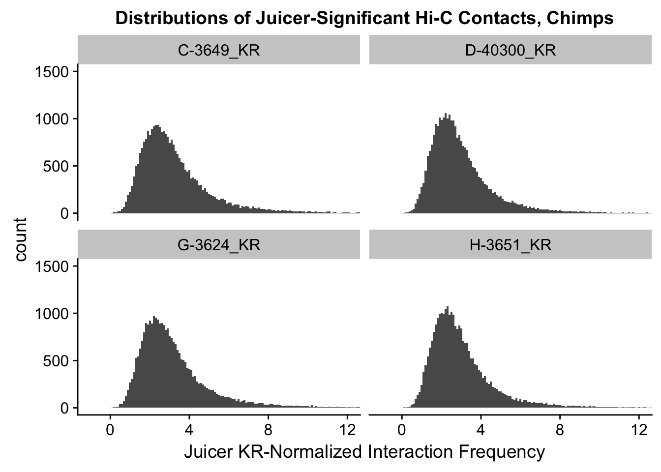
#There is no longer a good case for not normalizing in a pairwise cyclic loess fashion, especially now that I have clustering working on both types of normalization--just use what we have from here on out.

######PiCKUP HERE and see if I then slotted these pairwise cyclic loess back into the full DF in the other paradigm. I did indeed slot things into the data frame again in the other context, but here it must be two separate DFs--one for KR and one for VC, as the significant hits differ b/t these normalization schemes anyway.
full.KR[,112:119] <- full.contacts.KR
full.VC[,112:119] <- full.contacts.VC

###As an initial quality control metric, take a look at the mean vs. variance plot for the normalized data--first for KR, then for VC. Also go ahead and add on columns for mean frequencies and variances both within and across the species, while they're being calculated here anyway:

#KR:
select(full.KR, "A-21792_KR", "B-28126_KR", "E-28815_KR", "F-28834_KR") %>% apply(., 1, mean) -> full.KR$Hmean
select(full.KR, "C-3649_KR", "D-40300_KR", "G-3624_KR", "H-3651_KR") %>% apply(., 1, mean) -> full.KR$Cmean
select(full.KR, "A-21792_KR", "B-28126_KR", "E-28815_KR", "F-28834_KR", "C-3649_KR", "D-40300_KR", "G-3624_KR", "H-3651_KR") %>% apply(., 1, mean) -> full.KR$ALLmean #Get means across species.
select(full.KR, "A-21792_KR", "B-28126_KR", "E-28815_KR", "F-28834_KR") %>% apply(., 1, var) -> full.KR$Hvar #Get human variances.
select(full.KR, "C-3649_KR", "D-40300_KR", "G-3624_KR", "H-3651_KR") %>% apply(., 1, var) -> full.KR$Cvar #Get chimp variances.
select(full.KR, "A-21792_KR", "B-28126_KR", "E-28815_KR", "F-28834_KR", "C-3649_KR", "D-40300_KR", "G-3624_KR", "H-3651_KR") %>% apply(., 1, var) -> full.KR$ALLvar #Get variance across species.
{plot(full.KR$ALLmean, full.KR$ALLvar, main="Mean vs. Variance in Juicer KR contact frequency", xlab="Mean Hi-C Contact Frequency", ylab="Variance in Hi-C Contact Frequency")
  abline(lm(full.KR$ALLmean~full.KR$ALLvar), col="red")}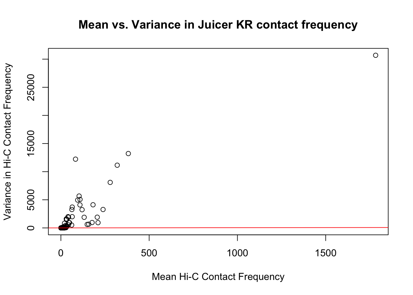
#Very flat line of the regression. Solid looking.

#VC:
select(full.VC, "A-21792_VC", "B-28126_VC", "E-28815_VC", "F-28834_VC") %>% apply(., 1, mean) -> full.VC$Hmean
select(full.VC, "C-3649_VC", "D-40300_VC", "G-3624_VC", "H-3651_VC") %>% apply(., 1, mean) -> full.VC$Cmean
select(full.VC, "A-21792_VC", "B-28126_VC", "E-28815_VC", "F-28834_VC", "C-3649_VC", "D-40300_VC", "G-3624_VC", "H-3651_VC") %>% apply(., 1, mean) -> full.VC$ALLmean #Get means across species.
select(full.VC, "A-21792_VC", "B-28126_VC", "E-28815_VC", "F-28834_VC") %>% apply(., 1, var) -> full.VC$Hvar #Get human variances.
select(full.VC, "C-3649_VC", "D-40300_VC", "G-3624_VC", "H-3651_VC") %>% apply(., 1, var) -> full.VC$Cvar #Get chimp variances.
select(full.VC, "A-21792_VC", "B-28126_VC", "E-28815_VC", "F-28834_VC", "C-3649_VC", "D-40300_VC", "G-3624_VC", "H-3651_VC") %>% apply(., 1, var) -> full.VC$ALLvar #Get variance across species.
{plot(full.VC$ALLmean, full.VC$ALLvar, main="Mean vs. Variance in Juicer VC contact frequency", xlab="Mean Hi-C Contact Frequency", ylab="Variance in Hi-C Contact Frequency")
  abline(lm(full.VC$ALLmean~full.VC$ALLvar), col="red")}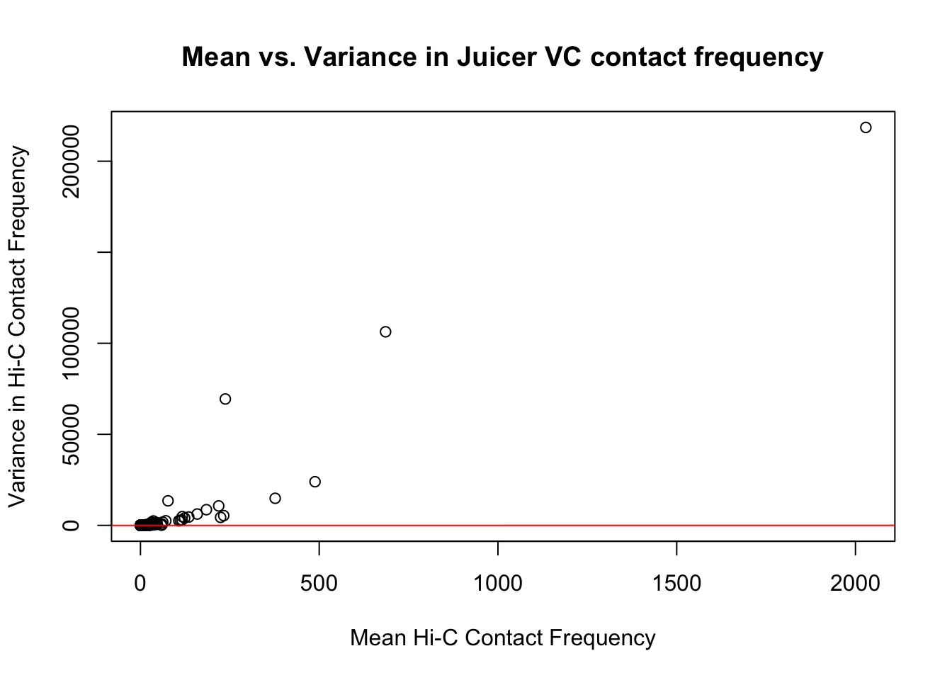
#Very flat line of the regression. Solid looking.On the whole, the distributions look fairly comparable across individuals and species, and the mean vs. variance plots show weak correlation at best between the two metrics. Now knowing the data are comparable in this sense, the next question would be whether they are different enough between the species to separate them from one another with unsupervised clustering and PCA methods.
Data clustering with Principal Components Analysis (PCA) and correlation heatmap clustering.
Now I use PCA, breaking down the interaction frequency values into principal components that best represent the variability within the data. This technique uses orthogonal transformation to convert the many dimensions in variability of this dataset into a lower-dimensional picture that can be used to separate out functional groups in the data. In this case, the expectation is that the strongest principal component, representing the plurality of the variance, will separate out humans and chimps along its axis, grouping the two species independently, as we expect their interaction frequency values to cluster together. I then also compute pairwise pearson correlations between each of the individuals across all Hi-C contacts, and use unsupervised hierarchical clustering to create a heatmap that once again will group individuals based on similarity in interaction frequency values. Again, I would expect this technique to separate out the species very distinctly from one another.
###Now do principal components analysis (PCA) on these data to see how they separate:
meta.data <- data.frame("SP"=c("H", "H", "C", "C", "H", "H", "C", "C"), "SX"=c("F", "M", "M", "F", "M", "F", "M", "F"), "Batch"=c(1, 1, 1, 1, 2, 2, 2, 2)) #need the metadata first to make this interesting; obtain this information from my study design
pca <- prcomp(t(full.contacts.KR), scale=TRUE, center=TRUE)
pca2 <- prcomp(t(full.contacts.VC), scale=TRUE, center=TRUE)
ggplot(data=as.data.frame(pca$x), aes(x=PC1, y=PC2, shape=as.factor(meta.data$SP), color=as.factor(meta.data$Batch), size=2)) + geom_point() +labs(title="PCA on KR normalized Hi-C Contact Frequency") + guides(color=guide_legend(order=1), size=FALSE, shape=guide_legend(order=2)) + xlab(paste("PC1 (", 100*summary(pca)$importance[2,1], "% of variance)")) + ylab((paste("PC2 (", 100*summary(pca)$importance[2,2], "% of variance)"))) + labs(color="Batch", shape="Species") + scale_shape_manual(labels=c("Chimp", "Human"), values=c(16, 17))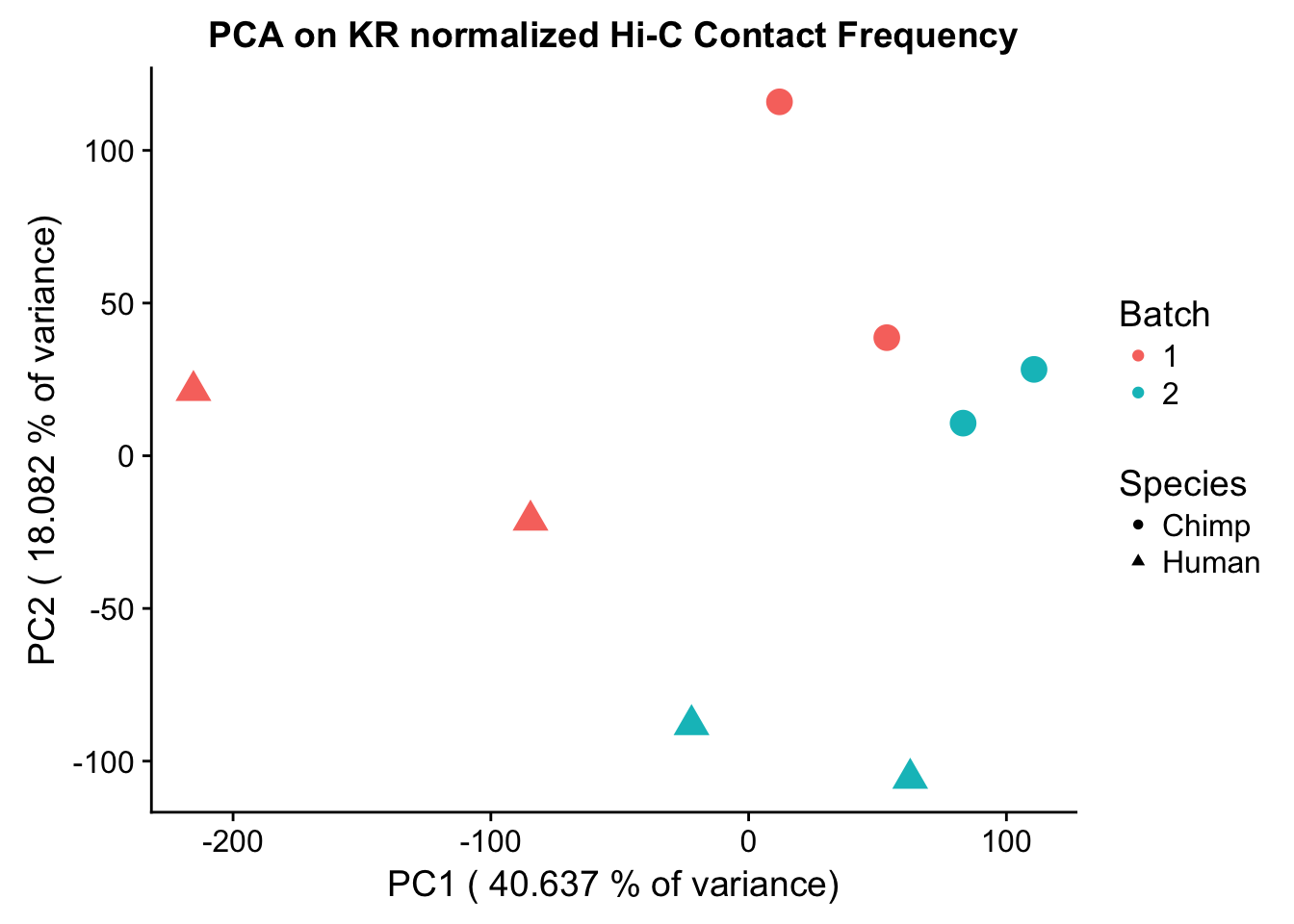
barplot(summary(pca)$importance[2,], xlab="PCs", ylab="Proportion of Variance Explained", main="PCA on KR normalized Hi-C contact frequency") #Scree plot showing all the PCs and the proportion of the variance they explain.
ggplot(data=as.data.frame(pca2$x), aes(x=PC1, y=PC2, shape=as.factor(meta.data$SP), color=as.factor(meta.data$Batch), size=2)) + geom_point() +labs(title="PCA on VC normalized Hi-C Contact Frequency") + guides(color=guide_legend(order=1), size=FALSE, shape=guide_legend(order=2)) + xlab(paste("PC1 (", 100*summary(pca)$importance[2,1], "% of variance)")) + ylab((paste("PC2 (", 100*summary(pca)$importance[2,2], "% of variance)"))) + labs(color="Batch", shape="Species") + scale_shape_manual(labels=c("Chimp", "Human"), values=c(16, 17))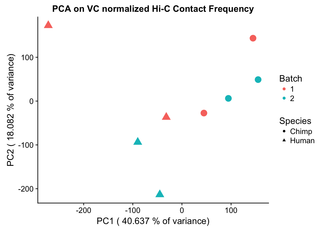
barplot(summary(pca2)$importance[2,], xlab="PCs", ylab="Proportion of Variance Explained", main="PCA on VC normalized Hi-C contact frequency")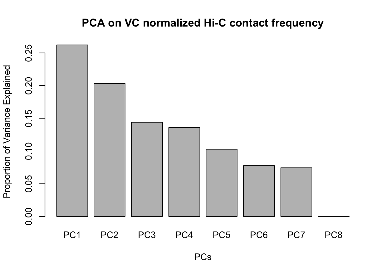
#Scree plotVariance exploration
Now I look at several metrics to assess variance in the data, checking which species hits were discovered as significant in and how many individuals a given hit was discovered in. I look at this to understand if there are some cutoffs that should be made to reduce the noisiness of the data and maximize the significance of further findings.
###Add columns to full.data to indicate species of discovery and number of individuals discovered in. These pieces of information are good to know about each of the hits generally, but can also be used to make decisions about filtering out certain classes of hits if variance is associated with any of these metrics.
humNAs <- rowSums(is.na(full.KR[,1:53])) #52 is when there is no human info. 13 NAs per individual.
chimpNAs <- rowSums(is.na(full.KR[,54:105])) #Same as above of course.
full.KR$found_in_H <- (4-humNAs/13) #Set a new column identifying number of humans hit was found in
full.KR$found_in_C <- (4-chimpNAs/13) #Set a new column identifying number of chimps hit was found in
full.KR$disc_species <- ifelse(full.KR$found_in_C>0&full.KR$found_in_H>0, "B", ifelse(full.KR$found_in_C==0, "H", "C")) #Set a column identifying which species (H, C, or Both) the hit in question was identified in. Works with nested ifelses.
full.KR$tot_indiv_IDd <- full.KR$found_in_C+full.KR$found_in_H #Add a column specifying total number of individuals homer found the significant hit in.

###Take a look at what proportion of the significant hits were discovered in either of the species (or both of them).
sum(full.KR$disc_species=="H") #~9.5k
[1] 9526sum(full.KR$disc_species=="C") #~12k[1] 11916sum(full.KR$disc_species=="B") #~7k[1] 6736#This is reassuring, as similar numbers of discoveries in both species suggests comparable power for detection.
###Now I look at variance in interaction frequency as a function of the number of individuals in which a pair was independently called as significant. Essentially, I'm checking here to see if there is some kind of cutoff I should make for the significant hits--i.e., if the variance looks to drop off significantly after a hit is discovered in at least 2 individuals, this suggests possibly filtering out any hit only discovered in 1 individual.
myplot <- data.frame(disc_species=full.KR$disc_species, found_in_H=full.KR$found_in_H, found_in_C=full.KR$found_in_C, tot_indiv_IDd=full.KR$tot_indiv_IDd, Hvar=full.KR$Hvar, Cvar=full.KR$Cvar, ALLvar=full.KR$ALLvar)
ggplot(data=myplot, aes(group=tot_indiv_IDd, x=tot_indiv_IDd, y=ALLvar)) + geom_boxplot() + ggtitle("Number of Individuals a Hi-C Hit is Discovered in vs. Variance") + xlab("# Individuals where Hi-C contact called significant") + ylab("Variance in KR Interaction Frequency") + coord_cartesian(ylim=c(0, 10))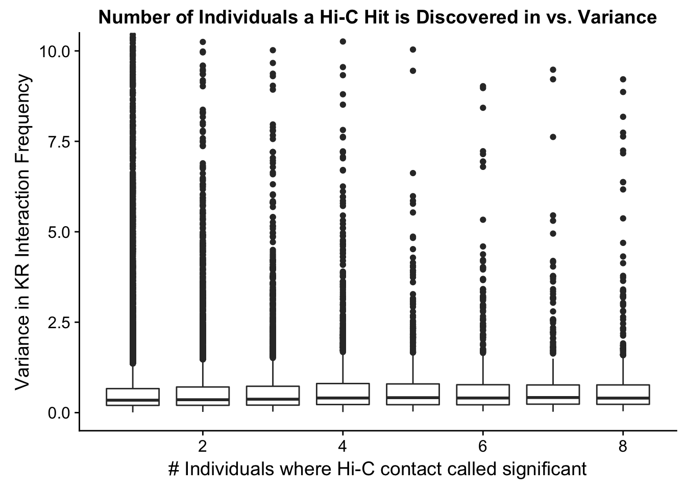
ggplot(data=myplot, aes(group=tot_indiv_IDd, x=tot_indiv_IDd, y=ALLvar)) + geom_boxplot() + scale_y_continuous(limits=c(0, 1)) + ggtitle("Number of Individuals a Hi-C Hit is Discovered in vs. Variance") + xlab("# Individuals where Hi-C contact called significant") + ylab("Variance in KR Interaction Frequency")Warning: Removed 4631 rows containing non-finite values (stat_boxplot).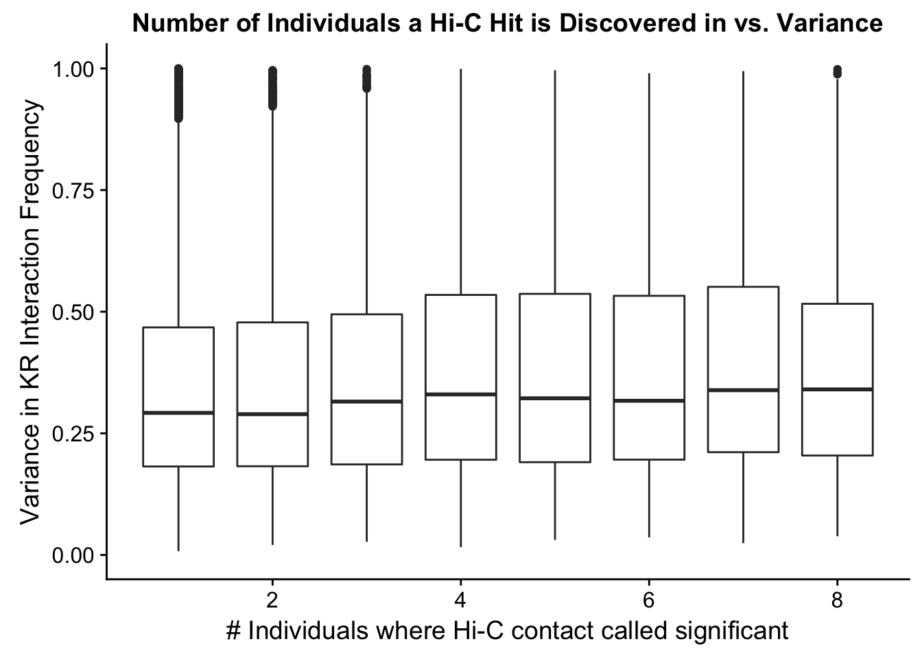
#There appears to be no clear trend here; simply decide to require a hit is discovered in at least 2 individuals to call it as biologically significant and not just technical nonsense? Do the same process for the VC data after this as well:
filt.KR <- filter(full.KR, tot_indiv_IDd>=2) #Brings us down from ~13k hits to only 4k hits though...


###EXACT same thing for VC data:
humNAs <- rowSums(is.na(full.VC[,1:53])) #52 is when there is no human info. 13 NAs per individual.
chimpNAs <- rowSums(is.na(full.VC[,54:105])) #Same as above of course.
full.VC$found_in_H <- (4-humNAs/13) #Set a new column identifying number of humans hit was found in
full.VC$found_in_C <- (4-chimpNAs/13) #Set a new column identifying number of chimps hit was found in
full.VC$disc_species <- ifelse(full.VC$found_in_C>0&full.VC$found_in_H>0, "B", ifelse(full.VC$found_in_C==0, "H", "C")) #Set a column identifying which species (H, C, or Both) the hit in question was identified in. Works with nested ifelses.
full.VC$tot_indiv_IDd <- full.VC$found_in_C+full.VC$found_in_H #Add a column specifying total number of individuals homer found the significant hit in.

###Take a look at what proportion of the significant hits were discovered in either of the species (or both of them).
sum(full.VC$disc_species=="H") #~56k
[1] 55851sum(full.VC$disc_species=="C") #~12k[1] 11718sum(full.VC$disc_species=="B") #~9k[1] 9228#This is the opposite of reassuring, as different numbers of discoveries in both species suggests incomparable power for detection...how is the coverage normalization making such a big difference here for humans?! I need to probably go back and look at my initial subsetting and significance calling and extraction again to make sure it's all right...
###Now I look at variance in interaction frequency as a function of the number of individuals in which a pair was independently called as significant. Essentially, I'm checking here to see if there is some kind of cutoff I should make for the significant hits--i.e., if the variance looks to drop off significantly after a hit is discovered in at least 2 individuals, this suggests possibly filtering out any hit only discovered in 1 individual.
myplot <- data.frame(disc_species=full.VC$disc_species, found_in_H=full.VC$found_in_H, found_in_C=full.VC$found_in_C, tot_indiv_IDd=full.VC$tot_indiv_IDd, Hvar=full.VC$Hvar, Cvar=full.VC$Cvar, ALLvar=full.VC$ALLvar)
ggplot(data=myplot, aes(group=tot_indiv_IDd, x=tot_indiv_IDd, y=ALLvar)) + geom_boxplot() + ggtitle("Number of Individuals a Hi-C Hit is Discovered in vs. Variance") + xlab("# Individuals where Hi-C contact called significant") + ylab("Variance in VC Interaction Frequency") + coord_cartesian(ylim=c(0, 10))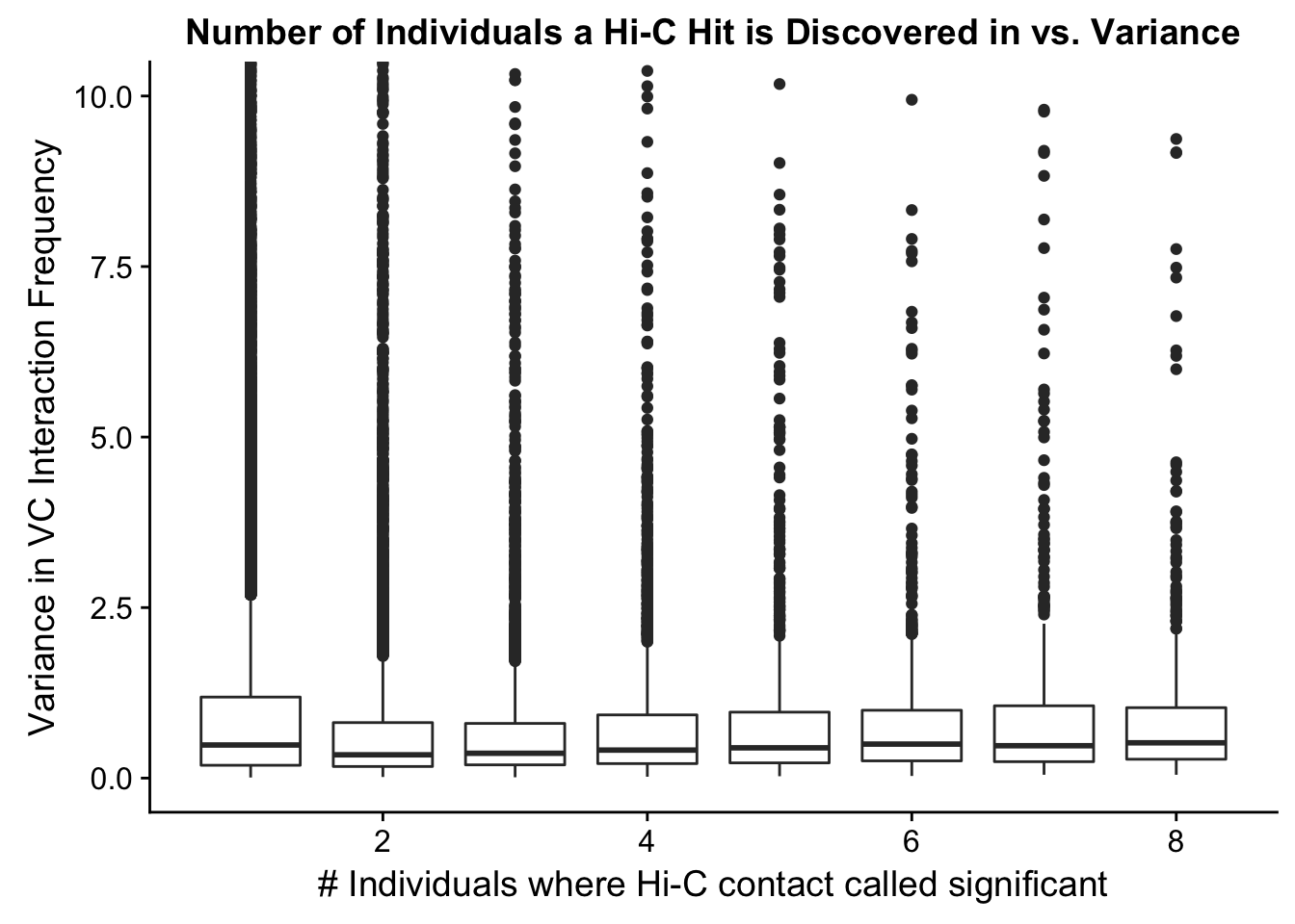
ggplot(data=myplot, aes(group=tot_indiv_IDd, x=tot_indiv_IDd, y=ALLvar)) + geom_boxplot() + scale_y_continuous(limits=c(0, 1)) + ggtitle("Number of Individuals a Hi-C Hit is Discovered in vs. Variance") + xlab("# Individuals where Hi-C contact called significant") + ylab("Variance in VC Interaction Frequency")Warning: Removed 21571 rows containing non-finite values (stat_boxplot).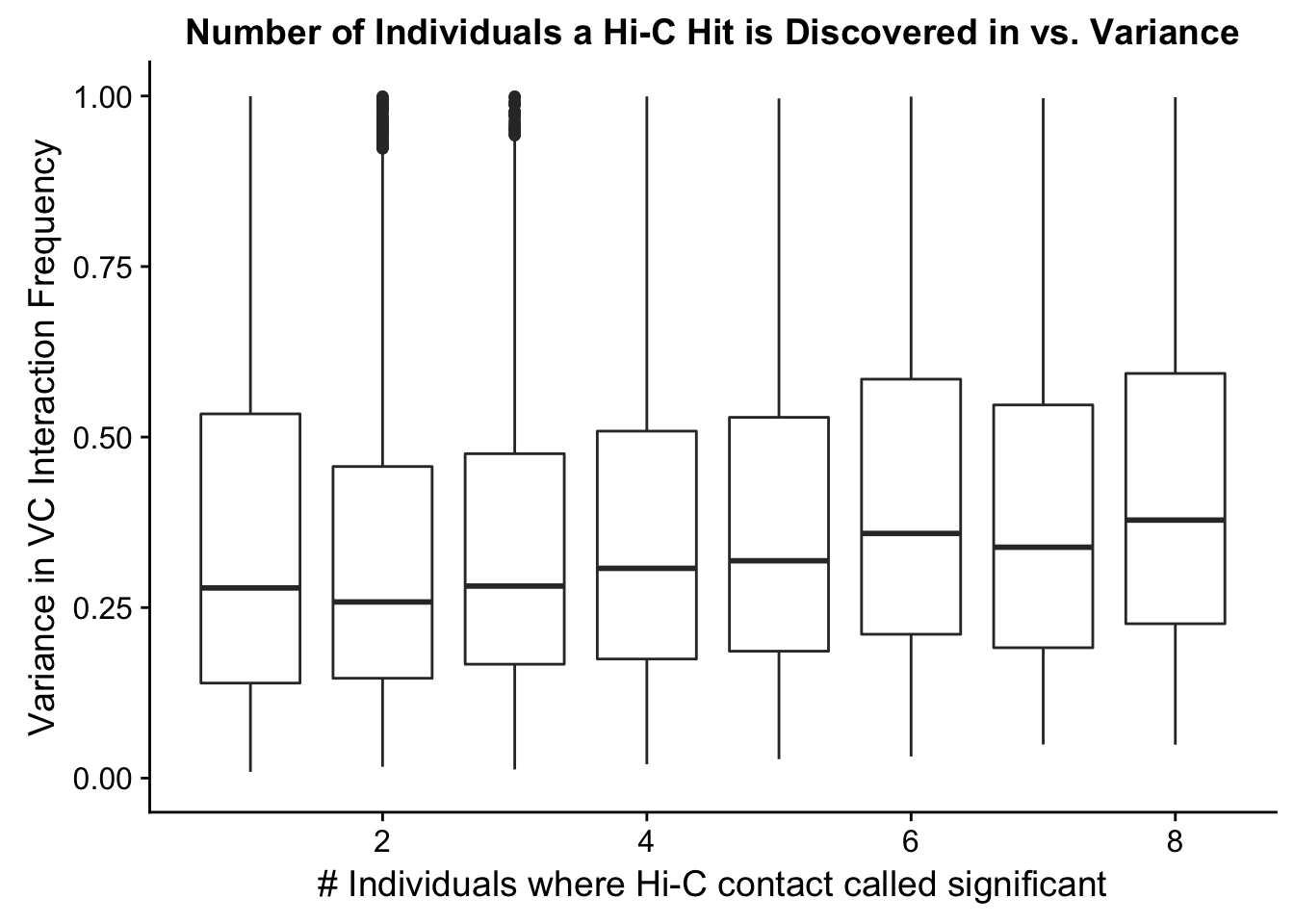
#There appears to be no clear trend here; simply decide to require a hit is discovered in at least 2 individuals to call it as biologically significant and not just technical nonsense?
filt.VC <- filter(full.VC, tot_indiv_IDd>=2) #Brings us down from ~13k hits to only 4k hits though...


sum(filt.VC$disc_species=="H") #~4k
[1] 3991sum(filt.VC$disc_species=="C") #~2.5k[1] 2448sum(filt.VC$disc_species=="B") #~9k[1] 9228sum(filt.KR$disc_species=="H") #~56k[1] 2136sum(filt.KR$disc_species=="C") #~12k[1] 2824sum(filt.KR$disc_species=="B") #~9k[1] 6736###Take one last look at the new distributions after doing the filtering, just to see what they look like, and also take a look at the PCA and hierarchical clustering, just for reference (don't really think it matters at this point?):
VC.humans <- melt(filt.VC[,c(112:113, 116:117)])No id variables; using all as measure variablesVC.chimps <- melt(filt.VC[,c(114:115, 118:119)])No id variables; using all as measure variablesKR.humans <- melt(filt.KR[,c(112:113, 116:117)])No id variables; using all as measure variablesKR.chimps <- melt(filt.KR[,c(114:115, 118:119)])No id variables; using all as measure variables#VC-normalized distributions:
ggplot(data=VC.humans, aes(x=value)) + geom_histogram(binwidth=0.1, aes(group=variable)) + facet_wrap(~as.factor(variable)) + ggtitle("Distributions of Juicer-Significant Hi-C Contacts, Humans") + xlab("Juicer VC-Normalized Interaction Frequency") + coord_cartesian(xlim=c(-1, 12), ylim=c(0, 750)) #Human dist'ns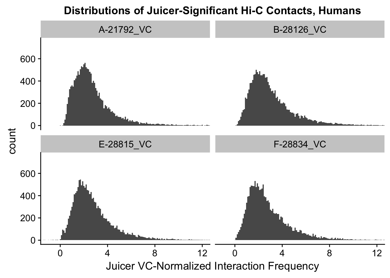
ggplot(data=VC.chimps, aes(x=value)) + geom_histogram(binwidth=0.1, aes(group=variable)) + facet_wrap(~as.factor(variable)) + ggtitle("Distributions of Juicer-Significant Hi-C Contacts, Chimps") + xlab("Juicer VC-Normalized Interaction Frequency") + coord_cartesian(xlim=c(-1, 12), ylim=c(0, 750)) #Chimp Dist'ns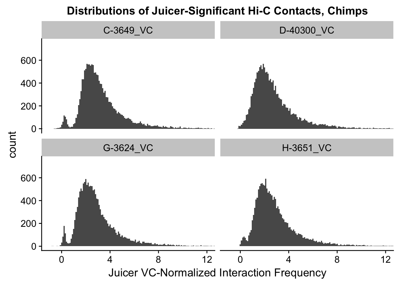
#Both sets of distributions look fairly bimodal, with chimps in particular showing a peak around 0.

###Now, the same thing for the KR-normalized interaction frequencies:
ggplot(data=KR.humans, aes(x=value)) + geom_histogram(binwidth=0.1, aes(group=variable)) + facet_wrap(~as.factor(variable)) + ggtitle("Distributions of Juicer-Significant Hi-C Contacts, Humans") + xlab("Juicer KR-Normalized Interaction Frequency") + coord_cartesian(xlim=c(-1, 12), ylim=c(0, 500)) #Human dist'ns
ggplot(data=KR.chimps, aes(x=value)) + geom_histogram(binwidth=0.1, aes(group=variable)) + facet_wrap(~as.factor(variable)) + ggtitle("Distributions of Juicer-Significant Hi-C Contacts, Chimps") + xlab("Juicer KR-Normalized Interaction Frequency") + coord_cartesian(xlim=c(-1, 12), ylim=c(0, 500)) #Chimp Dist'ns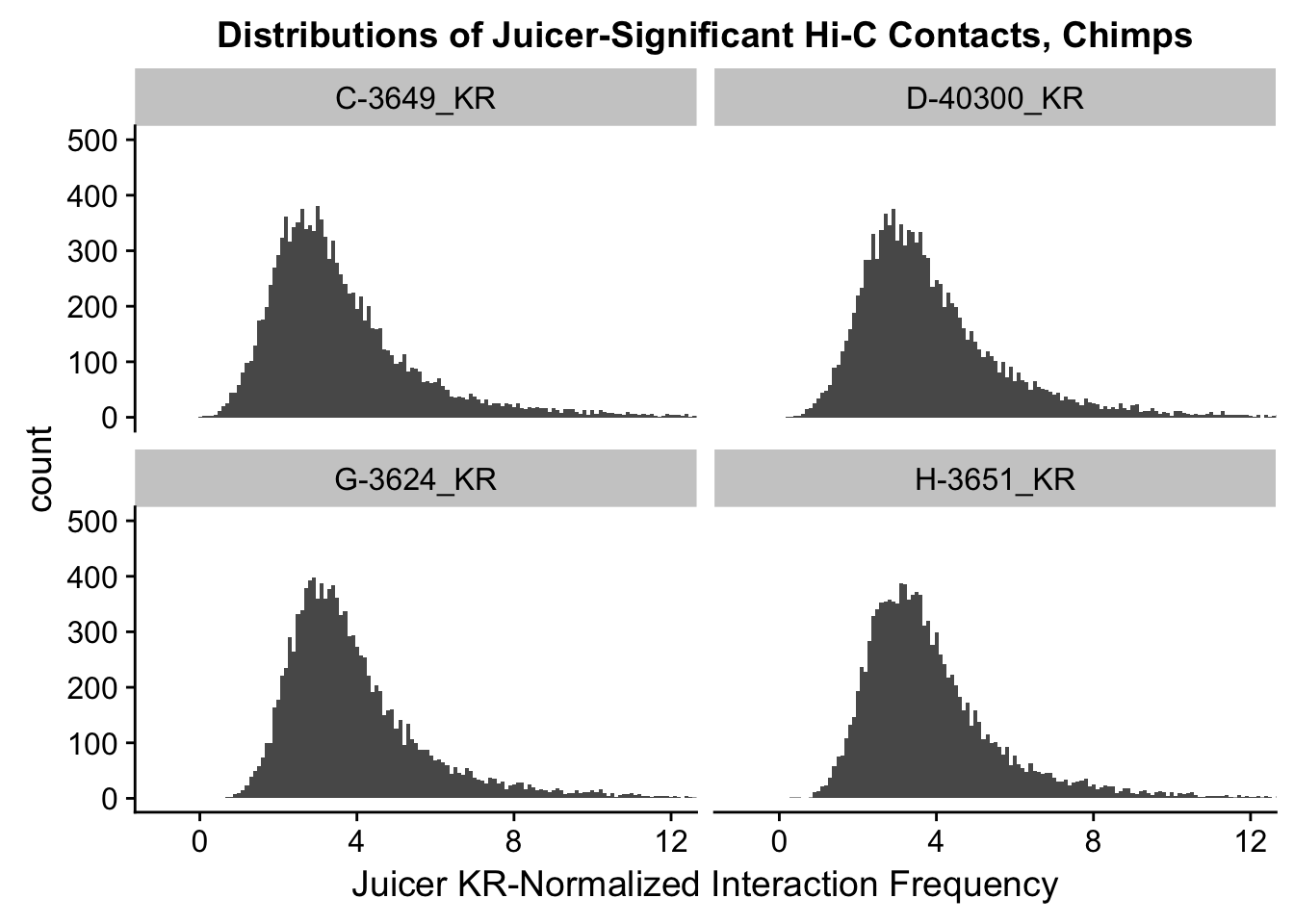
####Check on clustering and PCA now:
corheat <- cor(filt.KR[,112:119], use="complete.obs", method="pearson") #Corheat for the full data set, and heatmap. Pearson clusters poorly.
corheats <- cor(filt.KR[,112:119], use="complete.obs", method="spearman")
colnames(corheat) <- c("A_HF", "B_HM", "C_CM", "D_CF", "E_HM", "F_HF", "G_CM", "H_CF")
rownames(corheat) <- colnames(corheat)
colnames(corheats) <- colnames(corheat)
rownames(corheats) <- colnames(corheat)

#KR Clustering
heatmaply(corheat, main="Pairwise Pearson Correlation @ 10kb", k_row=2, k_col=2, symm=TRUE, margins=c(50, 50, 30, 30)) #Clusters poorly, but at least species groups are maintained!
We recommend that you use the dev version of ggplot2 with `ggplotly()`
Install it with: `devtools::install_github('hadley/ggplot2')`We recommend that you use the dev version of ggplot2 with `ggplotly()`
Install it with: `devtools::install_github('hadley/ggplot2')`
We recommend that you use the dev version of ggplot2 with `ggplotly()`
Install it with: `devtools::install_github('hadley/ggplot2')`heatmaply(corheats, main="Pairwise Spearman Correlation @ 10kb", k_row=2, k_col=2, symm=TRUE, margins=c(50, 50, 30, 30)) #Clusters excellently!We recommend that you use the dev version of ggplot2 with `ggplotly()`
Install it with: `devtools::install_github('hadley/ggplot2')`
We recommend that you use the dev version of ggplot2 with `ggplotly()`
Install it with: `devtools::install_github('hadley/ggplot2')`
We recommend that you use the dev version of ggplot2 with `ggplotly()`
Install it with: `devtools::install_github('hadley/ggplot2')`#FOR KR, after filtering, Spearman holds up perfectly, Pearson has slight issues (dendrogram isn't right although larger groups clustered properly)
##Repeat for VC before looking at PCA on both:
corheat <- cor(filt.VC[,112:119], use="complete.obs", method="pearson") #Corheat for the full data set, and heatmap. Pearson clusters poorly.
corheats <- cor(filt.VC[,112:119], use="complete.obs", method="spearman")
colnames(corheat) <- c("A_HF", "B_HM", "C_CM", "D_CF", "E_HM", "F_HF", "G_CM", "H_CF")
rownames(corheat) <- colnames(corheat)
colnames(corheats) <- colnames(corheat)
rownames(corheats) <- colnames(corheat)
#KR Clustering
heatmaply(corheat, main="Pairwise Pearson Correlation @ 10kb", k_row=2, k_col=2, symm=TRUE, margins=c(50, 50, 30, 30)) #Clusters poorly, but at least species groups are maintained!We recommend that you use the dev version of ggplot2 with `ggplotly()`
Install it with: `devtools::install_github('hadley/ggplot2')`
We recommend that you use the dev version of ggplot2 with `ggplotly()`
Install it with: `devtools::install_github('hadley/ggplot2')`
We recommend that you use the dev version of ggplot2 with `ggplotly()`
Install it with: `devtools::install_github('hadley/ggplot2')`heatmaply(corheats, main="Pairwise Spearman Correlation @ 10kb", k_row=2, k_col=2, symm=TRUE, margins=c(50, 50, 30, 30)) #Clusters excellently!We recommend that you use the dev version of ggplot2 with `ggplotly()`
Install it with: `devtools::install_github('hadley/ggplot2')`
We recommend that you use the dev version of ggplot2 with `ggplotly()`
Install it with: `devtools::install_github('hadley/ggplot2')`
We recommend that you use the dev version of ggplot2 with `ggplotly()`
Install it with: `devtools::install_github('hadley/ggplot2')`#FOR VC as well, after filtering, Spearman holds up perfectly, Pearson has slight issues (dendrogram isn't right although larger groups clustered properly)
###PCA:
pca <- prcomp(t(filt.KR[,112:119]), scale=TRUE, center=TRUE)
pca2 <- prcomp(t(filt.VC[,112:119]), scale=TRUE, center=TRUE)
ggplot(data=as.data.frame(pca$x), aes(x=PC1, y=PC2, shape=as.factor(meta.data$SP), color=as.factor(meta.data$Batch), size=2)) + geom_point() +labs(title="PCA on KR normalized Hi-C Contact Frequency") + guides(color=guide_legend(order=1), size=FALSE, shape=guide_legend(order=2)) + xlab(paste("PC1 (", 100*summary(pca)$importance[2,1], "% of variance)")) + ylab((paste("PC2 (", 100*summary(pca)$importance[2,2], "% of variance)"))) + labs(color="Batch", shape="Species") + scale_shape_manual(labels=c("Chimp", "Human"), values=c(16, 17))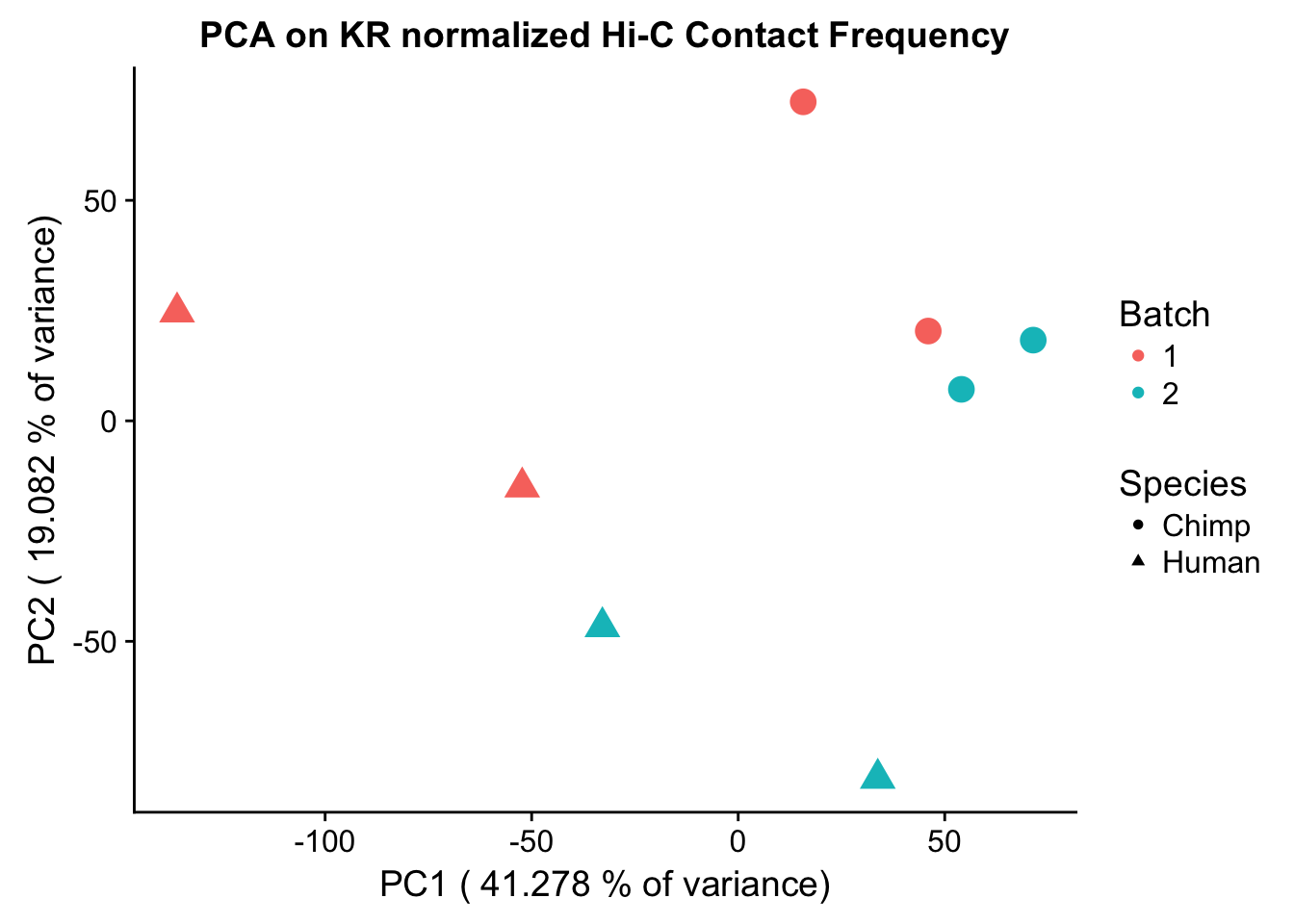
barplot(summary(pca)$importance[2,], xlab="PCs", ylab="Proportion of Variance Explained", main="PCA on KR normalized Hi-C contact frequency") #Scree plot showing all the PCs and the proportion of the variance they explain.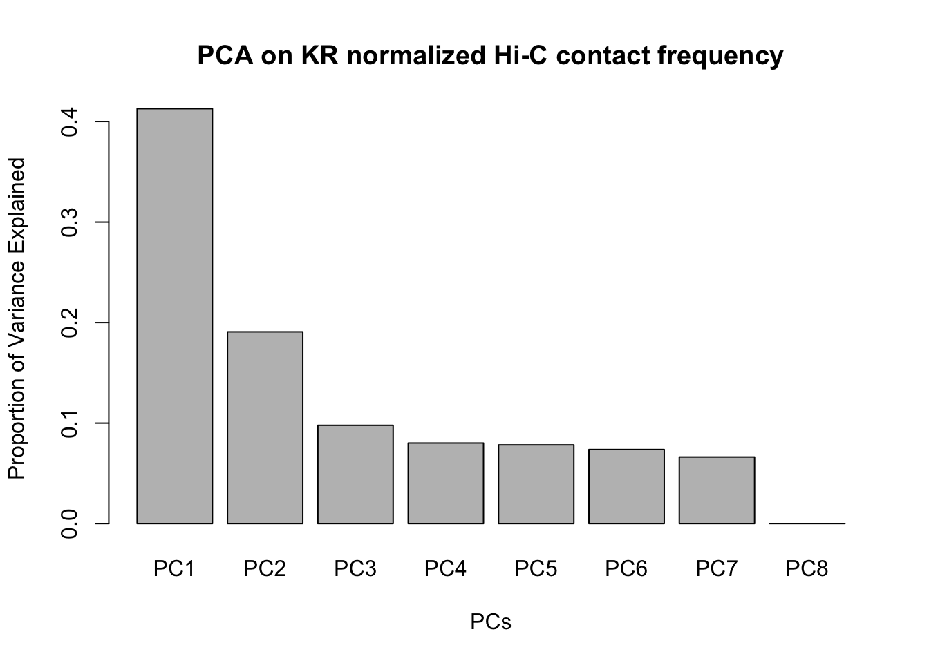
ggplot(data=as.data.frame(pca2$x), aes(x=PC1, y=PC2, shape=as.factor(meta.data$SP), color=as.factor(meta.data$Batch), size=2)) + geom_point() +labs(title="PCA on VC normalized Hi-C Contact Frequency") + guides(color=guide_legend(order=1), size=FALSE, shape=guide_legend(order=2)) + xlab(paste("PC1 (", 100*summary(pca)$importance[2,1], "% of variance)")) + ylab((paste("PC2 (", 100*summary(pca)$importance[2,2], "% of variance)"))) + labs(color="Batch", shape="Species") + scale_shape_manual(labels=c("Chimp", "Human"), values=c(16, 17))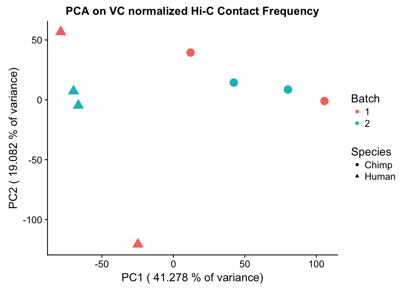
barplot(summary(pca2)$importance[2,], xlab="PCs", ylab="Proportion of Variance Explained", main="PCA on VC normalized Hi-C contact frequency")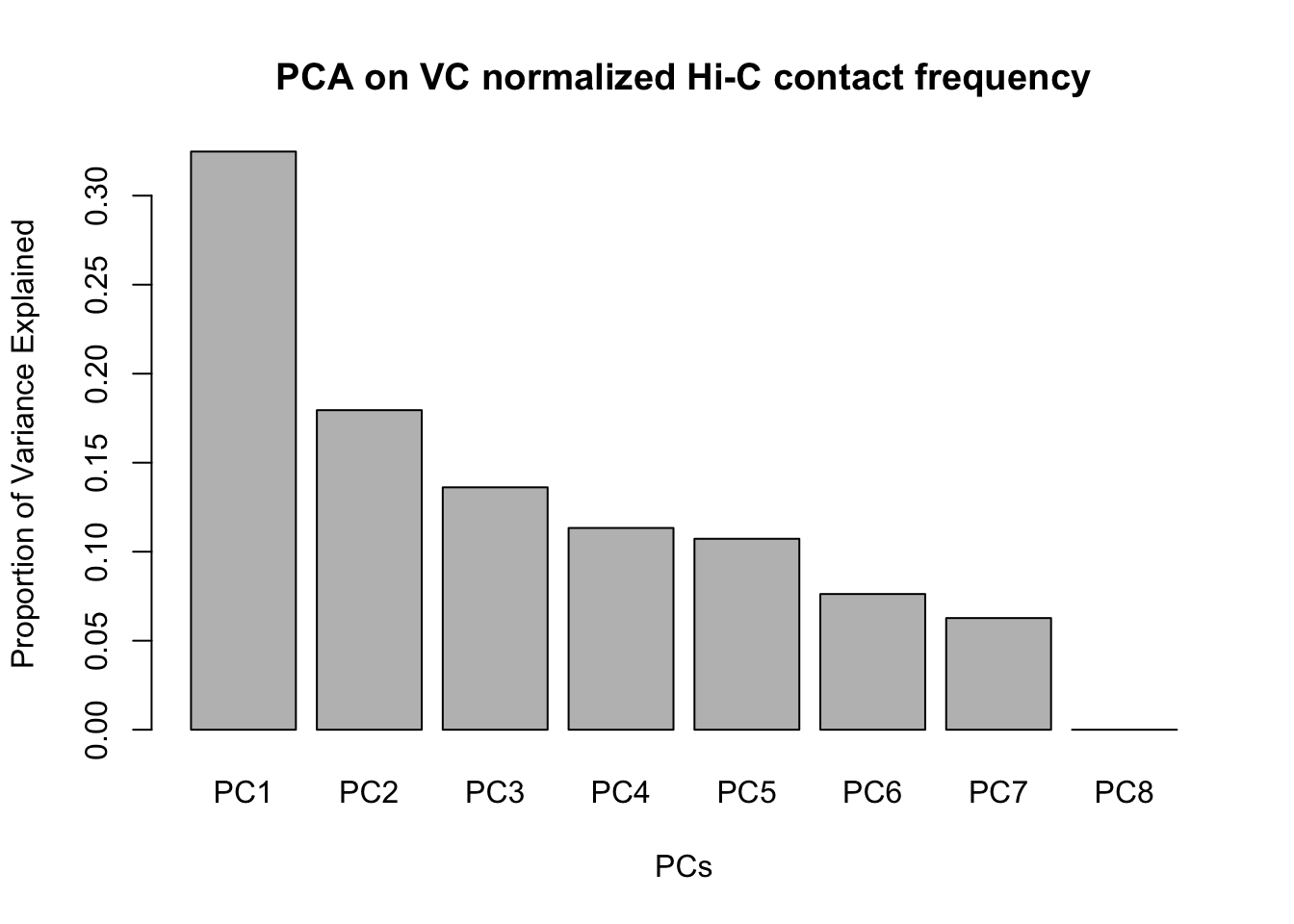
#Scree plot

#Ok, well nice to know. Now to write out files.

fwrite(filt.KR, "~/Desktop/Hi-C/juicer.filt.KR", quote = TRUE, sep = "\t", row.names = FALSE, col.names = TRUE, na="NA", showProgress = FALSE)
fwrite(filt.VC, "~/Desktop/Hi-C/juicer.filt.VC", quote=TRUE, sep="\t", row.names=FALSE, col.names=TRUE, na="NA", showProgress=FALSE)
Session information
sessionInfo()R version 3.4.0 (2017-04-21)
Platform: x86_64-apple-darwin15.6.0 (64-bit)
Running under: OS X El Capitan 10.11.6
Matrix products: default
BLAS: /Library/Frameworks/R.framework/Versions/3.4/Resources/lib/libRblas.0.dylib
LAPACK: /Library/Frameworks/R.framework/Versions/3.4/Resources/lib/libRlapack.dylib
locale:
[1] en_US.UTF-8/en_US.UTF-8/en_US.UTF-8/C/en_US.UTF-8/en_US.UTF-8
attached base packages:
[1] compiler stats graphics grDevices utils datasets methods
[8] base
other attached packages:
[1] bindrcpp_0.2 bedr_1.0.4 forcats_0.3.0
[4] purrr_0.2.4 readr_1.1.1 tibble_1.4.2
[7] tidyverse_1.2.1 edgeR_3.20.9 RColorBrewer_1.1-2
[10] heatmaply_0.14.1 viridis_0.5.0 viridisLite_0.3.0
[13] stringr_1.3.0 gplots_3.0.1 Hmisc_4.1-1
[16] Formula_1.2-2 survival_2.41-3 lattice_0.20-35
[19] dplyr_0.7.4 plotly_4.7.1 cowplot_0.9.3
[22] ggplot2_2.2.1 reshape2_1.4.3 data.table_1.10.4-3
[25] tidyr_0.8.0 plyr_1.8.4 limma_3.34.9
loaded via a namespace (and not attached):
[1] colorspace_1.3-2 class_7.3-14 modeltools_0.2-21
[4] mclust_5.4 rprojroot_1.3-2 htmlTable_1.11.2
[7] futile.logger_1.4.3 base64enc_0.1-3 rstudioapi_0.7
[10] flexmix_2.3-14 mvtnorm_1.0-7 lubridate_1.7.3
[13] xml2_1.2.0 R.methodsS3_1.7.1 codetools_0.2-15
[16] splines_3.4.0 mnormt_1.5-5 robustbase_0.92-8
[19] knitr_1.20 jsonlite_1.5 broom_0.4.3
[22] cluster_2.0.6 kernlab_0.9-25 R.oo_1.21.0
[25] shiny_1.0.5 httr_1.3.1 backports_1.1.2
[28] assertthat_0.2.0 Matrix_1.2-12 lazyeval_0.2.1
[31] cli_1.0.0 acepack_1.4.1 htmltools_0.3.6
[34] tools_3.4.0 gtable_0.2.0 glue_1.2.0
[37] Rcpp_0.12.16 cellranger_1.1.0 trimcluster_0.1-2
[40] gdata_2.18.0 nlme_3.1-131.1 crosstalk_1.0.0
[43] iterators_1.0.9 fpc_2.1-11 psych_1.7.8
[46] testthat_2.0.0 rvest_0.3.2 mime_0.5
[49] gtools_3.5.0 dendextend_1.7.0 DEoptimR_1.0-8
[52] MASS_7.3-49 scales_0.5.0 TSP_1.1-5
[55] hms_0.4.2 parallel_3.4.0 lambda.r_1.2
[58] yaml_2.1.18 gridExtra_2.3 rpart_4.1-13
[61] latticeExtra_0.6-28 stringi_1.1.7 gclus_1.3.1
[64] foreach_1.4.4 checkmate_1.8.5 seriation_1.2-3
[67] caTools_1.17.1 rlang_0.2.0 pkgconfig_2.0.1
[70] prabclus_2.2-6 bitops_1.0-6 evaluate_0.10.1
[73] bindr_0.1.1 labeling_0.3 htmlwidgets_1.0
[76] magrittr_1.5 R6_2.2.2 pillar_1.2.1
[79] haven_1.1.1 whisker_0.3-2 foreign_0.8-69
[82] nnet_7.3-12 modelr_0.1.1 crayon_1.3.4
[85] futile.options_1.0.0 KernSmooth_2.23-15 rmarkdown_1.9
[88] locfit_1.5-9.1 grid_3.4.0 readxl_1.0.0
[91] git2r_0.21.0 digest_0.6.15 diptest_0.75-7
[94] webshot_0.5.0 xtable_1.8-2 VennDiagram_1.6.19
[97] httpuv_1.3.6.2 R.utils_2.6.0 stats4_3.4.0
[100] munsell_0.4.3 registry_0.5 ###No longer used, just notes about the normalization scheme.
#full.contacts2 <- as.data.frame(normalizeCyclicLoess(VC.contacts, span=0.25, iterations=3, method="pairs")) #Good Spearman, poor Pearson (not even proper clustering)
#full.contacts3 <- as.data.frame(normalizeCyclicLoess(VC.contacts, span=0.29, iterations=3, method="pairs")) #Both terrible!
#full.contacts4 <- as.data.frame(normalizeCyclicLoess(VC.contacts, span=0.39, iterations=3, method="pairs")) #Spearman clusters properly but correlation values not great in terms of separation; Pearson just terrible and doesn't cluster right.
#full.contacts5 <- as.data.frame(normalizeCyclicLoess(VC.contacts, span=0.35, iterations=3, method="pairs")) #Both TERRIBUL
#full.contacts6 <- as.data.frame(normalizeCyclicLoess(VC.contacts, span=0.2, iterations=2, method="pairs")) #Gives the right clustering but not great correlations on Pearson. Same but a little better with Spearman.
#full.contacts7 <- as.data.frame(normalizeCyclicLoess(VC.contacts, span=0.3, iterations=1, method="pairs")) #Spearman decent but Pearson terrible.
#full.contacts8 <- as.data.frame(normalizeCyclicLoess(VC.contacts, span=0.333, iterations=5, method="pairs")) #Terrible!
#Normalization schemes
#KR.1 <- as.data.frame(normalizeCyclicLoess(KR.contacts, span=0.17, iterations=3, method="pairs"))
#KR.2 <- as.data.frame(normalizeCyclicLoess(KR.contacts, span=0.31, iterations=2, method="pairs"))
#VC.contacts <- as.data.frame(normalizeCyclicLoess(VC.contacts, span=0.31, iterations=3, method="pairs"))
# Kfull.contacts2 <- as.data.frame(normalizeCyclicLoess(KR.contacts, span=1/4, iterations=3, method="pairs")) #Awful Pearson, slightly worse than above Spearman.
# Kfull.contacts3 <- as.data.frame(normalizeCyclicLoess(KR.contacts, span=0.29, iterations=3, method="pairs")) #Terrible Pearson, middling Spearman.
# Kfull.contacts6 <- as.data.frame(normalizeCyclicLoess(KR.contacts, span=0.3, iterations=1, method="pairs")) #Terrible Pearson, solid Spearman.
# Kfull.contacts7 <- as.data.frame(normalizeCyclicLoess(KR.contacts, span=0.5, iterations=2, method="pairs"))
#
# for(myspan in seq(0.2, 0.25, 0.01)){
# iteration <- 2
# Kcontacts <- as.data.frame(normalizeCyclicLoess(KR.contacts, span=myspan, iterations=iteration, method="pairs"))
# corheat <- cor(Kcontacts, use="complete.obs", method="pearson")
# corheats <- cor(Kcontacts, use="complete.obs", method="spearman")
# colnames(corheat) <- c("A_HF", "B_HM", "C_CM", "D_CF", "E_HM", "F_HF", "G_CM", "H_CF")
# rownames(corheat) <- colnames(corheat)
# colnames(corheats) <- colnames(corheat)
# rownames(corheats) <- colnames(corheat)
# print(heatmaply(corheat, main=paste("Pearson, 10kb, ", myspan, " span, ", iteration, " iterations.", sep=""), k_row=2, k_col=2, symm=TRUE, margins=c(50, 50, 30, 30)))
# print(heatmaply(corheats, main=paste("Spearman, 10kb, ", myspan, " span, ", iteration, " iterations.", sep=""), k_row=2, k_col=2, symm=TRUE, margins=c(50, 50, 30, 30)))
# }This R Markdown site was created with workflowr