Hi-C Data Normalization and Initial Quality Control, Homer
Ittai Eres
2017-10-06
Last updated: 2018-09-28
Code version: d44d3bf
Homer QC Checks
First, I check some of the summary statistics produced on the libraries by homer, to see if the libraries are comparable across species. This includes distance between 5’ ends of the paired reads, to determine the Hi-C random genomic fragment size in the library, as well as distribution of paired end (PE) reads as a function of the distance between them. The only real point here is to ensure that there is no strong effect seen in either metric stratifying species.
#Read in pre-prepped tables of this information.
rand.frag <- fread("~/Desktop/Hi-C/homer_QCs/petag.Local.ALL.distn", header=TRUE, stringsAsFactors = FALSE, data.table=FALSE)
dist.distn <- fread("~/Desktop/Hi-C/homer_QCs/petag.Freq.ALL.distn", header=TRUE, stringsAsFactors = FALSE, data.table=FALSE)

#Create a huge long-form data frame of the same and opposite strand counts from each individual to place in a long-form dataframe for ggplot2 with the local distances and sample identities.
myfrags <- rbind(rand.frag[,2:3], rand.frag[,4:5], rand.frag[,6:7], rand.frag[,8:9], rand.frag[,10:11], rand.frag[,12:13], rand.frag[,14:15], rand.frag[,16:17])

fragdf <- data.frame(local_dist=rand.frag[,1], same=myfrags[,1], opposite=myfrags[,2], ID=c(rep("A_H", 20000), rep("B_H", 20000), rep("C_C", 20000), rep("D_C", 20000), rep("E_H", 20000), rep("F_H", 20000), rep("G_C", 20000), rep("H_C", 20000)))

ggplot(data=fragdf, aes(x=local_dist, group=ID)) + geom_line(aes(y=same, color=ID)) + ggtitle("Relationship b/t 5' ends of paired reads, same strand") + xlab("Local Distance from 5' of 1st read") + ylab("Counts per bp")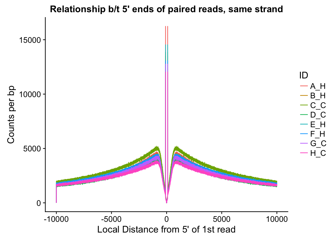
ggplot(data=fragdf, aes(x=local_dist, group=ID)) + geom_line(aes(y=opposite, color=ID)) + ggtitle("Relationship b/t 5' ends of paired reads, opposite strand") + xlab("Local Distance from 5' of 1st read") + ylab("Counts per bp")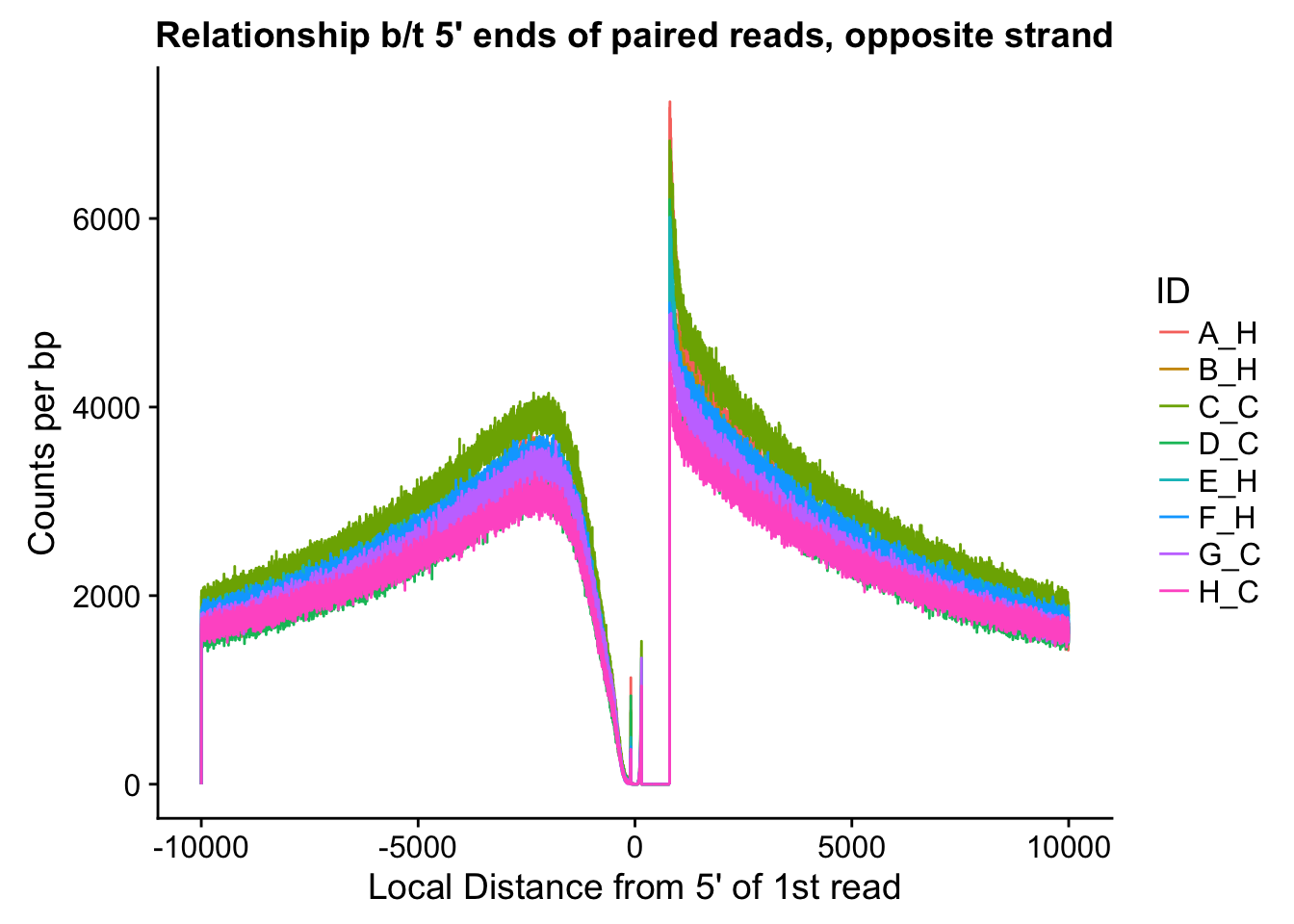
#Critically, there appears to be no clear separation between species here. If there is any effect, it would appear to be that of batch, but even this effect appears minor, and would likely be more related to total sequencing reads (batch 1 had the additional pooled lane) than to actual library prep differences.

#Rearrange data on fraction of reads from each library falling within a certain distance of one another so that it can be plotted for all individuals simultaneously in ggplot2.
dist.distn$`Distance between PE tags`[300001] <- 300000000
dist.distn$binID <- c(rep(seq(0, 299999000, 10000), each=10), 300000000)
colnames(dist.distn) <- c("distance", "A_H", "B_H", "C_C", "D_C", "E_H", "F_H", "G_C", "H_C", "binID")

#Group by to lump 10k together at a time.
group_by(dist.distn, binID) %>% summarise(A_H=sum(A_H), B_H=sum(B_H), C_C=sum(C_C), D_C=sum(D_C), E_H=sum(E_H), F_H=sum(F_H), G_C=sum(G_C), H_C=sum(H_C)) -> mydist

#Prepare long-form df of this information for plotting with ggplot.
distdf <- data.frame(dist=rep(mydist$binID, 8), fraction=c(mydist$A_H, mydist$B_H, mydist$C_C, mydist$D_C, mydist$E_H, mydist$F_H, mydist$G_C, mydist$H_C), ID=c(rep("A_H", 30001), rep("B_H", 30001), rep("C_C", 30001), rep("D_C", 30001), rep("E_H", 30001), rep("F_H", 30001), rep("G_C", 30001), rep("H_C", 30001)), species=c(rep("Human", 60002), rep("Chimpanzee", 60002), rep("Human", 60002), rep("Chimpanzee", 60002)))

#Now, plot out on several different distance scales to see if there is any strong species effect.
ggplot(data=distdf, aes(x=dist, group=ID)) + geom_line(aes(y=fraction, color=ID, linetype=species)) + coord_cartesian(xlim=c(0, 50000)) + xlab("Distance between mates") + ylab("Fraction of Hi-C PE reads") + ggtitle("Hi-C Pair Distance Distributions")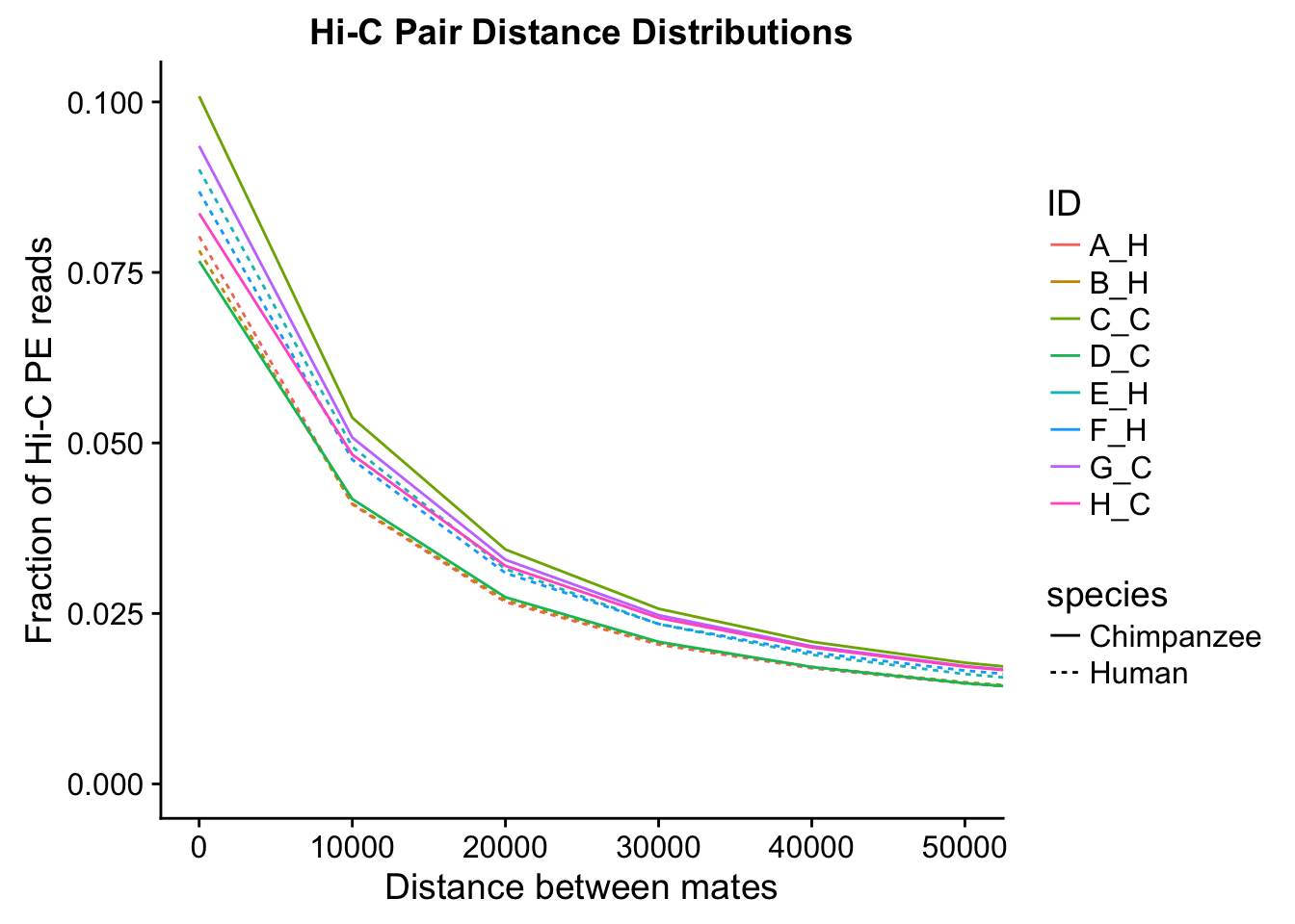
ggplot(data=distdf, aes(x=dist, group=ID)) + geom_line(aes(y=fraction, color=ID, linetype=species)) + coord_cartesian(xlim=c(0, 100000)) + xlab("Distance between mates") + ylab("Fraction of Hi-C PE reads") + ggtitle("Hi-C Pair Distance Distributions")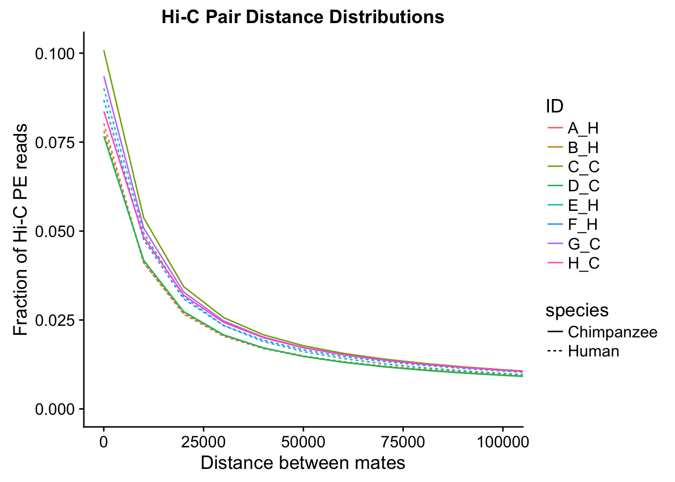
ggplot(data=distdf, aes(x=dist, group=ID)) + geom_line(aes(y=fraction, color=ID, linetype=species)) + coord_cartesian(xlim=c(0, 500000)) + xlab("Distance between mates") + ylab("Fraction of Hi-C PE reads") + ggtitle("Hi-C Pair Distance Distributions")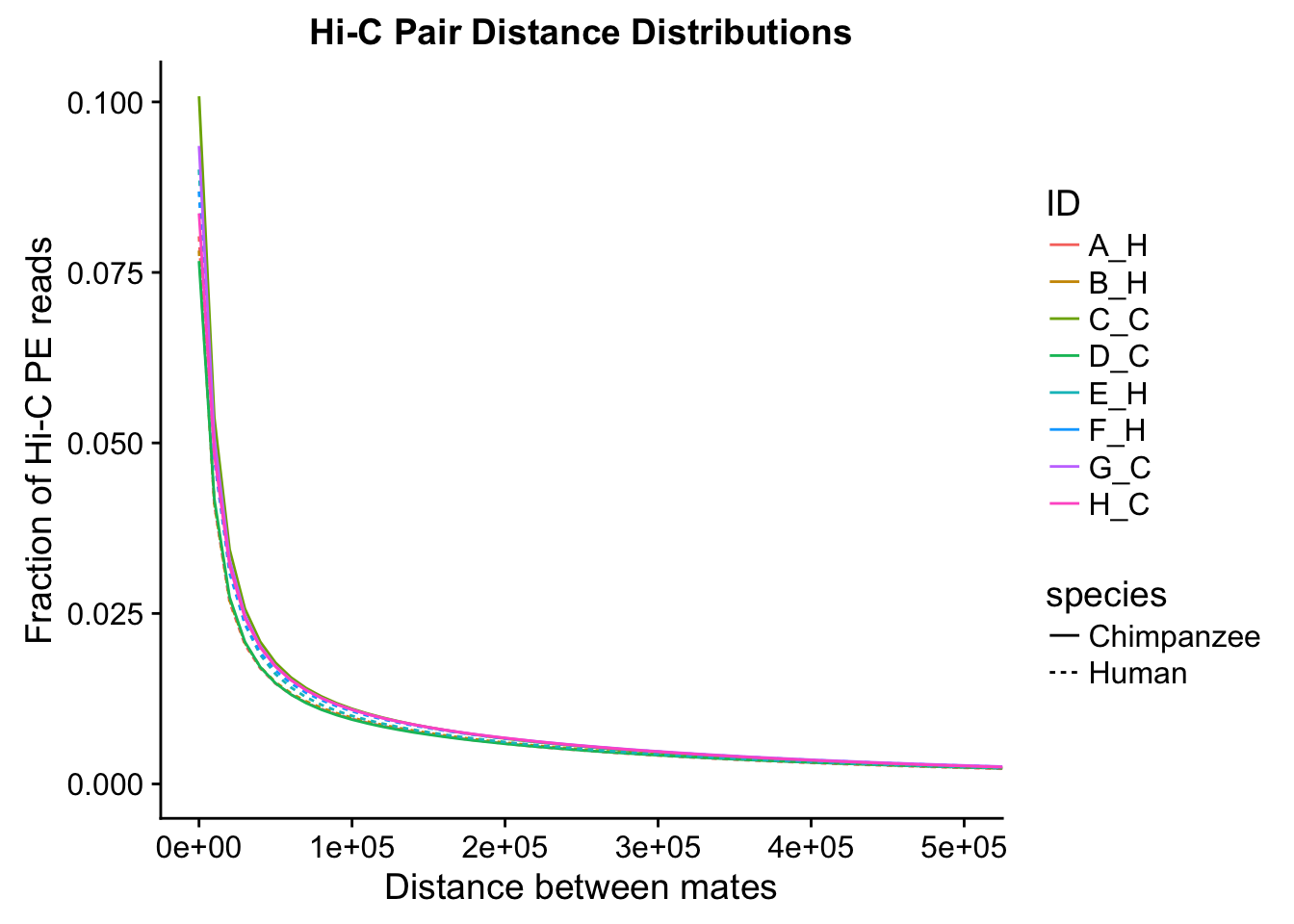
#Once again, there appears to be no clear separation between species here. There doesn't even appear to be a batch effect!From these quality control checks we can infer that the libraries are comparable across species, as neither of these basic metrics for Hi-C library quality differs significantly between the species.
Initial Data read-in and quality control
First, I read in the data and normalize it with cyclic pairwise loess normalization. Then I look at histograms of the distributions of the contact frequencies on an individual-by-individual basis, to see if they are comparable. I also look at a plot of the mean vs. the variance as an additional quality control metric; this is typically done on RNA-seq count data. In that case, it’s done to check if the normalized data are distributed in a particular fashion (e.g. a poisson model would have a linear mean-variance relationship). In the limma/voom pipeline, count data are log-cpm transformed and a loess trend line of variance vs. mean is then fit to create weights for individual genes to be fed into linear modeling with limma. Since this is not a QC metric typically used for Hi-C data, the only thing I hope to see is no particularly strong relationship between variance and mean.
###Read in data, normalize it with cyclic loess (pairwise), clean it from any rows that have missing values.
full.data <- fread("~/Desktop/Hi-C/final.10kb.homer.df", header=TRUE, stringsAsFactors = FALSE, data.table=FALSE, showProgress = FALSE)
full.contacts <- full.data[complete.cases(full.data[,304:311]), 304:311]
full.contacts <- as.data.frame(normalizeCyclicLoess(full.contacts, span=1/4, iterations=3, method="pairs"))
full.data <- full.data[complete.cases(full.data[,304:311]),]
full.data[,304:311] <- full.contacts

###First, a quick look at histograms of the distributions of the significant Hi-C hits from homer, in both humans and chimps.
ggplot(data=melt(full.contacts[,c(1:2, 5:6)]), aes(x=value)) + geom_histogram(binwidth=0.0009, aes(group=variable)) + facet_wrap(~as.factor(variable)) + ggtitle("Distributions of Homer-Significant Hi-C Contacts, Humans") + xlab("Homer-Normalized Interaction Frequency") + coord_cartesian(xlim=c(-6.6, 6.6), ylim=c(0, 4500)) #Human Dist'ns
No id variables; using all as measure variables
ggplot(data=melt(full.contacts[,c(3:4, 7:8)]), aes(x=value)) + geom_histogram(binwidth=0.0009, aes(group=variable)) + facet_wrap(~as.factor(variable)) + ggtitle("Distributions of Homer-Significant Hi-C Contacts, Chimps") + xlab("Homer-Normalized Interaction Frequency") + coord_cartesian(xlim=c(-6.6, 6.6), ylim=c(0, 4500)) #Chimp Dist'nsNo id variables; using all as measure variables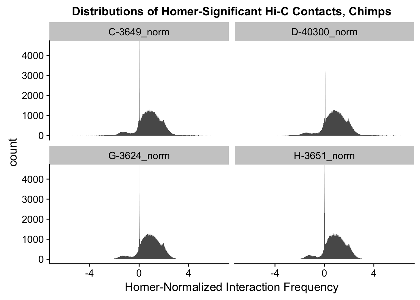
#Both sets of distributions look fairly bimodal, with chimps in particular showing a peak around 0.

###As an initial quality control metric, take a look at the mean vs. variance plot for the normalized data. Also go ahead and add on columns for mean frequencies and variances both within and across the species, while they're being calculated here anyway:
select(full.data, "A-21792_norm", "B-28126_norm", "E-28815_norm", "F-28834_norm") %>% apply(., 1, mean) -> full.data$Hmean
select(full.data, "C-3649_norm", "D-40300_norm", "G-3624_norm", "H-3651_norm") %>% apply(., 1, mean) -> full.data$Cmean
select(full.data, "A-21792_norm", "B-28126_norm", "E-28815_norm", "F-28834_norm", "C-3649_norm", "D-40300_norm", "G-3624_norm", "H-3651_norm") %>% apply(., 1, mean) -> full.data$ALLmean #Get means across species.
select(full.data, "A-21792_norm", "B-28126_norm", "E-28815_norm", "F-28834_norm") %>% apply(., 1, var) -> full.data$Hvar #Get human variances.
select(full.data, "C-3649_norm", "D-40300_norm", "G-3624_norm", "H-3651_norm") %>% apply(., 1, var) -> full.data$Cvar #Get chimp variances.
select(full.data, "A-21792_norm", "B-28126_norm", "E-28815_norm", "F-28834_norm", "C-3649_norm", "D-40300_norm", "G-3624_norm", "H-3651_norm") %>% apply(., 1, var) -> full.data$ALLvar #Get variance across species.
{plot(full.data$ALLmean, full.data$ALLvar, main="Mean vs. Variance in Homer-corrected contact frequency", xlab="Mean Hi-C Contact Frequency", ylab="Variance in Hi-C Contact Frequency")
  abline(lm(full.data$ALLmean~full.data$ALLvar), col="red")}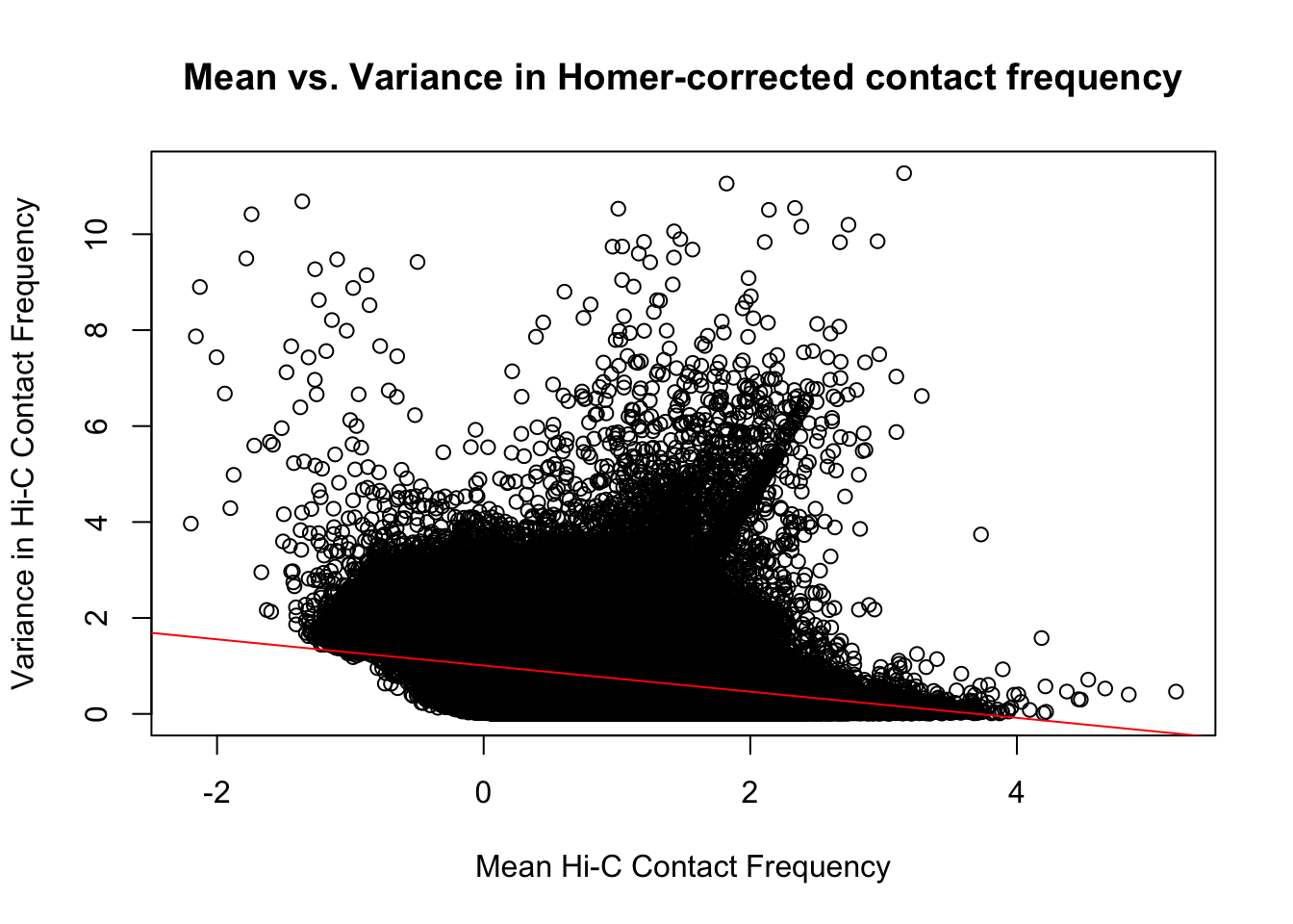
#Though there is a slight downward trend, on the whole, there is not a strong correlation between the contact frequency and the variance across individuals for it.On the whole, the distributions look fairly comparable across individuals and species, and the mean vs. variance plots show weak correlation at best between the two metrics. Now knowing the data are comparable in this sense, the next question would be whether they are different enough between the species to separate them from one another with unsupervised clustering and PCA methods.
Data clustering with Principal Components Analysis (PCA) and correlation heatmap clustering.
Now I use PCA, breaking down the interaction frequency values into principal components that best represent the variability within the data. This technique uses orthogonal transformation to convert the many dimensions in variability of this dataset into a lower-dimensional picture that can be used to separate out functional groups in the data. In this case, the expectation is that the strongest principal component, representing the plurality of the variance, will separate out humans and chimps along its axis, grouping the two species independently, as we expect their interaction frequency values to cluster together. I then also compute pairwise pearson correlations between each of the individuals across all Hi-C contacts, and use unsupervised hierarchical clustering to create a heatmap that once again will group individuals based on similarity in interaction frequency values. Again, I would expect this technique to separate out the species very distinctly from one another.
###Now do principal components analysis (PCA) on these data to see how they separate:
meta.data <- data.frame("SP"=c("H", "H", "C", "C", "H", "H", "C", "C"), "SX"=c("F", "M", "M", "F", "M", "F", "M", "F"), "Batch"=c(1, 1, 1, 1, 2, 2, 2, 2), "PE_reads"=c(1084472930, 1103077950, 1015696574, 1047650944, 980287418, 1037054332, 930089380, 964085606), "tags_per_BP"=c(0.351291, 0.357315, 0.342325, 0.353097, 0.317553, 0.335937, 0.313494, 0.324936), "inter_reads"=c(0.1825411, 0.1734168, 0.1559306, 0.2010798, 0.1711258, 0.1479523, 0.1604700, 0.1712287)) #need the metadata first to make this interesting; obtain some of this information from my study design and other parts of it from homer's outputs
pca <- prcomp(t(full.contacts), scale=TRUE, center=TRUE)
ggplot(data=as.data.frame(pca$x), aes(x=PC1, y=PC2, shape=as.factor(meta.data$SP), color=as.factor(meta.data$Batch), size=2)) + geom_point() +labs(title="PCA on normalized Hi-C Contact Frequency") + guides(color=guide_legend(order=1), size=FALSE, shape=guide_legend(order=2)) + xlab(paste("PC1 (", 100*summary(pca)$importance[2,1], "% of variance)")) + ylab((paste("PC2 (", 100*summary(pca)$importance[2,2], "% of variance)"))) + labs(color="Batch", shape="Species") + scale_shape_manual(labels=c("Chimp", "Human"), values=c(16, 17)) #PCA shows the species separating nicely along PC1, which explains the highest proportion of the variance (as seen from scree plot below). This is nice and suggests that there ARE true differences in the data between species we are likely to detect here. None of the other PCs correlate with the number of PE reads, the tags per base pair statistic, or the fraction of interchromosomal reads, all from the homer output (not shown).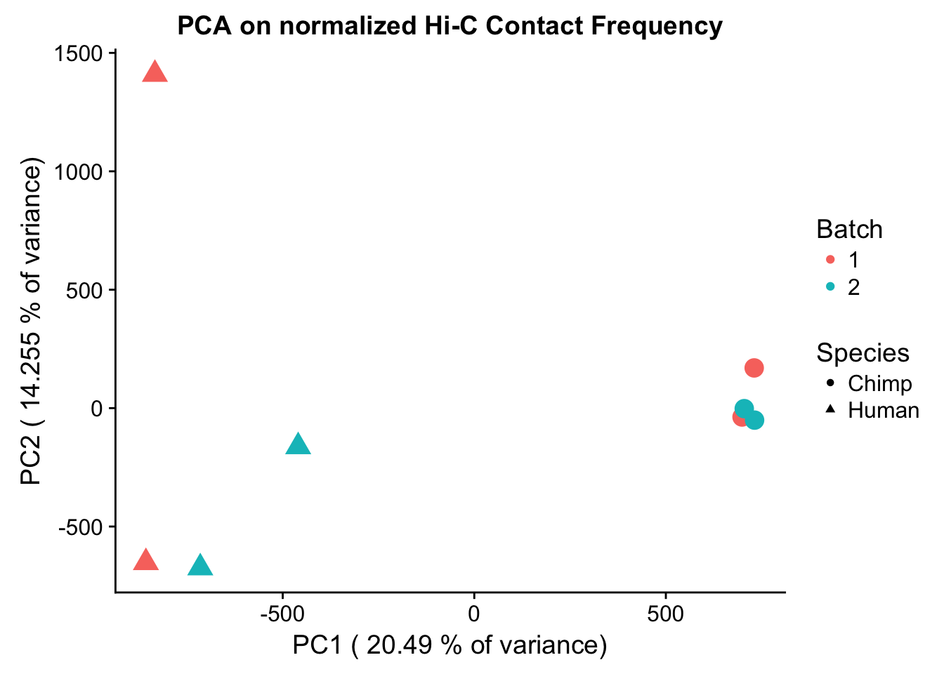
barplot(summary(pca)$importance[2,], xlab="PCs", ylab="Proportion of Variance Explained", main="PCA on normalized Hi-C contact frequency") #Scree plot showing all the PCs and the proportion of the variance they explain.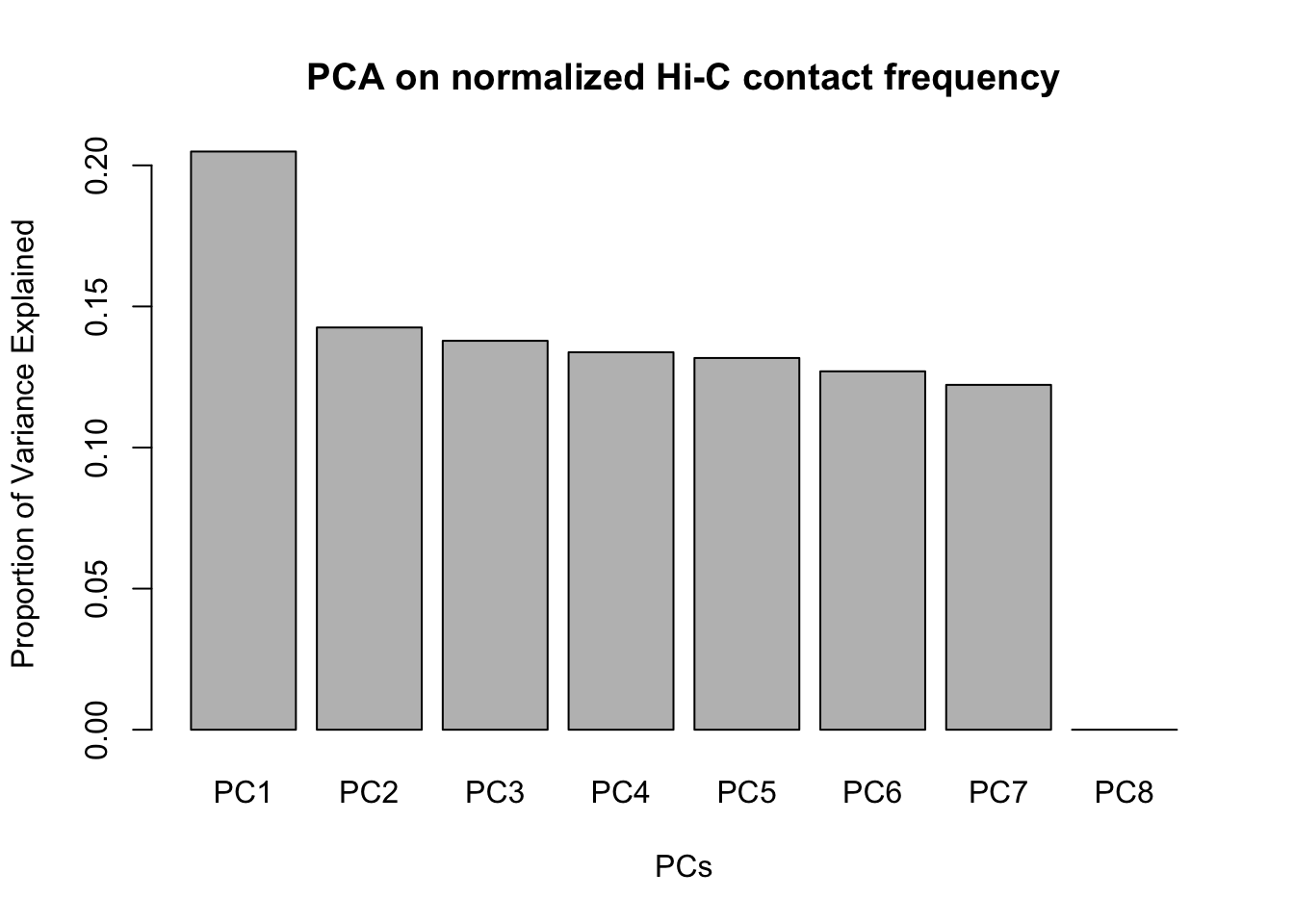
###Heatmap clustering of these data as another quality control metric:
corheat <- cor(full.contacts, use="complete.obs", method="pearson") #Corheat for the full data set, and heatmap
#colnames(corheat) <- c("A_HF", "B_HM", "C_CM", "D_CF", "E_HM", "F_HF", "G_CM", "H_CF")
colnames(corheat) <- c("H_F1", "H_M1", "C_M1", "C_F1", "H_M2", "H_F2", "C_M2", "C_F2") #Better for presentation
rownames(corheat) <- colnames(corheat)
heatmaply(corheat, main="Pairwise Pearson Correlation @ 10kb", k_row=2, k_col=2, symm=TRUE, margins=c(50, 50, 30, 30))
We recommend that you use the dev version of ggplot2 with `ggplotly()`
Install it with: `devtools::install_github('hadley/ggplot2')`
We recommend that you use the dev version of ggplot2 with `ggplotly()`
Install it with: `devtools::install_github('hadley/ggplot2')`
We recommend that you use the dev version of ggplot2 with `ggplotly()`
Install it with: `devtools::install_github('hadley/ggplot2')`#We can see that all the humans cluster together, as do all the chimps. This is very good, despite the fact that the correlations are fairly low.Variance exploration
Now I look at several metrics to assess variance in the data, checking which species hits were discovered as significant in and how many individuals a given hit was discovered in. I look at this to understand if there are some cutoffs that should be made to reduce the noisiness of the data and maximize the significance of further findings.
###Add columns to full.data to indicate species of discovery and number of individuals discovered in. These pieces of information are good to know about each of the hits generally, but can also be used to make decisions about filtering out certain classes of hits if variance is associated with any of these metrics.
humNAs <- rowSums(is.na(full.data[,1:149])) #148 is when there is no human info. 37 NAs per individual.
chimpNAs <- rowSums(is.na(full.data[,150:297])) #Same as above of course.
full.data$found_in_H <- (4-humNAs/37) #Set a new column identifying number of humans hit was found in
full.data$found_in_C <- (4-chimpNAs/37) #Set a new column identifying number of chimps hit was found in
full.data$disc_species <- ifelse(full.data$found_in_C>0&full.data$found_in_H>0, "B", ifelse(full.data$found_in_C==0, "H", "C")) #Set a column identifying which species (H, C, or Both) the hit in question was identified in. Works with nested ifelses.
full.data$tot_indiv_IDd <- full.data$found_in_C+full.data$found_in_H #Add a column specifying total number of individuals homer found the significant hit in.

###Take a look at what proportion of the significant hits were discovered in either of the species (or both of them).
sum(full.data$disc_species=="H") #~1.2 million
[1] 1186069sum(full.data$disc_species=="C") #~1.1 million[1] 1057817sum(full.data$disc_species=="B") #~690 k[1] 688624#This is reassuring, as similar numbers of discoveries in both species suggests comparable power for detection.
###Now I look at variance in interaction frequency as a function of the number of individuals in which a pair was independently called as significant. Essentially, I'm checking here to see if there is some kind of cutoff I should make for the significant hits--i.e., if the variance looks to drop off significantly after a hit is discovered in at least 2 individuals, this suggests possibly filtering out any hit only discovered in 1 individual.
myplot <- data.frame(disc_species=full.data$disc_species, found_in_H=full.data$found_in_H, found_in_C=full.data$found_in_C, tot_indiv_IDd=full.data$tot_indiv_IDd, Hvar=full.data$Hvar, Cvar=full.data$Cvar, ALLvar=full.data$ALLvar)
ggplot(data=myplot, aes(group=tot_indiv_IDd, x=tot_indiv_IDd, y=ALLvar)) + geom_boxplot() + ggtitle("Number of Individuals a Hi-C Hit is Discovered in vs. Variance") + xlab("# Individuals where Hi-C contact called significant") + ylab("Variance in Interaction Frequency")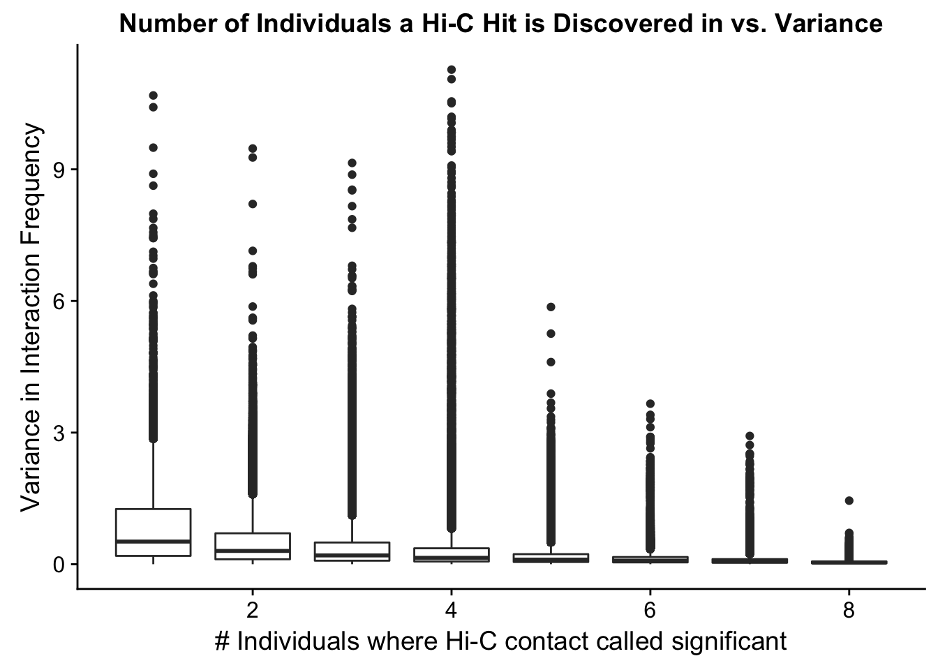
ggplot(data=myplot, aes(group=tot_indiv_IDd, x=tot_indiv_IDd, y=ALLvar)) + geom_boxplot() + scale_y_continuous(limits=c(0, 1)) + ggtitle("Number of Individuals a Hi-C Hit is Discovered in vs. Variance") + xlab("# Individuals where Hi-C contact called significant") + ylab("Variance in Interaction Frequency")Warning: Removed 737679 rows containing non-finite values (stat_boxplot).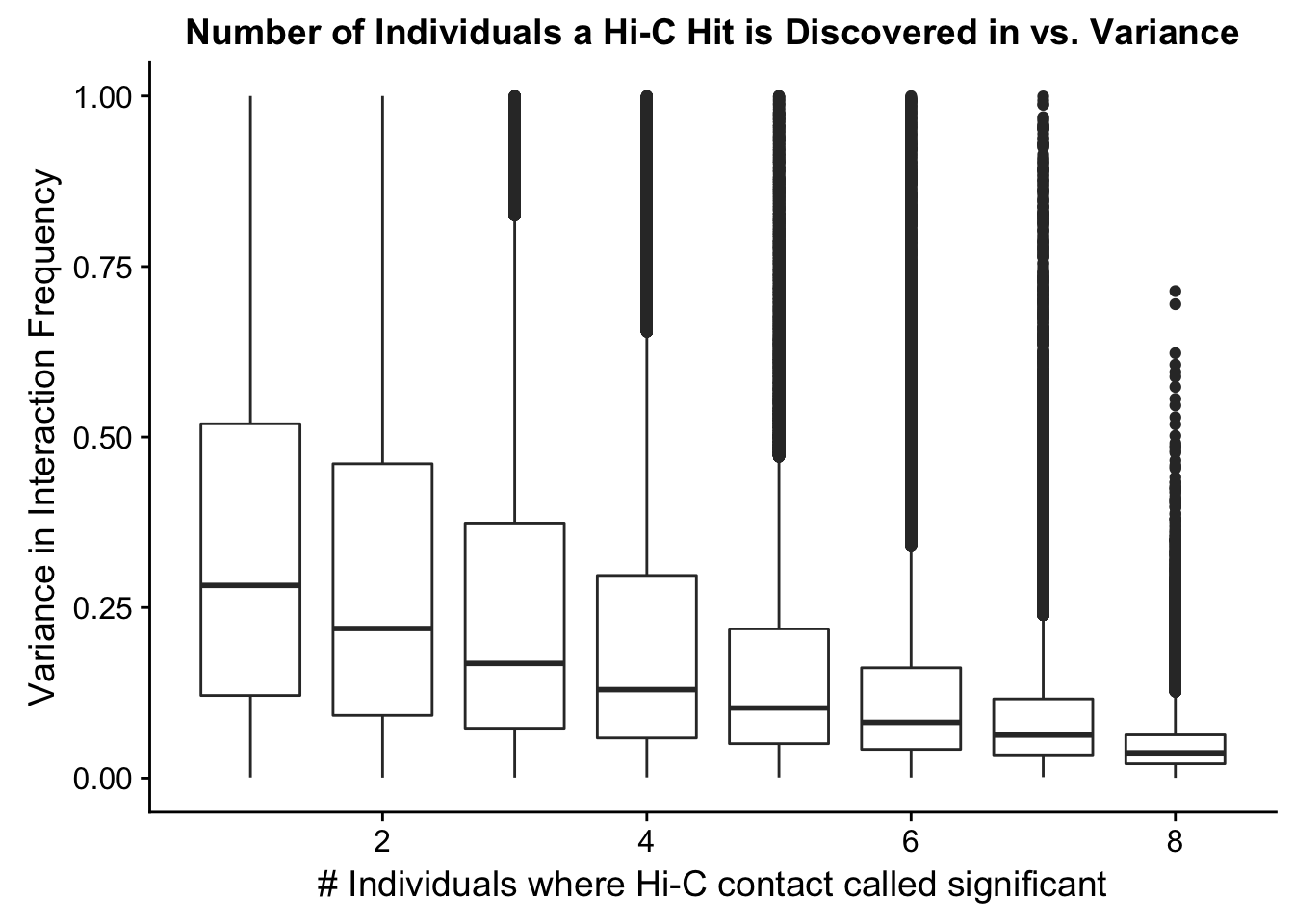 From this, it would appear that variance drops off drastically after discovery in at least 4 individuals. I observed a similar pattern when looking at number of individuals a hit is discovered in vs. species-specific variances, as well as similar reductions when looking at variance in hits within species vs. number of individuals discovered in (not shown). Hence I now repeat all of the QC analyses done above, but this time conditioned upon discovery in 4 individuals. Moving forward I will ultimately filter out all the hits that were not found in at least 4 individuals, though I sometimes check the full dataset as well just for sanity’s sake.
Initial Quality Control Analyses Conditioned Upon Discovery in at Least 4 Individuals
Given the results just seen for variance, I now repeat all the analyses I carried out previously on the data conditioned upon homer discovering a hit as significant in at least 4 individuals.
#Repeating all QC with the condition of discovery in 4 individuals:
data.4 <- filter(full.data, tot_indiv_IDd>=4) #Enforcing this condition brings us down from ~3 million hits to ~350k hits.

###See how distributions look with condition of 4 individuals.
ggplot(data=melt(data.4[,c(304:305, 308:309)]), aes(x=value)) + geom_histogram(binwidth=0.0009, aes(group=variable)) + facet_wrap(~as.factor(variable)) + ggtitle("Distributions of Homer-Significant Hi-C Contacts, Humans | 4") + xlab("Homer-Normalized Interaction Frequency") + coord_cartesian(xlim=c(-6.6, 6.6), ylim=c(0, 450))#Human Dist'ns
No id variables; using all as measure variables
ggplot(data=melt(data.4[,c(306:307, 310:311)]), aes(x=value)) + geom_histogram(binwidth=0.0009, aes(group=variable)) + facet_wrap(~as.factor(variable)) + ggtitle("Distributions of Homer-Significant Hi-C Contacts, Chimps | 4") + xlab("Homer-Normalized Interaction Frequency") + coord_cartesian(xlim=c(-6.6, 6.6), ylim=c(0, 450)) #Chimp Dist'nsNo id variables; using all as measure variables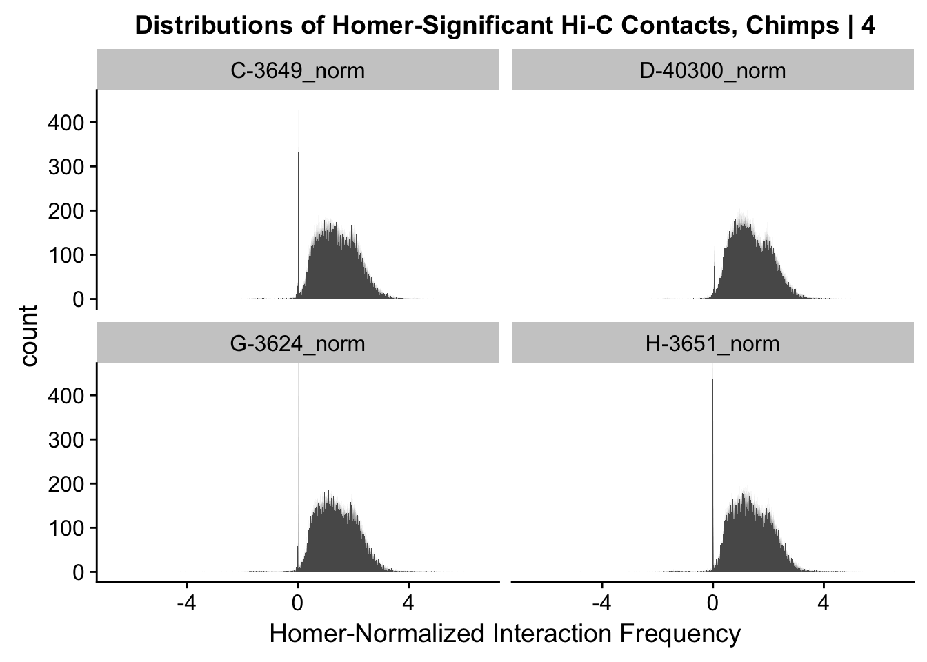
#Overall the distributions look fairly similar to before, with the bimodality seen before being much less stark here. Most of the negative interaction frequency significant hits have dropped out, and there is still a strong mass around 0 (especially in the chimp distributions). Tha majority of the mass of the hits now seems to hover around 1.8 or so.

###Mean vs. variance plot with condition of 4 individuals:
{plot(data.4$ALLmean, data.4$ALLvar, main="Mean vs. Variance in Homer-corrected contact frequency | 4", xlab = "Mean Hi-C Contact Frequency", ylab="Variance in Hi-C Contact Frequency")
  abline(lm(data.4$ALLmean~data.4$ALLvar), col="red")}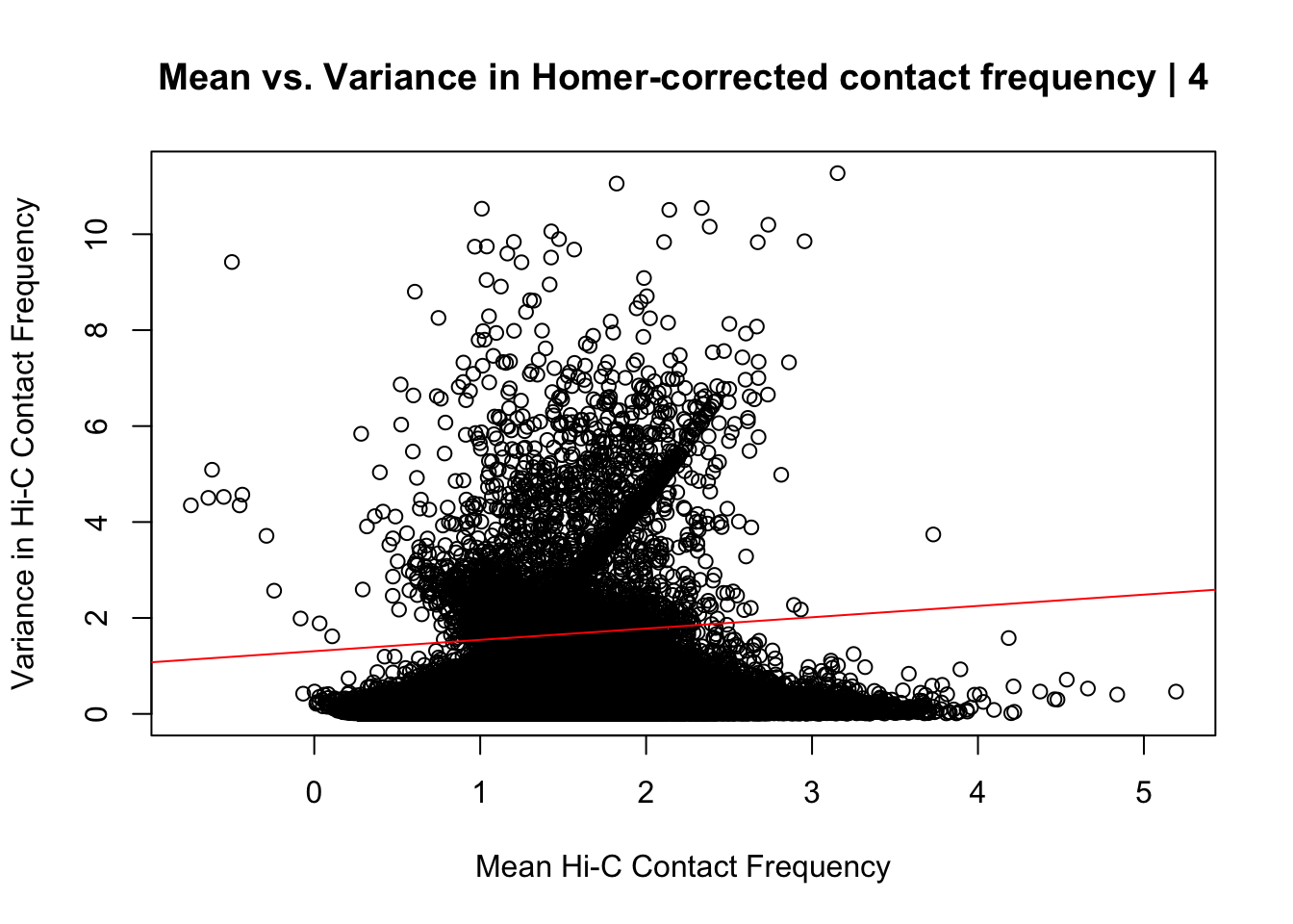
#Looks very similar to the same plot above for the whole dataset; with slightly fewer outliers in the top left of the plot and a different trend in the red line modeling the mean regressed upon the variance. Here, the line is fairly flat, perhaps trending slightly upwards, whereas the entire dataset sees it have a moderate negative slope. Overall, would really prefer there to be no relationship here, but, again, this is not an ideal metric for Hi-C data, so it's not a particularly worrisome result.

###Now to do PCA on the data conditioned upon discovery in 4 individuals--would expect many of the same patterns here, perhaps with even stronger separation due to only grabbing hits that are shared by 4 individuals:
pca4 <- prcomp(t(data.4[,304:311]), scale=TRUE, center=TRUE)
ggplot(data=as.data.frame(pca4$x), aes(x=PC1, y=PC2, shape=as.factor(meta.data$SP), color=as.factor(meta.data$Batch), size=2)) + geom_point() +labs(title="PCA on normalized Hi-C Contact Frequency") + guides(color=guide_legend(order=1, title="Batch"), size=FALSE, shape=guide_legend(order=2, title="Species")) + xlab(paste("PC1 (", 100*summary(pca4)$importance[2,1], "% of variance)")) + ylab((paste("PC2 (", 100*summary(pca4)$importance[2,2], "% of variance)"))) + labs(color="Batch", shape="Species") + scale_shape_manual(labels=c("Chimp", "Human"), values=c(16, 17)) #Metadata hasn't changed so use the same metadata from above. PCA shows a similar separation along species lines for PC1, with this time it representing 24.171% of the variance (up from 20.49% earlier). This is rather unsurprising, since we have subset down to hits that are more shared than the total set we had before.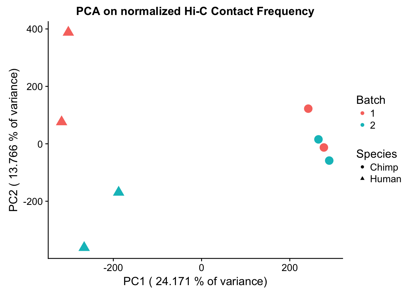
barplot(summary(pca4)$importance[2,], xlab="PCs", ylab="Proportion of Variance Explained", main="PCA on normalized Hi-C contact frequency") #Scree plot showing all the PCs and the proportion of the variance they explain. This is similar to above, with no PCs beyond a 7th one, and the first PC taking the vast majority of the variance while the others hover near 12%. No variables in experimentation, library prep, sequencing batch, or anything else seem to correlate with these PCs.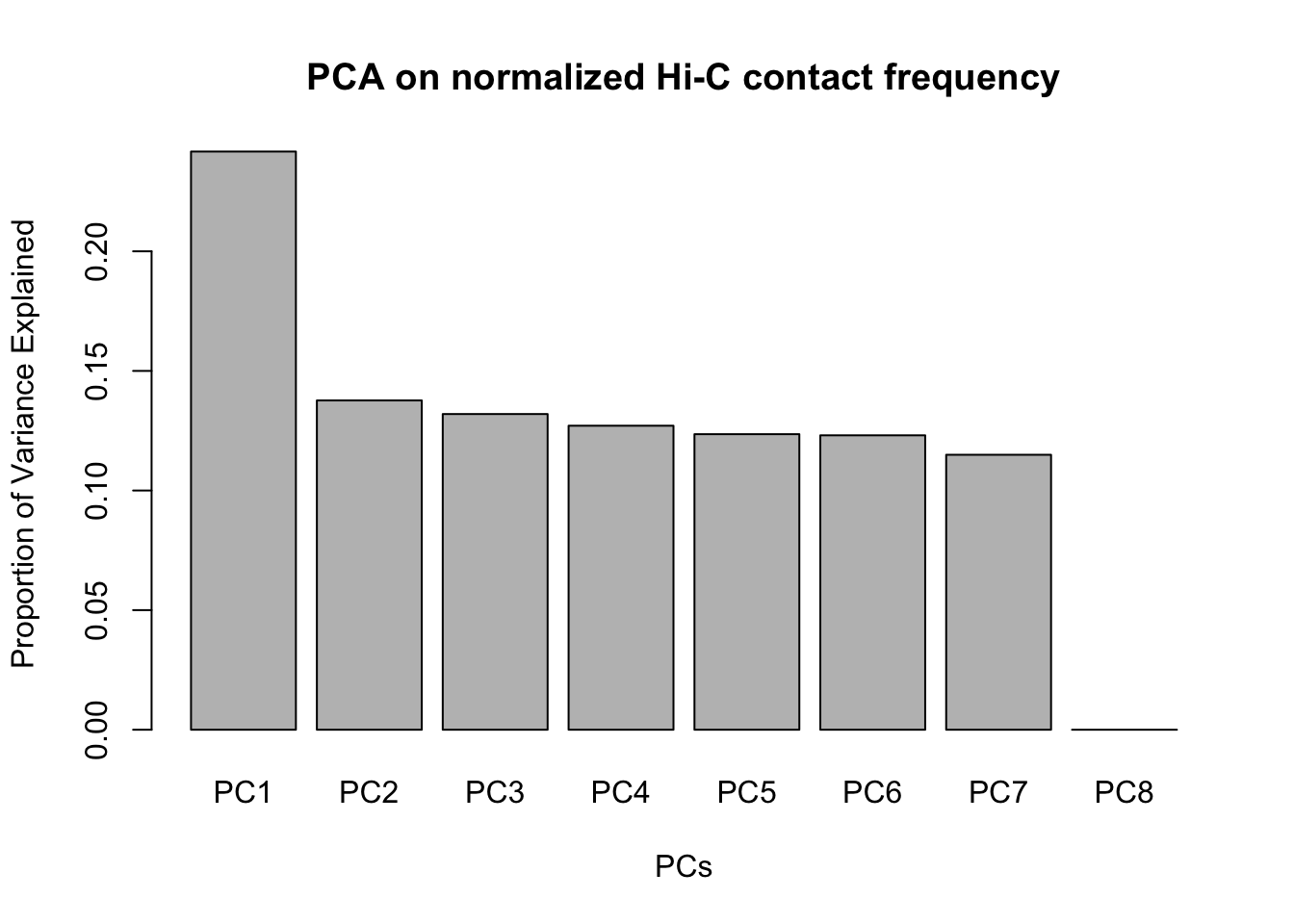
###Heatmap clustering of these data after conditioning upon discovery in 4 individuals. Would expect to see the same clustering, with perhaps higher correlation values due to conditioning upon discovery in 4 individuals.
corheat4 <- cor(data.4[,304:311], use="complete.obs", method="pearson") #Corheat for the full data set, and heatmap
#colnames(corheat4) <- c("A_HF", "B_HM", "C_CM", "D_CF", "E_HM", "F_HF", "G_CM", "H_CF")
colnames(corheat4) <- c("H_F1", "H_M1", "C_M1", "C_F1", "H_M2", "H_F2", "C_M2", "C_F2") #Better for presentation
rownames(corheat4) <- colnames(corheat4)
heatmaply(corheat4, main="Pairwise Pearson Correlation Clustering @ 10kb | 4", k_row=2, k_col=2, symm=TRUE, margins=c(50, 50, 30, 30))
We recommend that you use the dev version of ggplot2 with `ggplotly()`
Install it with: `devtools::install_github('hadley/ggplot2')`We recommend that you use the dev version of ggplot2 with `ggplotly()`
Install it with: `devtools::install_github('hadley/ggplot2')`
We recommend that you use the dev version of ggplot2 with `ggplotly()`
Install it with: `devtools::install_github('hadley/ggplot2')`#Indeed, we can again see that all the humans cluster together, as do all the chimps. This is very good, and given this new condition, we also see higher within-species correlations for the significant hits, in the 0.6-0.7 range (was much closer to 0.3 before).
###This initial QC suggest quality of the data is high, and has given us some information on how to filter the data before further intrepretation. When working locally, can be helpful to write out both the full dataset and the one conditioned upon 4 individuals, in order to do sanity checks on both later on. Note that a call of identical on something fread in after fwriting it out will still return FALSE with this as floating point can't represent decimals exactly (see https://stackoverflow.com/questions/9508518/why-are-these-numbers-not-equal or https://cran.r-project.org/doc/FAQ/R-FAQ.html#Why-doesn_0027t-R-think-these-numbers-are-equal_003f):
fwrite(full.data, "~/Desktop/Hi-C/full.data.10.2018", quote = TRUE, sep = "\t", row.names = FALSE, col.names = TRUE, na="NA", showProgress = FALSE)
fwrite(data.4, "~/Desktop/Hi-C/data.4.10.2018", quote=FALSE, sep="\t", row.names=FALSE, col.names=TRUE, na="NA", showProgress = FALSE)Session information
sessionInfo()R version 3.4.0 (2017-04-21)
Platform: x86_64-apple-darwin15.6.0 (64-bit)
Running under: OS X El Capitan 10.11.6
Matrix products: default
BLAS: /Library/Frameworks/R.framework/Versions/3.4/Resources/lib/libRblas.0.dylib
LAPACK: /Library/Frameworks/R.framework/Versions/3.4/Resources/lib/libRlapack.dylib
locale:
[1] en_US.UTF-8/en_US.UTF-8/en_US.UTF-8/C/en_US.UTF-8/en_US.UTF-8
attached base packages:
[1] compiler stats graphics grDevices utils datasets methods
[8] base
other attached packages:
[1] bindrcpp_0.2 bedr_1.0.4 forcats_0.3.0
[4] purrr_0.2.4 readr_1.1.1 tibble_1.4.2
[7] tidyverse_1.2.1 edgeR_3.20.9 RColorBrewer_1.1-2
[10] heatmaply_0.14.1 viridis_0.5.0 viridisLite_0.3.0
[13] stringr_1.3.0 gplots_3.0.1 Hmisc_4.1-1
[16] Formula_1.2-2 survival_2.41-3 lattice_0.20-35
[19] dplyr_0.7.4 plotly_4.7.1 cowplot_0.9.3
[22] ggplot2_2.2.1 reshape2_1.4.3 data.table_1.10.4-3
[25] tidyr_0.8.0 plyr_1.8.4 limma_3.34.9
loaded via a namespace (and not attached):
[1] colorspace_1.3-2 class_7.3-14 modeltools_0.2-21
[4] mclust_5.4 rprojroot_1.3-2 htmlTable_1.11.2
[7] futile.logger_1.4.3 base64enc_0.1-3 rstudioapi_0.7
[10] flexmix_2.3-14 mvtnorm_1.0-7 lubridate_1.7.3
[13] xml2_1.2.0 R.methodsS3_1.7.1 codetools_0.2-15
[16] splines_3.4.0 mnormt_1.5-5 robustbase_0.92-8
[19] knitr_1.20 jsonlite_1.5 broom_0.4.3
[22] cluster_2.0.6 kernlab_0.9-25 R.oo_1.21.0
[25] shiny_1.0.5 httr_1.3.1 backports_1.1.2
[28] assertthat_0.2.0 Matrix_1.2-12 lazyeval_0.2.1
[31] cli_1.0.0 acepack_1.4.1 htmltools_0.3.6
[34] tools_3.4.0 gtable_0.2.0 glue_1.2.0
[37] Rcpp_0.12.16 cellranger_1.1.0 trimcluster_0.1-2
[40] gdata_2.18.0 nlme_3.1-131.1 crosstalk_1.0.0
[43] iterators_1.0.9 fpc_2.1-11 psych_1.7.8
[46] testthat_2.0.0 rvest_0.3.2 mime_0.5
[49] gtools_3.5.0 dendextend_1.7.0 DEoptimR_1.0-8
[52] MASS_7.3-49 scales_0.5.0 TSP_1.1-5
[55] hms_0.4.2 parallel_3.4.0 lambda.r_1.2
[58] yaml_2.1.18 gridExtra_2.3 rpart_4.1-13
[61] latticeExtra_0.6-28 stringi_1.1.7 gclus_1.3.1
[64] foreach_1.4.4 checkmate_1.8.5 seriation_1.2-3
[67] caTools_1.17.1 rlang_0.2.0 pkgconfig_2.0.1
[70] prabclus_2.2-6 bitops_1.0-6 evaluate_0.10.1
[73] bindr_0.1.1 labeling_0.3 htmlwidgets_1.0
[76] magrittr_1.5 R6_2.2.2 pillar_1.2.1
[79] haven_1.1.1 whisker_0.3-2 foreign_0.8-69
[82] nnet_7.3-12 modelr_0.1.1 crayon_1.3.4
[85] futile.options_1.0.0 KernSmooth_2.23-15 rmarkdown_1.9
[88] locfit_1.5-9.1 grid_3.4.0 readxl_1.0.0
[91] git2r_0.21.0 digest_0.6.15 diptest_0.75-7
[94] webshot_0.5.0 xtable_1.8-2 VennDiagram_1.6.19
[97] httpuv_1.3.6.2 R.utils_2.6.0 stats4_3.4.0
[100] munsell_0.4.3 registry_0.5 This R Markdown site was created with workflowr